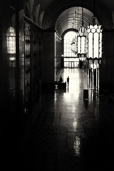
As photographers, it’s easy for us to make conscious composition choices that allow us to balance our photographs or to create harmony within them. It’s is more difficult however to try and lead viewers through your photographs. We rarely consider how to influence the viewers of our photographs. When composing images, we don’t think about the different elements in our images and the order by which we want viewers to see those elements.
This is a common tactic in classic painting, but not used readily by photographers. The reality is it’s hard to influence viewers and to dictate the ways in which they view our photographs.

The lines of the creek lead the viewer’s eye through and into the image.
In many cases, the subject matter we are shooting just happens too fast for us to consciously compose images with the intention of leading the viewer through our photographs. It’s much easier to lead the eye through images we construct like still life or landscape photos. In the case of sports photography, this would only happen by sheer luck or happy accident. But when you have the opportunity, think about using techniques that lead viewers to specific parts of your images.
#1 – Use a brightness gradient
One of my favorite techniques for leading the eye is to use a brightness gradient. The human eye is drawn to the brighter elements, and if you position an area of brightness within your image, the eye will be drawn to that location.
It is important, however, to remember that the key to this technique is to use a gradient of brightness. Small bright areas amidst darker tones will not achieve the same kind of effect. The idea is to make the progression of highlights subtle, like a path through your image. Of course, this technique will not be possible in all situations but if it’s available considering using this method.

Shot from a kayak during sunrise I wasn’t intending to shoot this image with a brightness gradient. Instead, it’s a happy accident.
#2 – Linear perspective
When using a wide angle lens, you can consciously create linear perspective within images. This technique might be one of the more easily attainable methods of leading the eye. The wide angle lens will exaggerate lines and lead the eye fairly directly through the photograph. You can compose your photographs in such a way that buildings or other architectural features draw viewers through your photograph.

The line of lights and the line of buildings lead the eye through the photo. The viewer should be stopped by the bright spots of light within the image but then continue on through the rest of the photograph.

I’ve added some arrows to this image so you can see how the lines of the pier point the viewer into the photograph. The teenager in the image is a second way of directing the eye as he stops to view the sunset.
#3 – Use shafts of light
Using shafts of light is another technique for pointing viewers in the right direction. The conditions are very specific, and shafts of light are not always readily available, but they can be a useful tool for pointing out specific directions or objects within a photograph.
The photograph below was taken by my son. His plan when composing was to have the ray of light point towards the people. I must admit I didn’t think of composing in such a manner and when I asked him later he said it was “the natural choice”. Since that time I’ve made conscious decisions to look for and incorporate rays of light into my images.

There’s a fairly strong lens flare in this image but my son made a conscious choice in how he composed his photograph and I’m proud of him for his decisions.
#4 – Use a blur gradient
Using a blur gradient (shallow depth of field) is another method of leading the eye. I will admit that I don’t use this technique much. I even struggled to find images to use as examples for the article. Part of my reasoning is that I hope I will now be forced to experiment more with this technique.
Using a focus gradient can lead the eye to the important elements of the photograph. Setting up a shot in which the foreground is blurred and slowly recedes through the image to the point of sharp focus will draw viewers to specific objects within the frame.

I used a fairly large aperture here and while the blur gradient isn’t as obvious it is still present in the image.
#5 – Use more than one technique
You can also combine these techniques to help influence eye movement throughout your images. In these two images, the eye moves through the image the light gradient is the most obvious technique but lines of architecture within the building help to draw the viewer down the tunnel. The lights hanging at the top of the image are an obvious line that directs the eye.

Similarly, this image of the couple walking through the image adds to the movement within the photograph. The lines of the path reinforce the direction the viewer should take within the image.

Shot at a provincial park this image combines elements like linear perspective and vectors.
Conclusion
Leading the eye through a photograph is not an exact science. You can’t force viewers to follow the path you set for them. Each person approaches the artwork in different ways. If your use some of the techniques outlined here, it will help you to create compelling compositions. The more thought and purpose we put into creating our images the better they will be. While there may not always be time to use these techniques, it’s always handy to keep them in the back of your mind and use them when the time is right.
The more thought and purpose you put into creating your images the better they will be. While there may not always be time to use these techniques, it’s handy to keep them in the back of your mind and use them when the time is right.

The eye-leading techniques used in this image are a little harder to spot. I used the lines of the barrels and rays of light to direct the viewer’s eye into the center of the image.
The post 5 Simple Techniques for Leading the Viewer’s Eye in Your Images by Erin Fitzgibbon appeared first on Digital Photography School.
from Digital Photography School https://digital-photography-school.com/5-techniques-leading-viewers-eye/
No comments:
Post a Comment