Thursday 2 May 2019

Mastering Color Series – The Psychology and Evolution of the Color GREEN and its use in Photography

The post Mastering Color Series – The Psychology and Evolution of the Color GREEN and its use in Photography appeared first on Digital Photography School. It was authored by Megan Kennedy.

Spanish dramatist, poet and writer Pedro Calderón de la Barca once said “green is the prime color of the world, and that from which its loveliness arises”. From the perspective of a well-loved frog however, it’s not so easy being green. On the visible spectrum, green occupies the space between blue and yellow. In color theory, it is a secondary color, made by mixing blue and yellow together. Here, we’ll have a look at the evolution of green and its impact in art from antiquity to the present day.

The psychology of green

Green’s strongest psychological associations lie with the natural environment. The word green originates from the Middle English and Old English word grene, which has the same root as the words grass and grow. Many humans respond to nature, and thereby green itself, with a sense of calm and renewal. According to a recent study, exposure to green spaces in childhood can provide significant mental health benefits into adolescence and adulthood. Another study suggests that the “availability and quality of neighborhood green spaces are associated with greater well-being”.

Green’s association with nature has led to the adoption of green as an emblem for environmental movements. Fresh greenery in spring and the steady growth of plant-life has fostered associations with green and rebirth and determination. In contrast, the green text on early computer systems have cultivated associations between green, modernity and the digital landscape. The movie The Matrix has furthered this association.

When the United States government began issuing cash in 1861, bills were printed with a green-black ink. This has fostered associations between green and money. Due to it’s reflective nature, neon green is often used for safety equipment, clothing and signage. Because of it’s vibrational quality, neon green also features heavily in psychedelic art.

A belief held by the ancient Greeks that the overproduction of bile (which is typically a dark green to yellowish brown fluid) was a symptom of jealousy has drawn associations between green, envy and illness. Poeticized by William Drennan as the “Emerald Isle,” Ireland is associated with the color green because of it’s lush green landscapes. In China, green is associated with the east, spring and generative energy. For many Native American peoples, green symbolizes endurance. Green is the sacred color of Islam, representing Muhammad. However, in South America, green can be a symbol of death.

The evolution of the color green

Malachite, green earth and verdigris

While prehistoric artists used a pallet made up of reds, yellows, blacks, browns and whites, greens and blues were noticeably absent from early art. Decorative ceramics made by ancient Mesopotamians depict some of the earliest examples of green in visual arts. However, the method used to produce these greens is unknown.

Mined in the west Sinai and eastern desert, ancient Egyptians adorned tombs and papyrus with finely ground blue-green malachite pigment. Referring to the afterlife as the Field of Malachite, the ancient Egyptians wore the crushed mineral around the eyes to ward away evil. Moderately lightfast but very sensitive to acids, and varying in tonal consistency, malachite’s use in art continued up until the 1800’s. The Egyptians also used green earth pigments or mixed yellow ochre with blue azurite to form green hues.

Sourced near Verona in Italy and on the Mediterranean island of Cyprus, the Romans used green earth extensively in decoration. According to the blog Eclectic Light Company, green earth pigments have also been found in paintings from North America and the Indian subcontinent. Although lacking in intensity, green earth has seen use right up to the present day. Perhaps its best known usage however, is in the under-painting of flesh tones during the middle ages.

The Romans also used verdigris as a source of green pigment. Verdigris occurs naturally when copper, brass or bronze is exposed to air or seawater over time. Deliberately cultivated by soaking copper plates in fermenting wine and collecting the resulting residue, verdigris was the most vibrant green available until the 19th century.

Scheele’s green

Invented in 1775 by chemist Carl Wilhelm Scheele, Scheele’s green was the first to contain arsenic in its composition. Although it faded rapidly, Scheele’s green was considered superior to previous paints due to its vibrancy. It was used in a range of applications from food dye to artist’s paints. Needless to say, Scheele’s green was highly toxic and carcinogenic. Both manufactures and consumers became ill or died from exposure to the deadly pigment.

Cobalt green

In 1780 Swedish chemist Sven Rinman, developed a process that resulted in a cobalt-green compound of cobalt and zinc. Arthur Herbert Church, a British chemist, published Rinmann’s process in his book, the Chemistry of Paints and Painting where he stated that cobalt green was created by “precipitating with an alkaline carbonate a mixture of the nitrates of cobalt and of zinc, and then strongly heating (after washing) the precipitate formed”.

“When prepared properly,” Church continued, “cobalt green is a pigment of great beauty and power.” However, despite the opportunity to vary the ratio of zinc to cobalt oxides in production, the pigment was never a pure green, taking on a blueish hue instead. In addition, the high cost and poor tinting strength of cobalt green meant it saw limited use by artists.

Paris green

Paris green is also known as emerald green. Becoming commercially available in 1814, Paris green was used as a pigment as well as a rodenticide and insecticide. Offering greater permanence and saturation over Scheele’s green, Paris green proved popular with artists such as Monet, and Van Gogh. Ranging from a pale blue-green to a deep green, Paris green was relativity cheap to manufacture. It was also used as a household paint and in decorative wallpaper. Highly toxic, it was discontinued over the second half of the twentieth century.

Viridian

Electing to keep their methodology a secret, Viridian was first produced by chemists Pannetier and Binet in Paris around 1838. It took another 20 years before chemist Guignet patented a process to manufacture Viridian, making the pigment available to artists.

Viridian takes its name from the Latin word viridis, meaning green. A dark shade of spring green, Viridian sits between green and teal on the color wheel. Viridian’s brilliance, excellent permanence and lack of toxicity meant that it soon eclipsed all other green pigments. Readily adopted by Edvard Munch, Monet and Van Gogh, the rich blue-green hues of viridian remain in use today.

Green in visual arts

Green’s presence in art history is a testament to its evocative associations with nature and life. Cultivated by the flooding of the River Nile, ancient Egyptians recognized the greenery of flourishing crops as a symbol of rebirth. Osiris, the ancient Egyptian god of the underworld and rebirth was depicted with a green complexion and the hieroglyph for the color green was represented by the stalk of the papyrus.

During the middle ages and renaissance, clothing color signaled social rank and occupation. Green was worn by merchants, bankers and gentry. Both the Mona Lisa and the bride in the Arnolfini portrait by Jan van Eyck are depicted in green, an indication of their status.

Taking advantage of greens refined over the renaissance period, Baroque artists conveyed moments of movement and drama with rich green hues. Dreamy green landscapes populated by the well-to-do defined the rococo art movement, while the green hues in 19th century realism mirrored the bleak reality of middle and lower class society. In contrast, pre-raphaelite artists used green to depict resplendent clothing and foliage.

Capturing the interplay between light and movement, green took on a new life under the strokes of the impressionist’s brush. Expressionist artists, in their distortions and exaggerations, valued emotion over reality, using green to convey new artistic possibilities. Cubists used green as a tool to alleviate some of the heaviness of their compositions and later, abstract artists like Mark Rothko and Helen Frankenthaler expressed the immersive nature of green through verdant tones on active canvasses.

Green in contemporary art

Contemporary examples of green used in art are as varied and unique as green itself.  In 1970 Bruce Nauman erected two walls, placed them 12 inches apart and suspended green lights above the gap. Encouraged to walk through the claustrophobic space, members of the public were bathed in green fluorescence as they shuffled along.

In 1998 Olafur Eliasson used a sodium salt variation of fluorescein called uranine to color waterways in Germany, Norway, Iceland, Sweden, Japan and the USA a vibrant green. He called his endeavors the Green River Project.

In 2016 Norwegian artist Per Kristian Nygard transformed an Oslo gallery into an organic work of art. Distributing soil and grass seed over a wooden framework covered with plastic sheets, Per Kristian Nygard cultivated Not Red But Green, a contemplative piece investigating the exchange between architecture and nature.

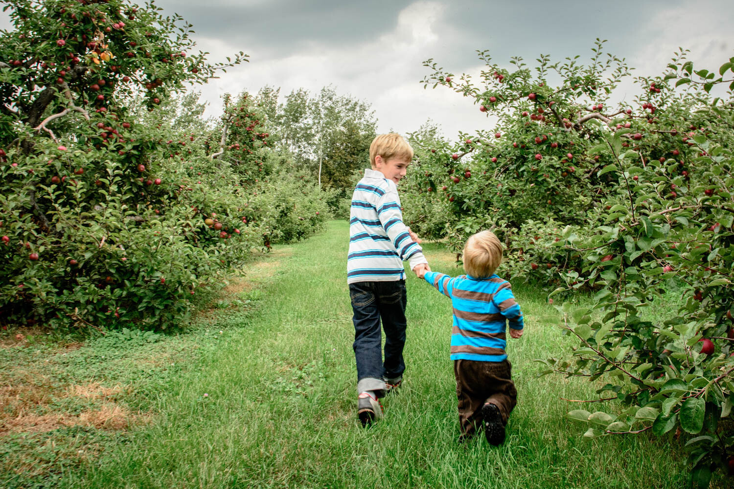
Green in photography

Green’s associations continue to be depicted in both film and digital photographic formats. Australian duo Prue Stent and Honey Long combine photography with performance, installation and sculpture, investigating the relationship between the human body and nature. Stent and Long’s series Bush Babies melds the green of the natural environment with the nakedness of the human body.

An overreaching theme in Narelle Autio’s photography is the study of human interaction within green spaces. Namia Green’s portraits of black and brown subjects against lush greenery reflects the photographer’s rejection of the narrow representation of black peoples in art. Photographed by Steve McCurry, the famously green eyes of the Afghan Girl (Sharbat Gula) are both haunting and haunted, piercing a viewer’s gaze. Ren Hang (link NSFW), known for his sexually expressive imagery, often relied on green for contrast, context and life.

Landscape and architectural photographer Andreas Gursky often applies green as a visual pause within his work. Fashion photographer Miles Aldridge uses green as a surreal brush with the surreal. Signalling time, place and atmosphere, macro photographers like Tomas Shahan feature green as an inevitable backdrop for their minuscule natural subjects. And Pep Ventosa’s dynamic works see green as a prevailing presence in her series In the Round, Trees.

Green has applications on-camera too. In black and white photography, green filters are mainly used for photographing plants, separating green foliage from brightly colored flowers. In landscape photography, green filters lighten organic greens, giving an image a more natural appearance.

Conclusion

Despite its late arrival to the artist’s pallet, green’s versatility is reflected in its many connotations. Associated with renewal and rebirth, green has also been linked with the digital landscape, money, jealousy and sickness. From ancient art to contemporary visual culture, green has shaped our comprehension of the environment around us. Portraying immeasurable depth and abundance, green is the color of nature and life.

Share with us your photos that use green in the comments below.


You may also like:

The post Mastering Color Series – The Psychology and Evolution of the Color GREEN and its use in Photography appeared first on Digital Photography School. It was authored by Megan Kennedy.


from Digital Photography School https://digital-photography-school.com/mastering-color-series-green-in-photography/

This Free Masterclass Teaches Adobe Lightroom in Just 30 Minutes

The popular YouTube channel Mango Street has released this free video that’s a crash course on Adobe Lightroom. The masterclass will train you in the basics in less than 30 minutes (it’s 28 minutes and 49 seconds, to be exact).

Here’s an index of the different sections and the timestamps at which they’re found:

00:41: Getting Started
03:06: Library Module
04:58: Develop Module
06:27: Histogram
07:03: Tools
10:58: Basic Adjustments
14:02: Tone Curve
15:41: HSL
17:06: Split Toning
18:04: Detail
19:35: Lens Corrections
21:42: Transform
22:19: Effects
22:46: Calibration
23:43: Editing Faster
25:27: Exporting

“We cover everything a new user needs to know to get up and running with Lightroom so they can edit their photos with confidence,” Mango Street tells PetaPixel.


from PetaPixel https://petapixel.com/2019/05/02/this-free-masterclass-teaches-adobe-lightroom-in-just-30-minutes/

CatLABS X FILM 80 is a New B&W Negative Film

Film vs. Digital: This is How Dynamic Range Compares

CASE Act Bills Introduced in Congress to Create Copyright Small Claims

Adobe’s $10 Photography Plan Gone from Site: Cheapest is $20/Month

Creative Commons Launches Search for Over 300 Million CC Images

How to Take Great Photos with Your iPhone

The post How to Take Great Photos with Your iPhone appeared first on Digital Photography School. It was authored by Sandra Roussy.

Camera phones have certainly come a long way. A few years ago it was impossible to try to achieve good photos with the camera that came with your smartphone. The quality and resolution were so low that we didn’t even think about post-processing and posting our photos.

The iPhone has had steady updates with new features added over the years including constant improvements to the camera quality. When the iPhone 8Plus came onto the market, photographers were finally ready to take photos that they could be proud of editing and posting. Many professional photographers are now using their smartphone cameras to snap photos during their travels or even on assignments.

Of course, the iPhone is limited and can’t provide all the creative features that a DSLR with interchangeable lenses can. But some days, carrying bulky camera gear is impossible, so the iPhone provides a great alternative.

Learn how to use your iPhone to its full potential, and you too will be taking great photos with your camera phone! We’ll take a look at the iPhone 8plus and newer models in this article because they have some great new photo features like Portrait Mode.

Super helpful tip: Use the slide-left feature from your lock screen to get quick access to your camera.

Learn the settings

Set to highest quality

Your iPhone camera can offer some high-quality photos and videos. If you intend to store hundreds of photos on your phone without downloading or transferring them into a cloud-based platform, then you may want to shoot in low resolution, so your phone doesn’t get full.

When you do want to shoot something important and want to edit the photos afterward, it’s best to shoot in the highest quality possible.

Set your focus point

The iPhone has a feature that you can use to set your exact focus point, and it’s quite important to use it to achieve tack sharp images.

  • Compose your shot
  • Tap your screen where you want the focus to be.
  • Slide the exposure up or down (The little yellow sun icon).
  • Press and hold to lock the focus point and recompose your photo if you wish (AE/AF LOCK).
  • Take your photo.

About HDR

HDR means High Dynamic Range and what it does is help provide evenly exposed images. The camera takes 3 shots when you take a photo and stacks them to provide a perfectly exposed image with all components having details in both the highlights and shadows.

Go to your camera setting and toggle off Auto HDR and Keep Normal Photo toggled on. While shooting you will see the HDR icon at the top. If there is a line through it, simply tap it to activate.

Helpful Tip: Your iPhone gives you the option to preserve your last shoot settings. This is especially useful when you plan to do the same type of photography. If these are not toggled on, the iPhone goes back to its default setting every time.

Use the grid lines

Nothing says amateur like a crooked horizon line. One of our pet peeves as photographers is to see a beautiful landscape where the ocean seems to be sliding down the side of the photograph.

Tilt your head to look at the photo? No.

Better, apply grid lines on your iPhone so that you can align the horizon line to get a perfectly straight horizon.

How-to: Go to settings and toggle the Grid option on.

Composition tips and tricks

Rule of thirds

Rule of Thirds is the main composition rule of photography that allows the viewer’s eye to flow easily over a photo. This is a good guideline to follow but it is not always the best composition for every situation.

Tip: Having the Grid Lines toggled on will help you achieve the rule of thirds better.

Keep it simple

Sometimes less is more. When you cram too much info into a photograph, the viewer doesn’t know where to look and may not capture your intent. Keep white space and focus on a single subject. This will bring attention to the subject and give your photo more creative meaning.

Get down and raise it up

Shooting from the same perspective and position will most probably create some pretty boring and repetitious photos. Try getting down on the ground and see how the perspective changes. This can sometimes add some drama to your subjects. Also, look up! Look at the contrasts with the sky, buildings, trees, and clouds.

Move in close

Sometimes a small detail can take a photograph from good to WOW!

Observe light, colors, and shadows

Learning to observe how light affects objects and changes throughout the day is key to improving your photos. Observe how shadows get created and how the light hits particular objects and capture those unique events.

Look for contrasts of color or a single color pop in a monotone environment.

Photo modes and special features

The iPhone comes with photo modes for you to choose from. The best feature to have come out in the last few years is Portrait Mode.

Portrait Mode

As of the introduction of the iPhone 8 plus, Portrait Mode has been accessible and has provided some broader creative possibilities. The iPhone Xs and iPhone Xr have the option to adjust the depth of field while shooting in Portrait Mode. Portrait Mode makes great portraits, of course, but can also be used for so much more. Try setting to portrait mode when you want a bokeh effect or a blurry background in your photos.


Square

This mode is useful if you want to post on Instagram while keeping your composition intact.


Pano

Shoot some panoramic photos to show a greater angle of a landscape.

Special features

Burst Mode: Burst mode is great when you want to capture some action shots. Press and hold the shutter button, and the camera takes a series of photos.

Live Photo: Live photo is a fun feature that records 3-second videos before and after you have pressed the shutter. When viewing your photo, press and hold the photo to see the effect in action. You can activate or deactivate this feature in your camera mode.

Loop, Bounce, Long Exposure: Swipe up on your Live Photo to gain access to a few more features that let you loop the live photo effect, bounce it, or create a long exposure.

Zoom or no zoom – Attachable lens options

  • The newer versions of the iPhone have two lenses that allow you to zoom into your subject without moving in closer. This is practical when photographing wildlife or even when doing portraits.
  • Click on the 1X at the bottom of the camera screen. The zoom will go to 2X. Click your photo. You can pinch your screen and zoom even further, but this can cause shake in your photo and probably create blur.

Attachable lenses have hit the market and can offer some fun alternatives when shooting. They come in a variety of prices and quality. Macro lenses and fish-eye lenses seem to be the most popular.

Try photo apps and filters

Photo editing apps and software are very popular with amateurs and professional photographers alike. Some apps let you add filters to create moods, while others give you access to features that let you edit and fine-tune your iPhone photos.

Some of these apps even let you get out of the automatic iPhone mode and into manual shooting mode. They let you adjust your shutter speed, ISO, and aperture as you wish.

Here is a list of some of our favorite apps available for your iPhone.

Pro Camera

You can shoot in Manual, Semi-automatic, or Automatic modes with Pro Camera. It contains RAW capture, live histogram, and an anti-shake feature. Pro Camera is the app that allows you to achieve super sharp images with your iPhone.

Snapseed

Snapseed is a popular go-to app for every level photographer. It’s one of the most complete free apps offering a variety of functions to edit your photos.

VSCO

VSCO is one of those apps, that when downloaded, allows you to shoot from your camera phone with the option of controlling the ISO, white balance, shutter speed, and other customizable camera functions.

Like a DSLR, you adjust your exposure components before you shoot to get your desired outcome. You can create long exposure photographs and fine-tune your focus points.

There’s a useful active tilt meter to level your phone to achieve a perfectly straight horizon line.

Have some fun with your iPhone

Even if you own an expensive DSLR and shoot in Manual mode, you can still get some great shots with your iPhone. The latest generation iPhones have stepped up the game regarding the cameras, lenses, and shooting options.

Keep in mind a few helpful tips to achieve beautiful compositions and don’t forget to add some useful photo-editing apps on your iPhone.

Your iPhone photos will look more professional, and you’ll be proud to post and show them off.

Feel free to share some with us in the comments section below.


The post How to Take Great Photos with Your iPhone appeared first on Digital Photography School. It was authored by Sandra Roussy.


from Digital Photography School https://digital-photography-school.com/how-to-take-great-photos-with-your-iphone/

Wednesday 1 May 2019

Gaining Confidence to Charge Properly for Your Photography

The post Gaining Confidence to Charge Properly for Your Photography appeared first on Digital Photography School. It was authored by Mat Coker.

So many of us are awkward about money – especially asking for it. A few years ago I was just starting out as a “professional” photographer. I did a free session just for the experience. The family insisted on paying me something even though I kept declining. They gave me $20. I couldn’t help but think, “is that all I’m worth?” I was happy to do it for free, yet $20 felt like an insult.

There were a lot of questions tangled up in that $20 session. Are my photos good enough to charge money? What is the right price to charge? How do I tell them my price when I feel so dirty about money? Why don’t they value me more?

I knew that I had to work through these questions or just forget about charging money at all.

Let me share with you how to:

  • Know what to sell (a service, prints, or digital)
  • Set your prices (to fund your hobby or go full time)
  • Get over the dirty feeling you have when talking about money
Photo session pricing

This was one of my first and cheapest photo sessions, but also one of my most memorable. It rained the whole time and we had to keep ducking back into our vehicles to stay dry.

A riddle

When I first started out and my prices were low, people would tell me that my prices were too high. And now that my prices are five times higher, people keep telling me my prices are too low. Why is that? I’ll tell you at the end.

First, the truth about prices

You will set your prices based on assumptions you have. Many of those assumptions are wrong, which leads to wrong pricing.

I promise you that:

  • The market is not over-saturated with photographers.
  • Cheap photographers have not driven down prices for the rest of us.
  • People do value photography and will spend good money on it.
Family photo session prices

I charged this family four times more for their next session and they gladly paid because they loved their first set of photos so much. I even got a call from the dad saying how much he liked the photos. And dad’s never want to pay for photos!

What do you really want?

There is little use in discussing pricing if you don’t have an end goal in mind. You need to begin by asking yourself what you really want.

Do you even want money? If so, do you want a little money to fund your photography hobby? Or, do you want enough money to count as income?

Money is a tool to get other things. So the question is, what do you want?

Don’t charge anything at all

Don’t feel as though you must charge for your photography. You might get sucked into the idea of making money with your photography just because so many other photographers do.

If you love photography for it’s own sake, you don’t necessarily need to make money doing it.

Keep your life simple and chase photography for it’s own sake. Go ahead and share your photography as a gift with no concern about money.

photography pricing

Figure out what you’re selling

If you do want to earn money with your photography, you need to decide what you’re selling and why.

You could sell sessions, digital files or prints (or any combination of these).

Don’t let anybody tell you what you must offer. Make your own decision.

Here are some examples of what you could sell.

  • Photograph events and then sell digital files or prints.
  • Do photography sessions (newborn, family, etc) and then sell digital files or prints.
  • Take photographs of your own ideas and then sell fine art prints or digital stock photography.

Create a price list for whatever you offer and then you’re ready when people ask how much you charge.

How to set your prices

I prefer to keep everything as simple as possible, so here is my model for how to set your prices.

  1. What do you want to make per month?
  2. How many sessions would you like to do per month? Or, how many prints or digital photos would you like to be selling per month?

Suppose you would like to earn $1000 per month and you would like to do four sessions per month. You’ll have to charge $250 per session (but also consider your expenses).

Perhaps you want to earn $500 per month by photographing one event and selling digital images. If you price your digital photos at $10 each, you’ll have to sell 50 of them.

How about full-time income? Suppose you would like to earn $4000 per month. You could do 8 photo sessions at $500. Or, you could do a couple of weddings per month.

Play with the numbers based on how much you would like to make and how much work you want to put out.

Earning money on the side

Hovering on the line between amateur and professional, I just loved the fact that I could take pictures and make a little money doing it.

What should amateurs charge?

Don’t assume that because you are an amateur you should charge less. You could be as fine a photographer as the pros – maybe better.

Just keep in mind how much you would like to make and how much work you want to put out.

Some amateurs like to photograph sporting events and then sell digital files or prints through an online gallery. Others like to do photo sessions for their friends. Some sell a few of their prints here and there. It’s often just a way to make a little extra money to spend on new lenses and camera bags.

Consider how much money you would like to make and set your prices accordingly.

How to get over the dirty feeling you have when talking about money

There are many reasons you might feel awkward about money.

If you haven’t set your prices in advance you’ll feel thrown off when somebody asks you. You’ll feel hesitant or doubt yourself. So set your prices and be ready to tell people what they are.

Confidence plays a role in setting your prices.

Are you ready to charge?

A lot of people just need to know if they are ready to charge money for their photography.

If you take good photos then you are ready. If you don’t take good photos then you’re not.

Get feedback from other photographers about whether your photos are good. Ask them how you could improve. When you get to the point that you feel confident, or almost confident, then offer your services with a price tag.

Photograph an event and sell digital photos. Or offer family photo sessions. Whatever it is, see if people are willing to pay. You’ll know you’re ready when your photos are good and people begin paying.

At this point you may know you’re a good photographer and how much money you would like to make, but deep inside something tells you you’re not worth it.

Are you worth it?

I often see photographers charging low prices for their incredible photography because they don’t feel worthy of charging more. They have many reasons for their low prices, but they’re mostly just excuses. Underneath is a sense of inferiority – a sense that they themselves are no good. If this is you, then you need to get out of your own head and prove yourself wrong.

There are countless photographers doing the work they want and charging what they want. Why not you?

confident photography pricing

Get out of your comfort zone and make trying new things a part of your lifestyle. You’ll gain confidence more quickly and overcome those voices that put you down.

But will people really pay?

Yes, people will pay. A lot.

You’ll hear a lot of people saying that everybody is running to cheap photographers and it’s putting the higher priced photographers out of business. But it’s not true.

Yes, a lot of people go to cheap photographers. It’s natural to seek out lower prices when we can. But that doesn’t mean that people never spend lots of money.

Have you ever noticed that people have two polar reactions to the money they spend? People love to brag that they got a great deal. But they also love to brag about how expensive something was. People are funny creatures and you’ll learn a lot about us by paying attention to what we do with our money.

photography pricing

My family is even willing to pay more for apples, just for the experience of picking our own.

Cheap commodity or something meaningful?

Remember that curious thing I told you in the beginning? When I first started out and my prices were low, people would tell me that my prices were too high. But now that my prices are five times higher, people keep telling me my prices are too low. Why is that?

In the beginning, I priced my photography as a cheap commodity. Nobody wants to pay a high price for a commodity. We all want the price of things like food, insurance and fuel to go down, not up! I priced my photography to be the sort of thing that is cheap and is found anywhere.

But later on, when my prices were higher, my photography began to appeal to people who thought differently about photography. They valued it as something truly meaningful to them – not as a cheap commodity like toothpaste. They valued it like a fine bottle of wine and were happy to pay more for it.

Some people don’t value photography, and it’s just a commodity to them. However, others do value it and are proud to seek out a talented photographer and pay good money for their work.

The subject of my photography, and the words I use to talk about my photos, speak of meaning rather than cheapness. My prices have come to reflect the true value of my photography.

From a purely business perspective, my prices are probably still too low. Even some of the people who hire me say that I should charge more than I do (and they prove it by giving me generous gratuities).

So why don’t I charge even more? Because, like many of you, I struggle with that voice inside that says, “are you crazy? Nobody will pay that price.” However, the people who hire you and I will keep proving that voice wrong.


The post Gaining Confidence to Charge Properly for Your Photography appeared first on Digital Photography School. It was authored by Mat Coker.


from Digital Photography School https://digital-photography-school.com/gaining-confidence-to-charge-properly-for-your-photography/

Drone Chases Tornado and Captures Incredible Close-Up Footage

When a tornado touched down near Sulphur, Oklahoma, yesterday, storm chaser Brandon Clement of WxChasing launched his 4K camera drone and flew it toward to the tornado. This incredible 4-minute video is what resulted from his efforts.

Clement, a field correspondent and producer at Weather Nation TV, chased the twister by air as it roared across the landscape, and the video comes to an end as the tornado loses steam and disappears.

(via WeatherNation via Fstoppers)


from PetaPixel https://petapixel.com/2019/05/01/drone-chases-tornado-and-captures-incredible-close-up-shots/

Moment Pro Camera App Update Adds Zebra Stripes and Focus Peaking

Moment just launched what it calls the “hugest update ever” for its Pro Camera app, which provides advanced camera features for both video and filmmaking in a simple-to-use app.

Two new features for both iOS and Android are Zebra Stripes and Focus Peaking.

Zebra Stripes overlays stripes on over-exposed and under-exposed areas in the viewfinder.

Focus Peaking in photo or video mode highlights sharp edges in the viewfinder while you’re manually focusing.

The Android version of the app is getting a number of additional features as well, including Split Focus and Exposure (two-finger tap to set exposure and focus points to different areas), RGB Histogram (a live histogram for dialing in your video color, balance, and exposure), RAW+JPEG (capture JPEG simultaneously while in RAW mode for faster previews), and a camera roll upgrade (a redesign and performance boost).

While the $4 Android app has always been a paid download, the iOS app is changing now from being a freemium app (a free app with paid add-ons) to being a $6 paid download. You can buy the apps now from the Google Play Store and iTunes App Store.


from PetaPixel https://petapixel.com/2019/05/01/moment-pro-camera-app-update-adds-zebra-stripes-and-focus-peaking/

A Behind-the-Scenes Look at Canon’s Business Empire

Instagram Begins Hiding Like Counts to Put Focus Back on Photos

Instagram is launching a real-world test of hiding Like counts on photos and videos, an idea that was leaked earlier this month. Within the next several days, users in Canada will no longer be able to see the numbers of likes on posts by people they follow.

At its F8 developer conference yesterday, Facebook confirmed that the removal of public Likes is more than an internal idea or mockup and is something Instagram is considering rolling out to its community. Starting next week, Instagram users in Canada will no longer see the total number of likes on photos and videos in their feed and in profiles.

“We want your followers to focus on what you share, not how many likes your posts get,” Instagram states in a message displayed to users in the test. “During this test, only you will be able to see the total number of likes on your posts.”

This change only applies to viewing other people’s posts, though, so Instagram users will still be able to see the Like counts on their own content.

The goal of this potential change is to make Instagram less of a post popularity contest and more about the content itself. The Like count on posts has become such an important metric in the exploding influencer industry that many people are finding ways to cheat and game the system, even going so far as to pay hefty amounts of money for fake Likes by bot accounts.

Whether or not Instagram does remove Likes for all users will presumably depend on how Canadian users respond to the change.


from PetaPixel https://petapixel.com/2019/05/01/instagram-begins-hiding-like-counts-to-put-focus-back-on-photos/

Kazakhstan Caught Beauty Retouching Photos of New Leader

How to Shoot Milky Way Photos with a Crop-Sensor DSLR and Kit Lens

Can you shoot Milky Way photos using an entry-level crop-sensor DSLR and a basic kit lens? Yes, you can, but there are some tips, tricks, and techniques you can use to improve your results. Photographer Michael Ver Sprill (AKA Milky Way Mike) made this 16-minute video tutorial as a basic guide to doing this.

Ver Sprill used a Nikon D7100 and 18-55mm f/3.5-5.6 kit lens. Since the DX camera features a smaller sensor compared to a 35mm full-frame camera, you’ll need to shoot relatively shorter exposures at higher ISOs in order to prevent the stars from turning into light trails in your photos.

Here’s Ver Sprill’s method for crop-sensor Milky Way photos in his own words:

First, obtain focus by using a flashlight or headlamp and stand far enough away from your subject that your lens will be focusing at infinite to capture a sharp foreground and sky.

You can use apps like PhotoPills to help figure out the minimum distance you need to stand back to achieve infinite focus. For the Nikon D7100 and 18mm kit lens combo, the software recommended 15 feet or farther away from the foreground subject. To play it safe I stood about 20 feet from the shack. Next, I implemented these photography steps…

Step 1: While nightscape stacking software like Starry Landscape Stacker and Sequator do a great job in stacking your Milky Way and foregrounds, sometimes the foreground comes out a little too noisy for my liking. I like to use a shutter release cable, set my camera to bulb mode and lower my ISO to take a long exposure for the foreground only. In the first shot, my camera settings were 18mm, f/4, ISO 1600, and 120s.

Step 2: You need to take 5 to 15 consecutive photos (1 right after the other), which will be used in Starry Landscape Stacker ($40 for macOS) or Sequator (free for PCs). These stacking programs separate the sky and foreground so the sky and track the stars and stack them. The foreground will also get stacked as well, which essentially averages the images together and in return reduces noise. You want to find a shutter that is short enough to capture sharp stars which means you may have to raise your ISO quite substantially (3200-25600). For this single exposure shot my settings were 18mm, f/4, ISO 25600, and 15s.

Step 3: Import your the photos into Starry Landscape Stacker or Sequator. For this test, I wanted to show how well only 5 photos at ISO 25600 would look stacked compared to a single photo. This photo is 18mm, f/4, ISO 25600, 15s, and a stack of 5 images.

Step 4: Whiles stacking looks good, the foreground can still be improved. I take the long exposure foreground and blend it over the stacked foreground creating an even cleaner nightscape image.

Blending can be done with any program that allows masking (Photoshop, Affinity, etc.)

You can find more of Ver Sprill’s work on his website and more of his videos on his YouTube channel.

(via Milky Way Mike via Fstoppers)


from PetaPixel https://petapixel.com/2019/05/01/how-to-shoot-milky-way-photos-with-a-crop-sensor-dslr-and-kit-lens/