The goal of any photographer is to make each and every photo stand out from the crowd. Making an image that pops is something that we all strive to achieve, but it’s not always easy to do. Luckily, there are tools at our disposal in Adobe Lightroom that can go a long way to help us achieve an image that we can be proud of, and that catches the attention of the viewer. What are these tools? They are many and varied, but there are three central processing techniques that can make your images transcend the average, and reach the potential you intended. They are Clarity, Sharpness, and Dehaze.
These three tools are deceptively simple and subtle. When used properly, the enhancements they will make to your photos will be nearly imperceivable. They can take your image from good to great, with just a few simple clicks of the mouse. In this tutorial, I will show you how each one of these processing tools affect your photos, and how they can be put to best use, so that your photographs really stand out from the rest. Let’s get started!
Clarity
The clarity slider has been around virtually since the inception of Lightroom. You can find it in the Basic panel of the Develop module. It functions to add definition and well, clarity, to your images. It accomplishes this by darkening the lines surrounding the perimeter of objects within your photo. Think of it as contrast on steroids. The clarity slider can really add a lot of punch to your photos, and add drama.
Tips for Using the Clarity Slider
- Don’t add too much. If you push the clarity slider too far to the right, you can begin to see unattractive halos around objects within the frame, resulting in a fake or unnatural looking photograph. If using it globally (applies to the entire image), do so judiciously. Be careful when applying the clarity slider to an entire image, most areas of your photo probably won’t need to be clarified.
- It’s best to apply clarity after everything else. Since the clarity tool will add a good amount of contrast to your photo, it’s best to apply it towards the end of your workflow. While this is not always true, it is a good guideline to follow in order to avoid the need to backtrack.
- Use the Adjustment Brush or Graduated Filter tools to apply it to select areas of your image that need clarity. This will enable you to apply clarity only to foregrounds or backgrounds and to specific points you want to emphasize in the image.
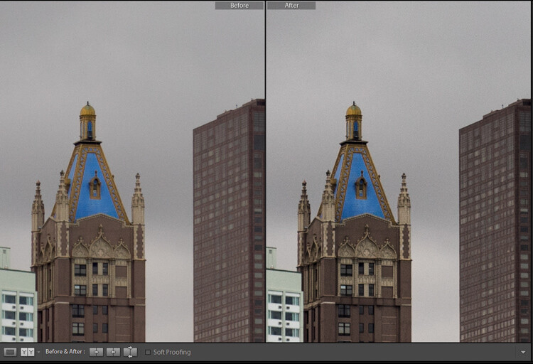
Clarity applied at +30, viewing at 1:1
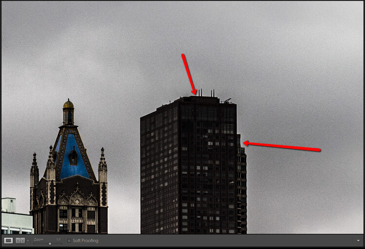
Clarity slider taken too far, viewed at 1:1 (100%)
Sharpness
The art of sharpening an image can often make or break the composition. Sharpening is one of those awesome features of Lightroom which has been around from the beginning, and it only seems to be getting better with time.
The sharpening tool is located under the Details panel in the Develop module. Basically, sharpening is accomplished by adding contrast between pixels so that the area being sharpened appears to have more definition, compared to its surroundings. There are a few key tweaks that you can perform in order to get the most from the sharpening panel.
Make use of the radius slider. The radius controls how many pixels around the perimeter of objects are affected by the sharpening. Think of this as the halo of sharpness. The greater the radius, the more apparent the sharpening will become. Don’t over do the details. You might think the more details you preserve in your sharpening, the better quality your image will be. This is not true. Usually, the farther you move the detail slider to the right, the more grainy and gaudy the image will be. Find a happy medium here and you will be happy in turn.
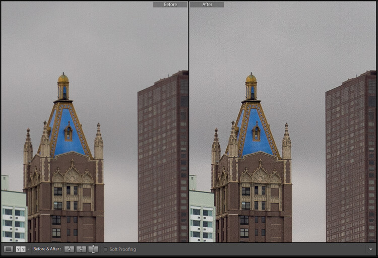
Global sharpen at +50
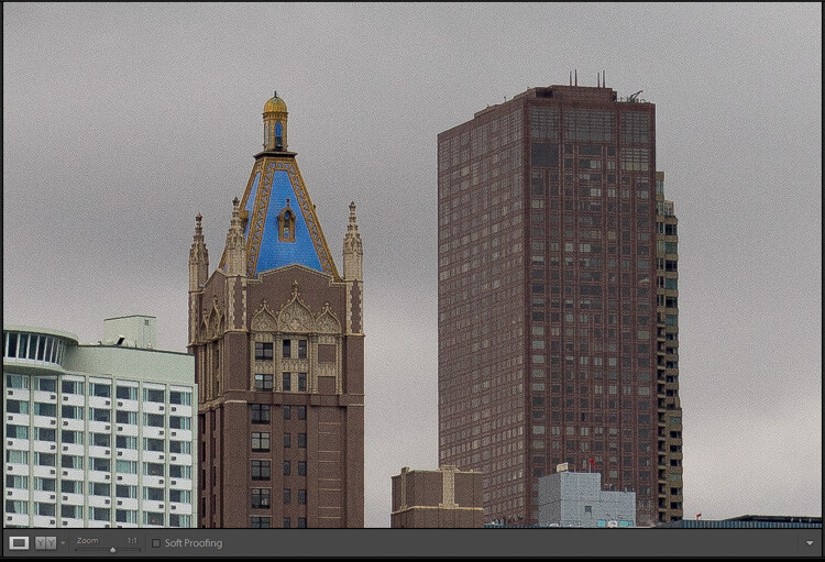
Over sharpened – this is what too much sharpening looks like at 1:1
Apply sharpening only to the areas you need to sharpen. It’s easy to simply sharpen an entire image instead of taking the time to selectively apply the edit. Rest assured though, if you apply your sharpening using the Adjustment Brush tool you will have a much more aesthetically pleasing result. Much like clarity, you usually do not need to sharpen the whole photograph.
Use the masking slider with the Alt key (Option key on Mac). The masking slider can be considered the most underrated asset in the sharpening panel. It dictates what areas will be sharpened. However, by itself the masking slider is rather lacklustre. This is where the Alt key comes into play. Hold down the Alt key while you adjust the masking slider.
You will see that the image is transformed into a black and white relief image. The areas in white are where the sharpening will be applied; the areas in black will not be sharpened. This is a great way to fine tune your sharpening when adjusting globally. (Note: to keep people’s skin from becoming overly sharp and showing every pore and bump, move the masking slider until the skin areas are black and therefore unaffected by the sharpening adjustment)
Dehaze
This is a feature that was introduced very recently in Lightroom CC. It is a magical little function that people seem to either hate or love.
I for one love this little guy. It’s located under the Effects panel. The explanation of how exactly it works is somewhat cryptic. Here is an answer pulled directly from Adobe Blog:
The Dehaze technology is based on a physical model of how light is transmitted, and it tries to estimate light that is lost due to absorption and scattering through the atmosphere.
Simply put, the dehaze slider can reduce haze within your images. It can also add a mystical fogginess as well if you choose (just slide it the other way).
Basically, it will make an otherwise hazy photo more clear. This comes in handy for photographs of the night sky when your want to make the stars more pronounced, or when you have to deal with physically dense atmospheric conditions.
Tips for Using the Dehaze Slider
- Keep an eye on your black points within the image. The dehaze slider can cause loss of shadow detail if you push it too far. Use the J key to show highlight and shadow clipping in order to preserve details.
- Perform your white balance adjustments BEFORE you apply dehaze. The dehaze tool can do some incredible things for your photo, but it can also cause some funky color distortions if you adjust white balance after the fact. As always, strive to obtain optimal white balance before you ever begin to post-process an image.
- Sometimes an image will benefit from added haze instead of dehazing. Experiment with adding a small amount of haze by moving the dehaze slider to the left. This can add an ethereal glow to some landscapes and even portraits.
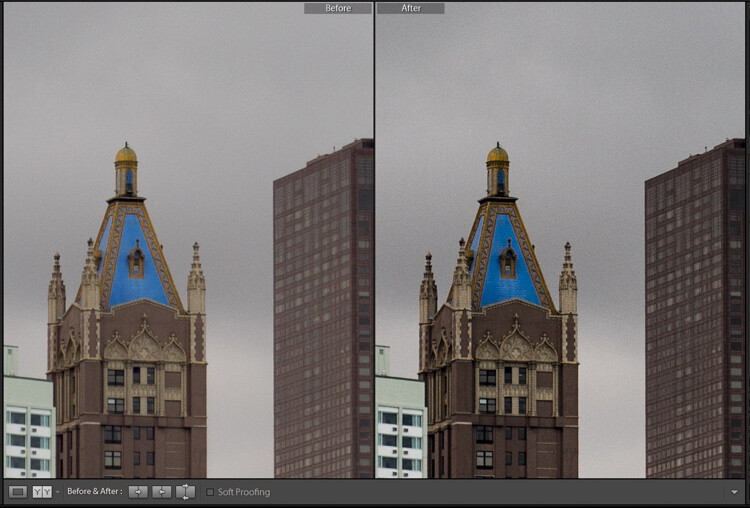
Dehaze +20 at 1:10 view
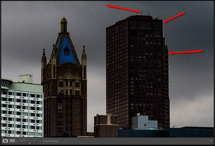
Dehaze pulled too far
As with all post-processing, the less you have to adjust after the image has been made, the better off you will be. The tools in Lightroom are a fantastic way to bring out the true power of your photographs, if you use them deliberately, and with good judgment.
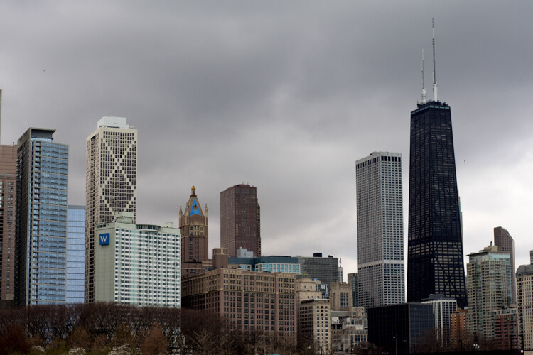
Before clarity, sharpening and dehaze
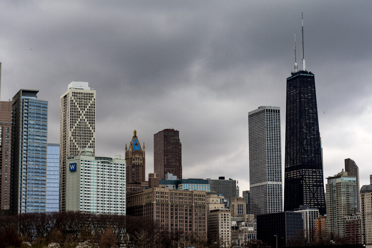
After
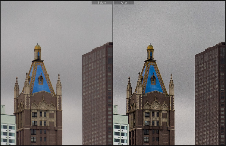
After clarity, sharpening and dehaze were applied
Any adjustments you make to the clarity and sharpness of your photo should never make them appear unrealistic (with exceptions) or detract from your original vision. Even the dehaze tool should be used sparingly and only when required. Just as the saying goes that one brush stroke can ruin a painting, so too can one more click of the slider. The goal of post-processing is to enhance a photograph to the point of meeting your pre-visualzation. No more and no less. Experiment with the tips you’ve learned here and witness the hidden potential within your own photographs!
The post How to Make Your Photos Shine Using Clarity, Sharpening, and Dehaze in Lightroom by Adam Welch appeared first on Digital Photography School.
from Digital Photography School http://digital-photography-school.com/how-to-make-your-photos-shine-using-clarity-sharpening-and-dehaze-in-lightroom/
No comments:
Post a Comment