Saturday, 30 April 2016

5 Tips for More Professional-Looking Food Photography

In an age where iPhones are shooting stellar images and high quality DSLRs are coming down in price, it’s becoming increasingly challenging for food photographers to make a living as professionals. As a food photographer in Seattle, I’ve noticed that many of my clients have become opinionated about what makes a good photo, and in many cases are shooting right next to me with their iPhones. I take it as a positive sign that clients, and most people with smartphones, are becoming more informed and educated about photography, but there is of course the notion that this could very soon make professional photography even more undervalued.

So, what’s a professional food photographer to do? Here are some tips to help make sure you capture quality food photography images that attest to the value of paying you, a professional, to do the job.

Tip #1: Don’t use natural lighting

Food photography tips

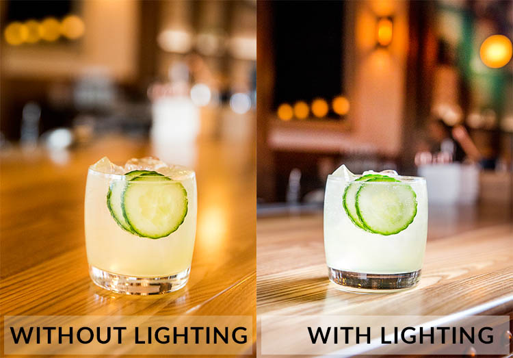
Natural lighting is fantastic, and I still try to use it as often as possible. However, many of my clients have realized the value of using natural lighting and tend to shoot their iPhone photos in naturally lit areas. Taking into account the quality of iPhone photos these days, it’s not unusual that their cell phone photos look pretty darn good, even compared to my DSLR shots. To make sure your photos always look unquestionably better than those taken with a cell phone, use natural lighting less and do some experimenting with strobes and off-camera flash.

Tip #2: Shoot in dark spaces

Taking tip #1 into consideration, take full advantage of your professional-grade camera’s low lighting capabilities, and/or your strobe lighting knowledge, by shooting dishes of food in spaces where iPhones have a slim chance of performing well. This is also a good opportunity to incorporate some of the unique features of the restaurant’s interior spaces, into your main shot.

Food photography tips

Photographed in an extremely dark space, this photo wouldn’t have been possible without a DSLR and strobe.

Tip #3: Use a macro lens

While cell phone cameras are becoming equipped with better features with every new release, many still can’t shoot quality macro photos the way that DSLRs can. Use this fact to your advantage and make a macro lens your best friend when shooting food photos. Don’t be afraid to get up close and personal, and capture the details of the dishes you’re shooting. These photos may not be exactly what your clients have in mind, but at the very least it’s always a good thing to show them an alternative perspective that reminds them why they hired you.

Food photography tips

Tip #4: Be a creative director and/or food stylist

Most amateurs approach food photos very statically, opting to shoot dishes from a seated position or overhead. Very few will get creative and incorporate people, props, or activity in their shots. This is your opportunity to shine as a food photographer. Move beyond standalone food photos and use your creativity to make a more dynamic shot. Ways to do this might be capturing action shots, adding a beverage or extra silverware in the shot, or even working with chefs to help them plate dishes in ways that will be photographically appealing. These skills are also part of the reason your client is hiring you, so don’t be afraid to exert your creative authority.

Food photography tips

Tip #5: Shoot tethered

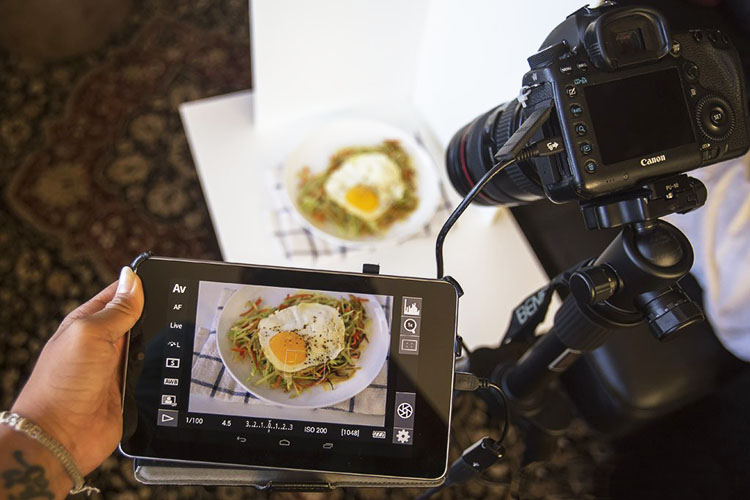
A very simple, yet highly effective, way to come off as a polished, professional photographer is to shoot tethered. If you’re unfamiliar with tethered shooting, it is basically the act of connecting your camera to a computer or tablet, which allows your clients to see your shots on a screen just seconds after you’ve pressed the shutter. This might sound intimidating, but it’s a very simple way to make sure that you and your client are on the same page throughout the photo shoot. It also invites your client to actively participate in the shoot and give you feedback and their own ideas. Tethered shooting is very easy to do using a USB cord or even Wi-Fi technology if your camera has this capability. If you have the means to shoot tethered, definitely consider offering this service to your clients.

Food photography tips

Tip #6: Transmit photos via Wi-Fi

If you have a client who is shooting alongside you with their iPhone, chances are it’s because they want access to photos for immediate posting on social media. Do yourself and your client a favor and offer to send them images on the spot using in-camera Wi-Fi, or do a few quick edits and transmit some shots directly from your computer if you’re shooting tethered. Depending on your agreement with your client, you could even charge a little extra for these services.

Over to you

Do you have other tips for offering more professional-looking food photography that outperforms iPhones and other amateur cameras? Let me know in the comments below!

The post 5 Tips for More Professional-Looking Food Photography by Suzi Pratt appeared first on Digital Photography School.


from Digital Photography School http://digital-photography-school.com/5-tips-for-more-professional-looking-food-photography/

The Anatomy of a Newspaper Feature Portrait Shoot

LEE Releases Simple Exposure Guide App to Use with Their ND Filters

leeexposure

This is useful. The folks over at LEE filters just released a handy little exposure guide app that will help you calculate the right shutter speed when you’re using their Little Stopper, Big Stopper, or Supper Stopper ND filters.

The app is extremely easy to use: you simply pick which of LEE’s ND filters you’re using and scroll the wheel on the left until it matches your camera’s metered shutter exposure without the filter. As you do that, the wheel on the right will automatically change to match the “correct” exposure with the filter attached.

The app even has a countdown timer and alarm for exposures over 30 seconds so you can see how long you have left before the shot is over.

LEE released a short video to show you how it works:

We put “correct” in quotes above because, as we all know, there’s no such thing as a “correct” exposure. The exposure you’re going for depends entirely on the effect you’re going for. Still, this will come in very handy for those of you who don’t enjoy doing math while you shoot, or trying remember how many stops of light that Big Stopper is taking away from your exposure.

The LEE Filters Stopper Exposure Guide app is free, and it’s already available for download on the iTunes App Store. Android version “coming soon.”


from PetaPixel http://petapixel.com/2016/04/30/lee-releases-official-exposure-guide-app-use-nd-filters/

Drone Fishing: Guys Use Drone to Capture Tuna from Above… Literally

dronefishing

Drone Fishing. It’s exactly as ridiculous-but-kind-of-fascinating-but-really!? as it sounds. Jaiden Maclean and his friends at Sea Ulcer Aerial Media went fishing for longtail tuna with a Phantom Drone, and captured the entire battle on camera.

What starts off as a standard “beautiful views from above” style video quickly turns into a fight for survival for one fish once it takes the drone-delivered bait. From that point on, it looks like the line attached to the Phantom disconnects so (spoiler alert) the tuna doesn’t pull the drone into the sea.

Once the fish is hooked, the drone simply captures the struggle of man vs nature from above. Check out the video for yourself below:

Personally, some may be turned off by watching an animal struggle to survive. But the perspective of the video is at least novel if not entirely unique.

So if you’re tired of the same old aerial shots by the same old drones of the same old subjects with the same old slow, swelling inspirational music playing in the background, this video might just scratch an itch. But if watching a longtail tuna fight for its life makes you queasy, you should probably just skip this one.

(via Fstoppers)


from PetaPixel http://petapixel.com/2016/04/30/guys-use-drone-fish-tuna/

How to Make Your Photos Shine Using Clarity, Sharpening, and Dehaze in Lightroom

The goal of any photographer is to make each and every photo stand out from the crowd. Making an image that pops is something that we all strive to achieve, but it’s not always easy to do. Luckily, there are tools at our disposal in Adobe Lightroom that can go a long way to help us achieve an image that we can be proud of, and that catches the attention of the viewer. What are these tools? They are many and varied, but there are three central processing techniques that can make your images transcend the average, and reach the potential you intended. They are Clarity, Sharpness, and Dehaze.

These three tools are deceptively simple and subtle. When used properly, the enhancements they will make to your photos will be nearly imperceivable. They can take your image from good to great, with just a few simple clicks of the mouse. In this tutorial, I will show you how each one of these processing tools affect your photos, and how they can be put to best use, so that your photographs really stand out from the rest. Let’s get started!

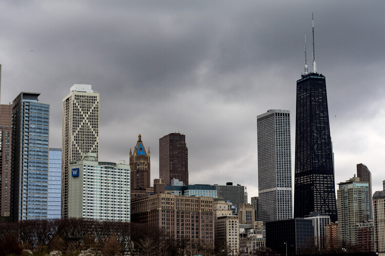
After CSD

Clarity

The clarity slider has been around virtually since the inception of Lightroom. You can find it in the Basic panel of the Develop module. It functions to add definition and well, clarity, to your images. It accomplishes this by darkening the lines surrounding the perimeter of objects within your photo. Think of it as contrast on steroids. The clarity slider can really add a lot of punch to your photos, and add drama.

Clarity

Tips for Using the Clarity Slider

  • Don’t add too much. If you push the clarity slider too far to the right, you can begin to see unattractive halos around objects within the frame, resulting in a fake or unnatural looking photograph. If using it globally (applies to the entire image), do so judiciously. Be careful when applying the clarity slider to an entire image, most areas of your photo probably won’t need to be clarified.
  • It’s best to apply clarity after everything else. Since the clarity tool will add a good amount of contrast to your photo, it’s best to apply it towards the end of your workflow. While this is not always true, it is a good guideline to follow in order to avoid the need to backtrack.
  • Use the Adjustment Brush or Graduated Filter tools to apply it to select areas of your image that need clarity. This will enable you to apply clarity only to foregrounds or backgrounds and to specific points you want to emphasize in the image.

Clarity Adjustment

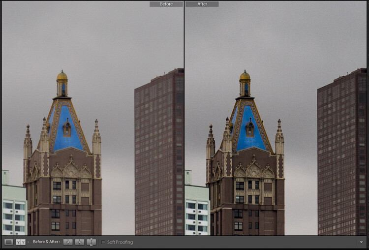
Clarity applied, viewing at 1:1

Clarity applied at +30, viewing at 1:1

Clarity slider taken too far, viewed at 1:1 (100%)

Clarity slider taken too far, viewed at 1:1 (100%)

Sharpness

The art of sharpening an image can often make or break the composition. Sharpening is one of those awesome features of Lightroom which has been around from the beginning, and it only seems to be getting better with time.

Sharpening

The sharpening tool is located under the Details panel in the Develop module. Basically, sharpening is accomplished by adding contrast between pixels so that the area being sharpened appears to have more definition, compared to its surroundings. There are a few key tweaks that you can perform in order to get the most from the sharpening panel.

Make use of the radius slider. The radius controls how many pixels around the perimeter of objects are affected by the sharpening. Think of this as the halo of sharpness. The greater the radius, the more apparent the sharpening will become. Don’t over do the details. You might think the more details you preserve in your sharpening, the better quality your image will be. This is not true. Usually, the farther you move the detail slider to the right, the more grainy and gaudy the image will be. Find a happy medium here and you will be happy in turn.

Global sharpen at +50

Global sharpen at +50

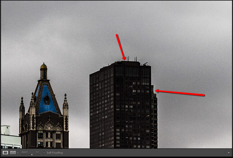
Over sharpened

Over sharpened – this is what too much sharpening looks like at 1:1

Apply sharpening only to the areas you need to sharpen. It’s easy to simply sharpen an entire image instead of taking the time to selectively apply the edit. Rest assured though, if you apply your sharpening using the Adjustment Brush tool you will have a much more aesthetically pleasing result. Much like clarity, you usually do not need to sharpen the whole photograph.

Use the masking slider with the Alt key (Option key on Mac). The masking slider can be considered the most underrated asset in the sharpening panel. It dictates what areas will be sharpened. However, by itself the masking slider is rather lacklustre. This is where the Alt key comes into play. Hold down the Alt key while you adjust the masking slider.

Sharpening Mask

You will see that the image is transformed into a black and white relief image. The areas in white are where the sharpening will be applied; the areas in black will not be sharpened. This is a great way to fine tune your sharpening when adjusting globally. (Note: to keep people’s skin from becoming overly sharp and showing every pore and bump, move the masking slider until the skin areas are black and therefore unaffected by the sharpening adjustment)

Dehaze

This is a feature that was introduced very recently in Lightroom CC. It is a magical little function that people seem to either hate or love.

Dehaze Slider

I for one love this little guy. It’s located under the Effects panel. The explanation of how exactly it works is somewhat cryptic. Here is an answer pulled directly from Adobe Blog:

The Dehaze technology is based on a physical model of how light is transmitted, and it tries to estimate light that is lost due to absorption and scattering through the atmosphere.

Simply put, the dehaze slider can reduce haze within your images. It can also add a mystical fogginess as well if you choose (just slide it the other way).

Dehaze

Basically, it will make an otherwise hazy photo more clear. This comes in handy for photographs of the night sky when your want to make the stars more pronounced, or when you have to deal with physically dense atmospheric conditions.

Tips for Using the Dehaze Slider

  • Keep an eye on your black points within the image. The dehaze slider can cause loss of shadow detail if you push it too far. Use the J key to show highlight and shadow clipping in order to preserve details.
  • Perform your white balance adjustments BEFORE you apply dehaze. The dehaze tool can do some incredible things for your photo, but it can also cause some funky color distortions if you adjust white balance after the fact. As always, strive to obtain optimal white balance before you ever begin to post-process an image.
  • Sometimes an image will benefit from added haze instead of dehazing. Experiment with adding a small amount of haze by moving the dehaze slider to the left. This can add an ethereal glow to some landscapes and even portraits.
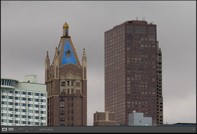
Dehaze +20 at 1:10 view

Dehaze +20 at 1:10 view

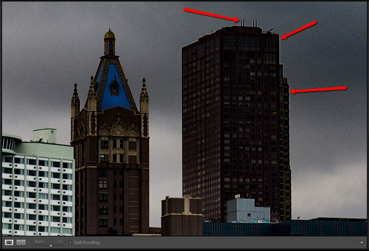
Dehaze pulled too far

Dehaze pulled too far

As with all post-processing, the less you have to adjust after the image has been made, the better off you will be. The tools in Lightroom are a fantastic way to bring out the true power of your photographs, if you use them deliberately, and with good judgment.

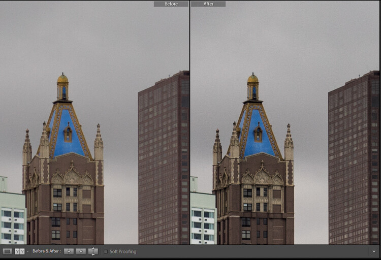
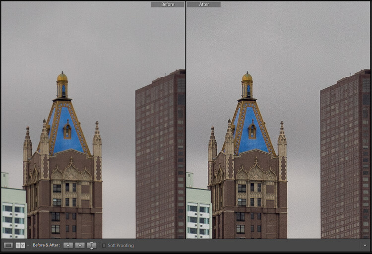
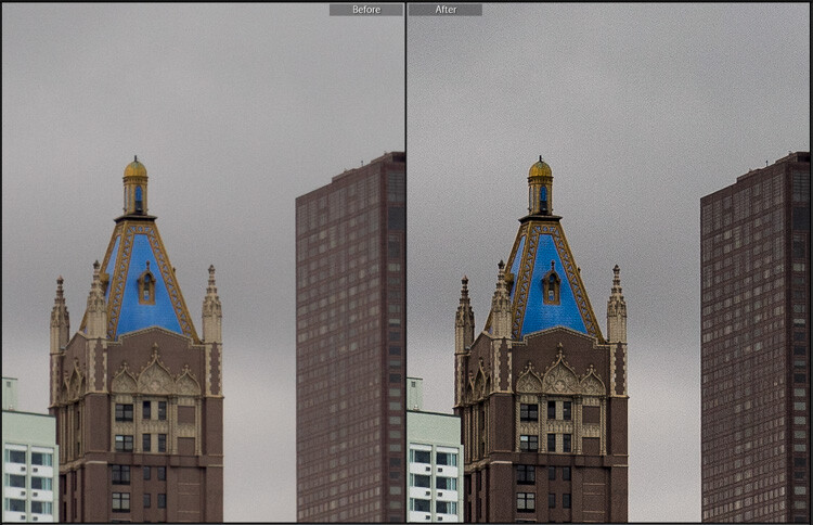
Before clarity, sharpening and dehaze

Before clarity, sharpening and dehaze

After

After

After clarity, sharpening and dehaze were applied

After clarity, sharpening and dehaze were applied

Any adjustments you make to the clarity and sharpness of your photo should never make them appear unrealistic (with exceptions) or detract from your original vision. Even the dehaze tool should be used sparingly and only when required. Just as the saying goes that one brush stroke can ruin a painting, so too can one more click of the slider. The goal of post-processing is to enhance a photograph to the point of meeting your pre-visualzation. No more and no less. Experiment with the tips you’ve learned here and witness the hidden potential within your own photographs!

The post How to Make Your Photos Shine Using Clarity, Sharpening, and Dehaze in Lightroom by Adam Welch appeared first on Digital Photography School.


from Digital Photography School http://digital-photography-school.com/how-to-make-your-photos-shine-using-clarity-sharpening-and-dehaze-in-lightroom/

You Have Access to All the Means of Production

Friday, 29 April 2016

The Striking and Surreal Photoshop Creations of Vincent Bourilhon

vincent_feature

At just 23 years old, Paris-based photographer and Photoshop artist Vincent Bourilhon is already showing more creative chops than some artists two and three times his age. His striking, surreal Photoshop creations explore the meaning and function of everyday objects in strange new ways.

A lightbulb, a book, a hair drier, a matchstick, or even the moon, it’s objects like these that Burilhon turns his creative lens upon. “I am very inspired by the object, its physical form and its meaning,” he tells Mashable. “In each of my photographs, the object becomes an important issue.”

The moon isn’t just the moon. Once Burilhon gets his hands on it, it’s suddenly in need of repair. Light bulbs, though his Photoshop lens, are now created like bubbles… or eaten like ice cream. Thanks to Photoshop, Burilhon can turn his wildest, most whimsical ideas into photographic reality.

22744153562_209205676d_k__1_

7890546860_33b843393f_k

15680741499_49c150f7f5_k

16842874378_534e74c4ad_k__1_

18166628389_9950518e6d_k__1_

18466782964_fd713f9c68_k

19421310570_793b5f8440_k

19674432569_32cafbabe4_k

21493967389_6abdf74a64_k__1_

21885552809_76d8e744e3_k__1_

23021643181_037b5ed280_k

23360598053_07bad379b5_k

23835061690_5b1def5355_k

26025117856_2900b91f12_k__1_

26505344842_506e149290_k

To see more of Burilhon’s work or follow along as he creates more strange imagery—he hopes to expand far beyond Paris in the near future—head over to his website or give him a follow on Facebook.

(via Mashable)


Image credits: Images by Vincent Bourilhon and used with permission.


from PetaPixel http://petapixel.com/2016/04/29/beautiful-surreal-photoshop-creations-vincent-bourilhon/