If you are struggling with getting your photos of cities and architecture to pop out, chances are that you are underestimating the power of lines in your images. Lines help you structure your images in ways that lead your viewers to look at different parts of the picture, and create interest in both your main objects and the surroundings.

The image above shows an example of how you can use lines to create a visual guidance within your city and architecture images, that will help your viewers find multiple points of interest and take a closer look.
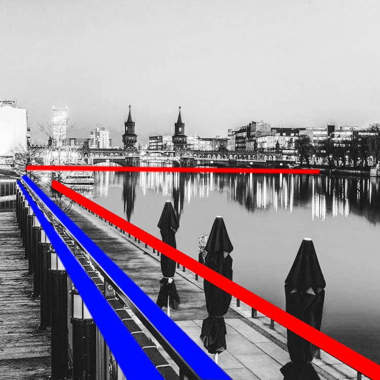
To help you understand how the lines work in a rather complex image like this, reducing the image to a black and white version with high contrast, can help visualize the structures of the image without getting distracted by the color elements.
Why lines are important especially for urban images
While in many areas of photography, using depth of field and blurred backgrounds is a good way to lead the viewers’ eyes to the most important element, and add a sense of perspective, as city photographers we rarely have this choice. In architecture images, you want most elements to be in focus.
When taking pictures of city scenes, you need to structure your images in different ways to provide perspective and a feel of scale. The conscious use of lines in your images can divide a photo into smaller pieces, separate elements from each other, provide a sense of perspective and lead your viewers’ eyes to where you want them to focus.
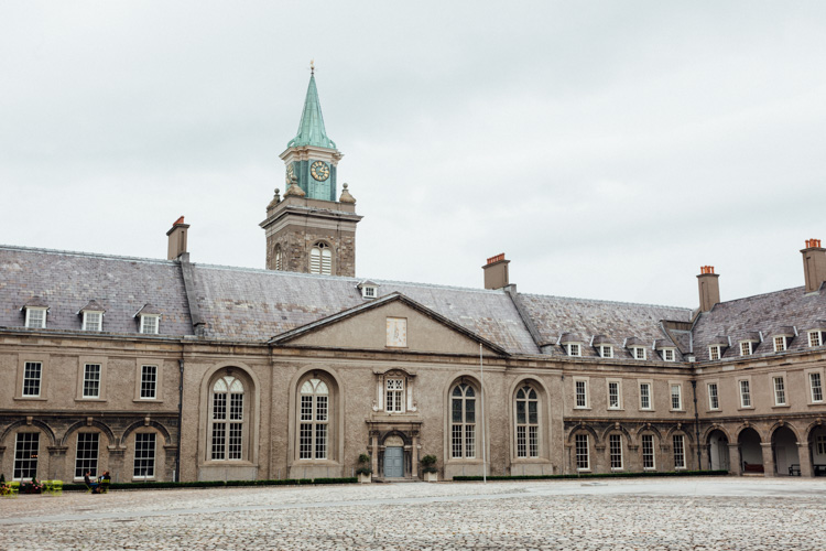
The image above shows an example of a random shot without considerations for the use of lines. With its grey stones, the National Museum of Ireland in Dublin on a cloudy day, doesn’t offer much to work with when trying to create an interesting image. This is merely a documentation of the place, but probably wouldn’t make it as a header image.
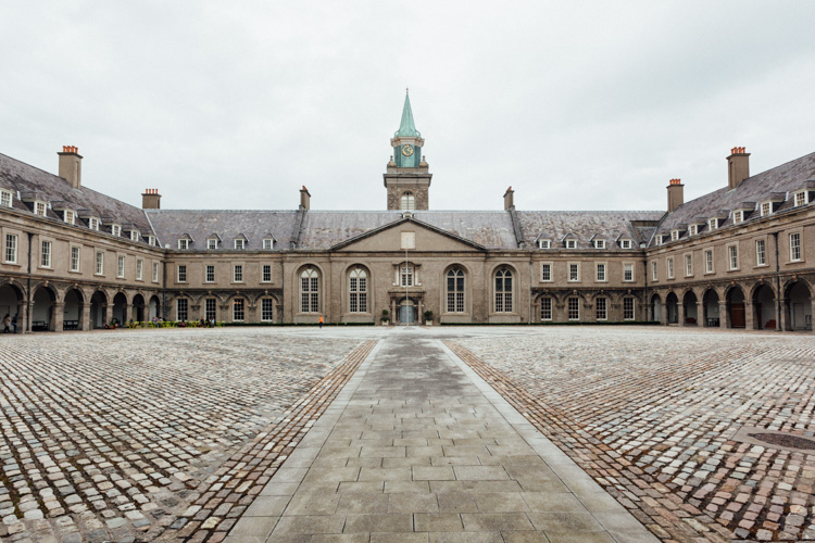
However, beyond the documentary aspect, the use of lines to create perspective, orientation and symmetry can increase the impact, even of an otherwise dull looking image.
Which lines can you use to increase impact?
You can separate the lines in three categories which I call:
- Dividing lines
- Leading lines
- Symmetrical lines
A dividing line structures your images into separate areas of interest. It can be horizontal, vertical, or diagonal. You can use it to make a clear difference between bottom and top of an image, but also make sure to use dividing lines to show near and far. In many outdoor images, the horizon line is a natural dividing line.

In this image, I am using a major dividing line to clearly separate the floor and the wall. Less noticeable, the additional line in the wall serves as another separation in the photo. Without the addition of this line, the right half of the image would be rather boring. By adding a simple line into the frame, it helps dividing the image into a left and right.
Make sure that your dividing lines are in the right place. With very few exceptions, make sure to place your lines outside of the center of the image (both horizontally or vertically) but also not too close to the borders. The well known Rule of Thirds is good guidance, in many cases dividing images into a two-thirds and a one-third part works best.
Leading lines are an important way to provide your viewers with an idea of perspective. They will lead the eyes into, and around the image. Leading lines often come in pairs, slowly merging into the distant part of the picture. But in fact, you can use multiple leading lines, even one can help the viewer find orientation. Leading lines don’t even have to be straight, you can use curves and angles just as well.

The main street in this image serves as a single leading line, it helps the eye find orientation from the interesting space in the foreground, and puts it into the context of the big city.
The third way of using lines to increase impact, is the use of symmetries. When looking for interesting images to capture in a city, try to find symmetrical lines in the architecture around you. Thankfully, architects also know the visual impacts of symmetries, and use them to create the buildings around us.
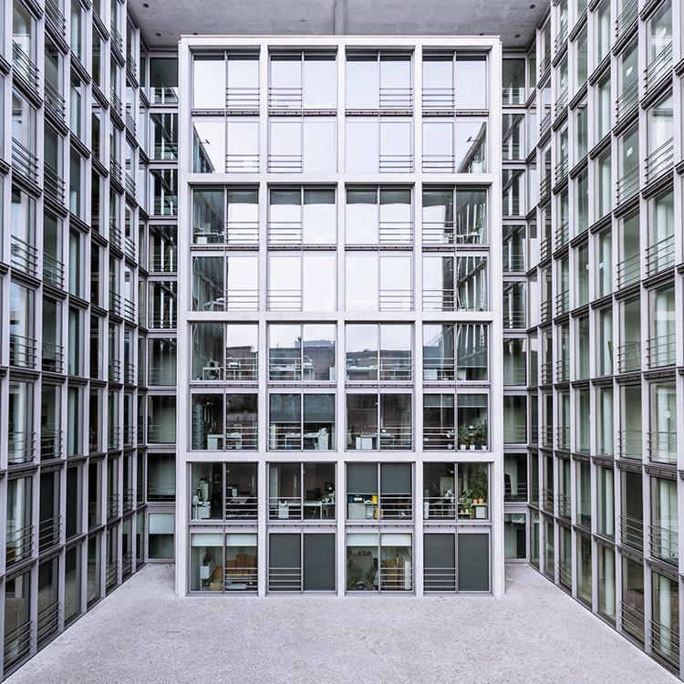
Buildings like this lend themselves to be taken in symmetries. While the content is not perfectly symmetrical due to the individual office decorations on the inside, the structure of the building makes an interesting frame for these individual elements. The symmetry helps to create interest, as you subconsciously start looking for the differences between the halves.
Learn to focus on lines
If you are shooting with a camera capable of RAW images, there is an easy way to train yourself to look out for lines: Use your camera settings, and change your camera to shoot in black and white!
When shooting RAW, the camera will still capture and store all the data from the sensor, including the color information. So when you are back at your computer to edit images, you will find all the options to create color images as well. But while shooting, you can look at your images at the screen in black and white, which will eliminate distractions from the forms in your image.
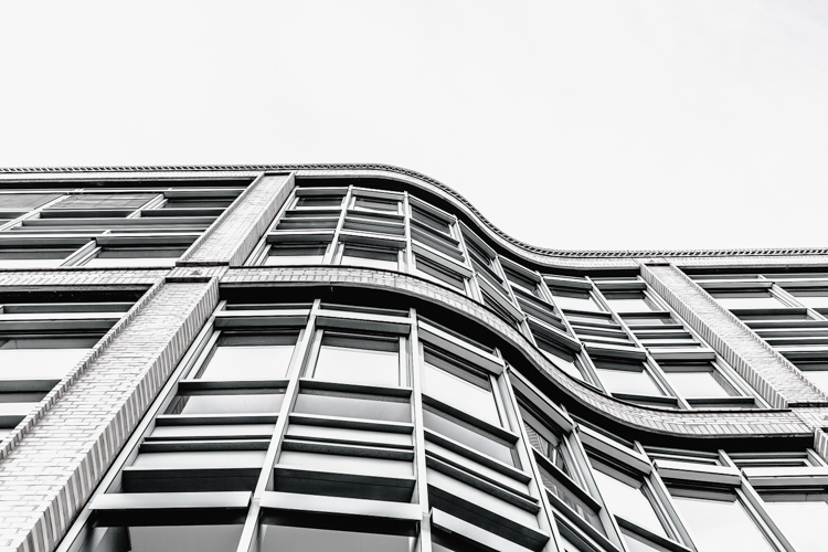
Going a step further, in most cameras you can set up your own image processing profile in camera: Increase the contrast and sharpness of the image as far as possible, and you will end up with a preview image on the camera screen that is mostly reduced to the lines.
Additional ways to use lines
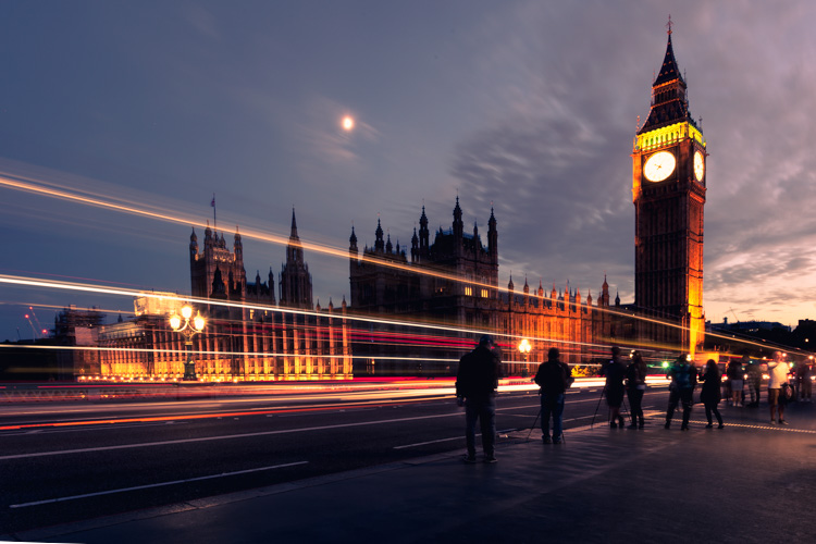
Probably one of the most photographed objects in the world, the houses of parliament and the tower with Big Ben in London, UK, it is hard to come up with a unique version. In this image above, I added the light trails created by the passing traffic to add an interesting element. The light trails serve both a dividing lines between the other photographers in the foreground and the architecture in the background, as well as leading lines providing perspective from the left to the right part of the picture.
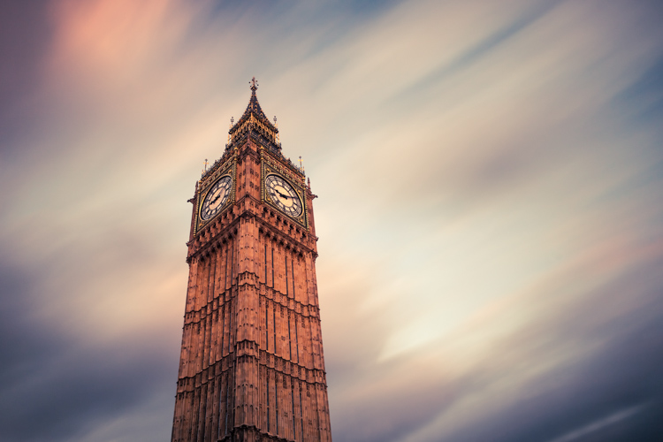
When taking images of tall buildings, like in this case the tower of Westminster, the borders of the building will typically provide leading lines from the bottom (near) to the top (far). To generate an additional element of interest, I used a long exposure image to create another set of lines, through the moving clouds in the sky above the building. This helps add a dynamic element and interest, to an otherwise static and often boring background.
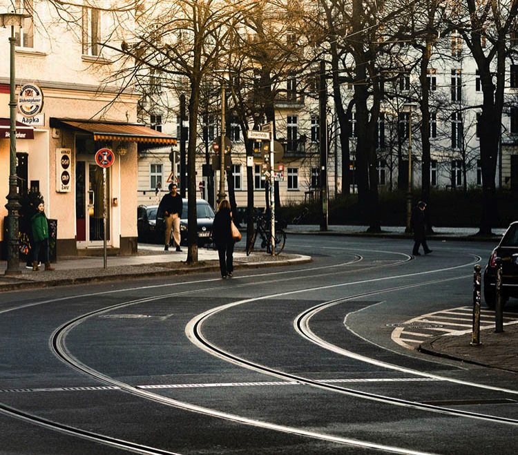
Do not limit yourself to using only straight lines. While a horizon should always be straight and strictly horizontal, others, especially leading lines, can also be curved. In this image above, the cable car tracks take two turns that lead the viewer’s eyes from the bottom (near) to the center (far) part of the image.
Even complex scenes win from the use of lines
Once you become aware of the lines in your images, you can use them to structure even more complex scenes.
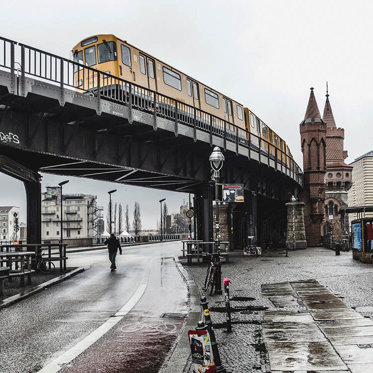
While the above example might show the lines all that obvious, you will most likely see the curb of the street easily as a (curved) leading line into the image.
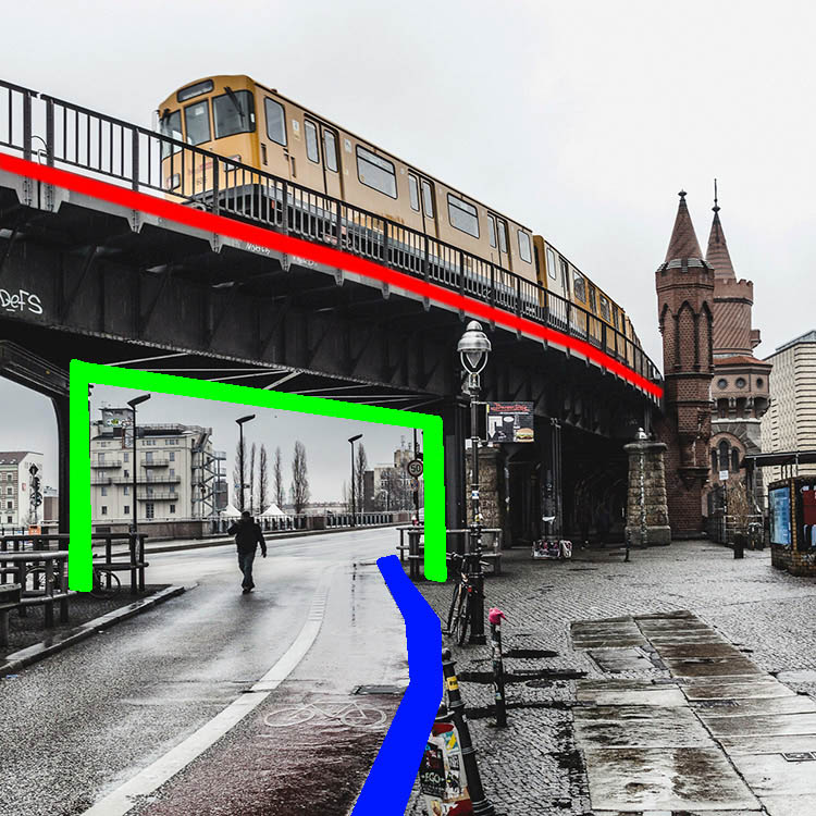
However, upon a closer look, you can also note the use of a dividing line separating the photo into a top and bottom part to provide additional perspective and scale. Finally, a use of lines as a frame puts more emphasis on the silhouetted person crossing the scene, adding further scale to the size of the elements contained.
These lines help the viewers structure the image into separate parts and make it easier for the brain to digest all the elements contained.
How do you use lines in your compositions? Please share in the comments below.
The post How to Improve the Impact of Your Urban Images Using Lines by Michael Zwahlen appeared first on Digital Photography School.
from Digital Photography School http://digital-photography-school.com/improve-impact-urban-images-using-lines/
No comments:
Post a Comment