One thing that can be difficult to get across when taking pictures is a true sense of how large something is in real life. A skyscraper that appears towering and imposing in person, can come across as unimpressive, or stripped of its majesty when photographed. Natural formations that inspire awe and self-reflection, often seem puny and insignificant when we go through our photos later at home or on our phones.
This is something I have had happen many times in my own journey as a photographer, and while it can be tricky to create a sense of scale, there’s a way to use the concept of framing to capture the massive size of things in the world around you.
What is framing?
Framing has to do with the way the elements in a picture are positioned, in relation to one another. I struggled with the concept of framing for scale for a long time, before I really got the hang of it. But if you really want to show how big something is, it helps to put something else in the picture with it. This concept might seem a little counterintuitive, but adding elements to the foreground, background, or image sides, helps to not only give the viewer a sense of scale by showing how big the object is in relation to something else, but often it helps make the picture more compelling from a compositional perspective.
As an example, here’s a picture I took when I visited the Grand Canyon a few years ago. I really wanted to capture the sheer size of this natural wonder, so naturally I pointed my camera out from a precipice and took a few pictures. Sadly, the resulting images look flat, muddy, and downright boring – almost the polar opposite of the Canyon itself.
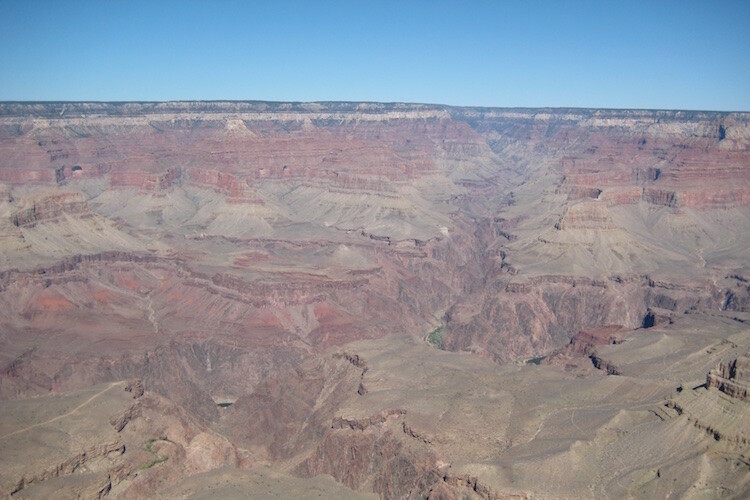
An incredibly boring picture of one of the most amazing natural formations I have ever seen.
The problem with this image is it does nothing to impart a sense of scale to the viewer. In order to truly appreciate how big the canyon is, we need other visual information in the frame, to which we may compare the background elements. Fortunately, one of my friends took a much better picture that includes a few foreground elements, which although they block out some of the Canyon, help to capture the grandeur of this natural wonder.
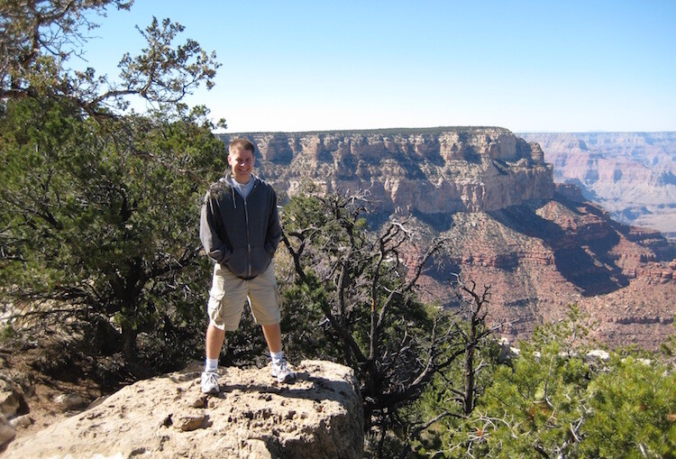
A much better picture, even though part of the Grand Canyon is blocked out.
The second picture works because it contains several layers: me, the trees, the plateau, and a glimpse of the rest of the Canyon. Of course this concept, like much in the world of photography, is quite subjective and some might think the top picture looks better because you can see more of the canyon itself. However, in my opinion the bottom image is more interesting because of the multiple compositional layers, while at the same time helping the viewer understand just how big the Grand Canyon really is.
How to apply framing to show scale
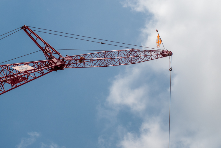
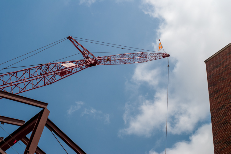
You can see the same principle at work in the following pair of shots as well. The first one was zoomed in a little and focused just on the crane, which is fine, but it doesn’t really tell the story of how big the crane is, or how much it towers over the surrounding buildings.
To adequately capture the size of this piece of construction equipment I stood in the same place, but zoomed out a little bit, in order to frame the crane between two of the surrounding buildings. The result is a picture that adds a great deal of additional context, which helps the viewer to understand the size of the subject in the photo.
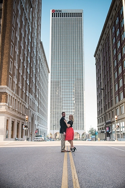
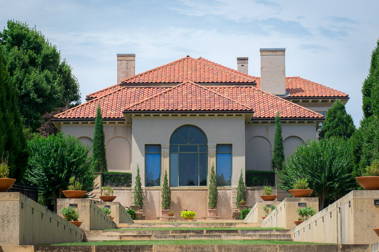
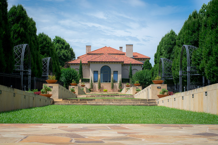
Often these types of framing decisions are not all that complicated. It can be as simple as stepping a few meters in any direction, or zooming in and out with your camera. Another example is this set of two images taken at the Philbrook Museum in Tulsa, Oklahoma. It’s a grand building with a rich history, but unless the building is properly framed it can look like any other house.
Looking at the above image you might get the idea that this dwelling is somewhat old, with a bit of a terrace in front. But, it doesn’t really capture a true sense of the scale, not only of the house, but its surrounding gardens.
In the second image (above), the size of the mansion is smaller in the image, yet it seems much larger because it is framed on the sides by rows of trees, as well as the lower portion of the photo which shows many distinct levels of the terrace. It’s somewhat ironic that stepping back and re-framing a shot like this, so that the subject is smaller in the frame, can actually make it appear larger. But, you will find this phenomenon to be true across a wide range of photographic situations in which you want to convey the true size of something.
Don’t overdo it
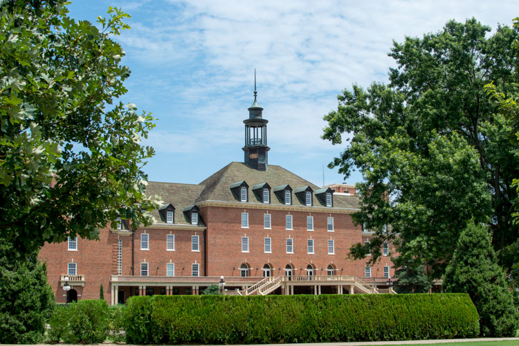
Of course, just as important as knowing how to frame your subjects is knowing when to hold back a little bit. The picture below shows the student union of Oklahoma State University, one of the largest student unions in the country. Yet when it is framed between two trees on the sides and a hedge in the foreground, it almost gets dwarfed and seems somewhat diminutive in size.
One reason the framing is not useful here is because it actually covers up part of the building, whereas in the previous example the technique was used enhance the large subjects. There are also several visual cues, such as windows and stairs, that on their own do a good job of imparting a sense of size to the viewer. To properly showcase how big this structure is, it’s enough to simply show it on its own.
The above examples are just a few illustrations of how you can use the idea of framing to capture a sense of scale, but I’m curious about your own personal approach. How do you use various photographic techniques to truly capture the size of your subject? Leave your thoughts and images in the comments below.
The post How to Use Framing to Create a Sense of Scale by Simon Ringsmuth appeared first on Digital Photography School.
from Digital Photography School http://digital-photography-school.com/how-to-use-framing-to-create-a-sense-of-scale/

No comments:
Post a Comment