Get 50% off Tom’s ebook Ang’s World – A Life in Photography eBook, now only until July 26 at Snapndeals.
One of the most important skills in photography is pre-visualization. The idea is that before you capture an image in the camera, you have a clear idea in your mind of what it’s going to look like. You preview the image before you shoot it. Colour or black-and-white in rendering? Rich in tones or pale and soft? Misty-blurry in feel or so tack-sharp you might cut your eyes on it? What – exactly – will your image look like?
One of the early objections to digital photography was that it wasn’t really photography because there was no negative; no sense of what kind of picture you’re making. In fact, with digital, there’s not much at all, apart from data in the form of a very, very long row of zeroes and ones. You know what kind of image you have only when you use that data to drive a screen (on camera or at computer) or a printer. And before you get there, you have to process the image. If you feel feel isolated from the process of creating the image, it’s no wonder.
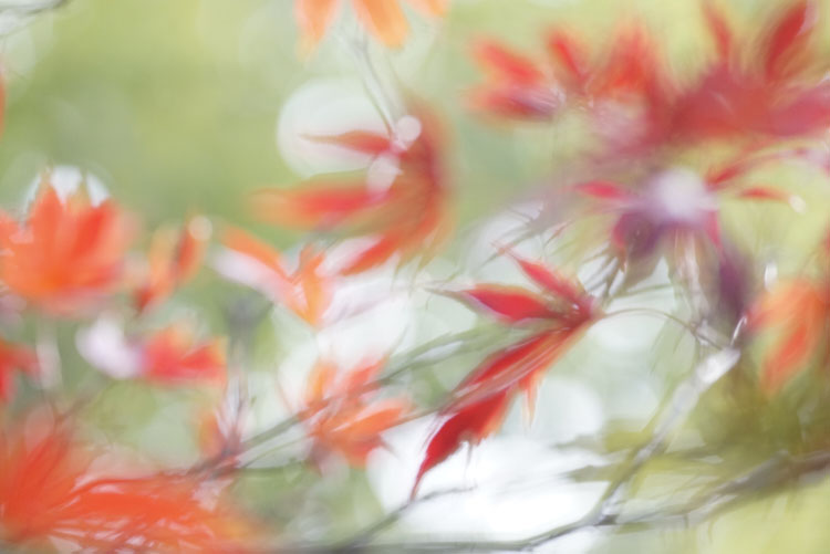
The most basic in-camera processing setting is your exposure. For this nature shot in my back-garden (above), I over-exposed by two stops. This pales out the colours, fills the shadows nicely to get the effect I envisaged, all suffused with light.
If you feel a bit disjointed from your images or from your camera, one way back is to try some old-school photography. If you feel your photography is getting a bit jaded, you can re-discover its joys by committing to a treatment or filter effect at the time you take the photograph.
You simply think, feel and shoot as if you’re using film.
I love this way of working. There are two simple steps. You choose an in-camera processing or filter effect (which, of course, produces JPEG files), and you do not use the screen to review your images (it’s good practice anyway). So, let’s set to the Toy Camera option – this vignettes the image heavily (darkens the corners), under-exposes, and adds strong saturation. And off we go:
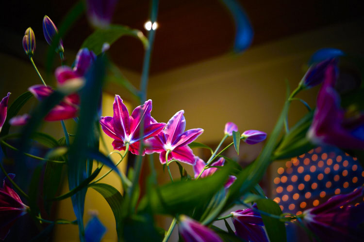
This indoor scene on our dining table (above) is rich in a surreal way, because the strong colours in the centre and heavy vignetting forces the viewer’s attention to the centre. The very shallow depth of field – from using a f/2 aperture – also helps make the space tensioned.
One reason some photographers have returned to work with film, is that the process of envisioning how the image will look before clicking the shutter, creates a sense of connection with the subject. You feel more involved with the process, and that’s an important part of the fun of photography.
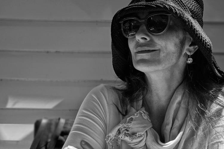
This portrait is a rich-toned black-and-white: it takes a shocking amount of processing in-camera, but comes out with deep, sharp tones that is surprisingly flattering. It works well in mixed hard and soft lighting.
There’s another advantage to camera processing – if you work this way, you often don’t need to touch the image before being able to use it. When I photograph for my books, I produce thousands of images, and have to submit as many as 1,500 images to the art department. You won’t find me messing about with the images more than I need to, I have a book to write! So images that pop straight out of the can into the book are what I aim for, like this one.
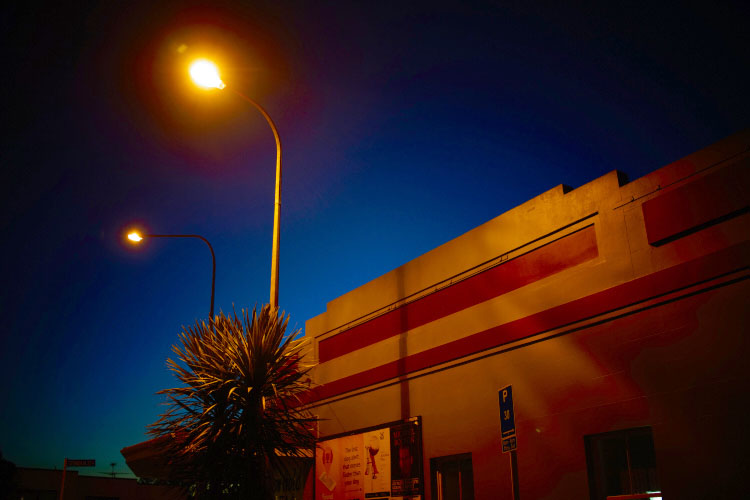
This late evening scene in Auckland, New Zealand comes straight out of the camera as rendered by the Toy Camera effect. I did try out some adjustments, but quickly decided it was best left as shot.
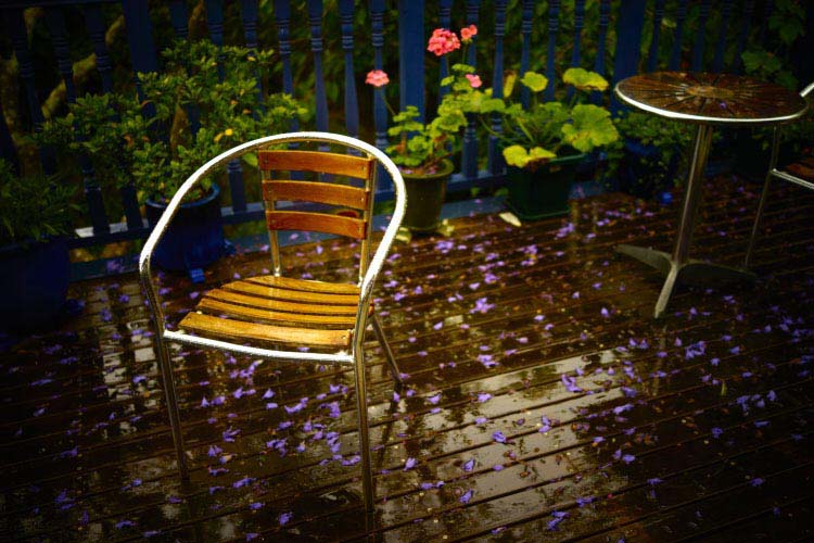
Garden furniture left in the rain came out glowing with the Toy Camera filter, which often brings out a mood that is slightly world-forsaken. I like using the filter with the lens wide open, to leave as much as possible softly blurred.
So the question is; do you know what your image will look like before you capture it? If commitment scares you, one approach is to at least think ahead to the post-processing that you’ll do. Instead of blundering around trying one effect or adjustment after another, you will go straight to the effects that you want. Saves a LOT of time.
Or you can do as I’m showing here, and bravely go for it. More jeopardy equals more fun! And that’s exactly what you’d have done with film. You load the camera with film – say slow black-and-white for fine grain, or fast colour for low-light work. 24 or 36 exposures, and you’re stuck with it until the last frame reels off, come rain or shine, action or still-life. Many photographers have found fun in photography again by embracing the risks of film-like limitations.
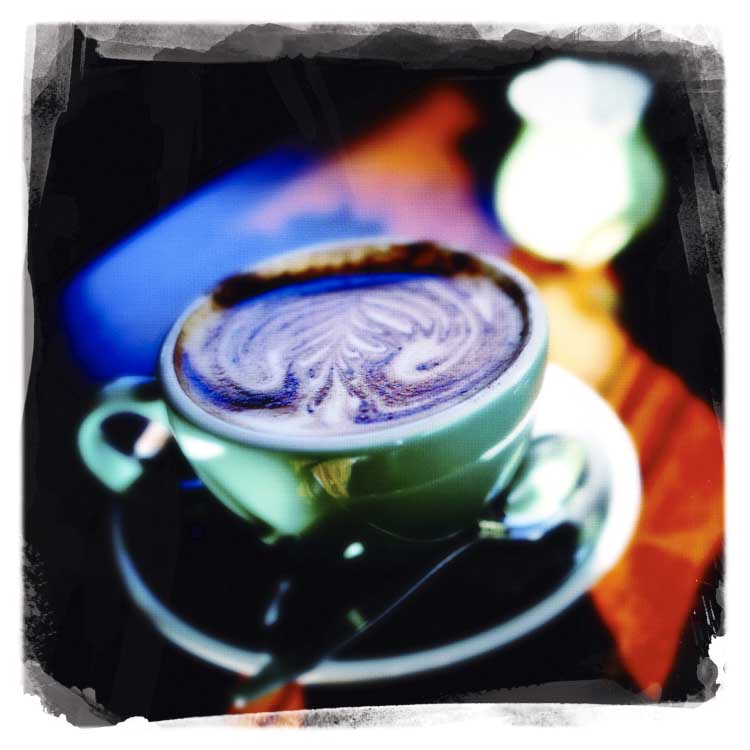
I’ve used the Hipstamatic app on my iPhone since the beginning, as I enjoy the commitment to the image coming out according to the film and lens combination you pick. This is one of my favourite combinations – the Libatique lens – and the Dream Canvas film.
Just like learning to work with a fixed focal length, what looks like an imposition and inhibiting feature, can actually free you artistically. For example, knowing that I’ve chosen a filter that gives a particular soft focus but richly coloured look, means that everyday scenes become mysterious washes of colour and tone. Without that effect, I might not have thought of making this shot.
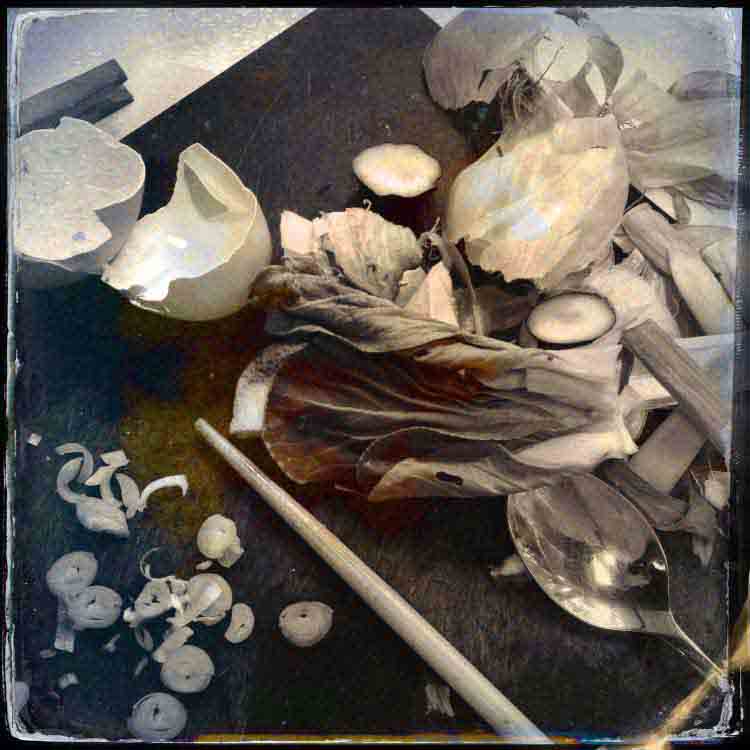
This is a Hipstamatic shot using D-Type Plate film with the Jane lens, processed for increased saturation.
A mundane scene like the mess on a chopping board just looks ordinary in colour. But in black-and-white, with a bit of fake Tintype effects, and the image moves into another arena.
Committing to a treatment challenges you, and changes the way you look at things. Some photographers say they can see compositions only in black-and-white. If you set your camera to shoot black-and-white, you will find that you photograph different things from your usual subjects. You’ll probably shoot them in a different way too. If you’re feeling especially brave, you can set your camera to apply an art filter. I like using the Illustration filter, which pumps up colours and draws a line on sharp edges. It works neatly with nature.
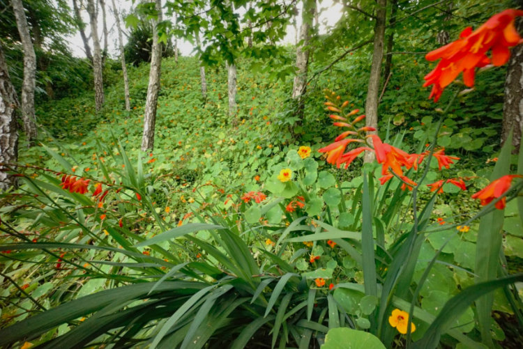
A moderate wide-angle view of a nature reserve. (Looks pretty but actually it’s over-run with invasive foreign species.) In the soft light, I thought the image would come out flat and lacking in contrast. So I decided to add some filter fizz.
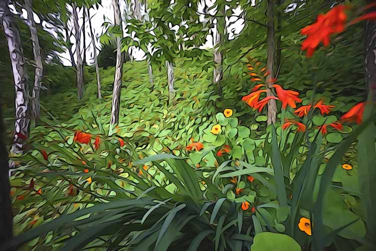
With the illustration filter applied, all the important features have been brought out; the trees, the slope of the hill, the bright lilies, and lily leaves. This image came straight out of the camera, with no post-processing at all.
You don’t have to be so drastic though. One useful in-camera effect available in several models, is built-in HDR (High Dynamic Range). In fact, what the effect does should be called tone-mapping. It makes three or more rapid-fire shots of the subject, at different exposure values. Then, in camera, it combines them so that the image is predominantly filled with mid-tones. Now if you try this on a moving subject, you get weird double-fringed effects. More in-camera fun!
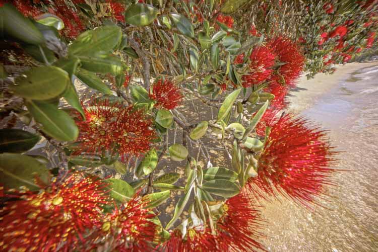
Three separate exposures of trees waving in the wind, even when shot at a high rate of fire, will create blurred or fringed images. Then tone-mapping them – processing to bring out mid-tones – gives a half-photographic, half-graphic effect. (Post-processed to reduce brightness and increase saturation.)
All this works, because pre-visualization makes you see in a different way. What happen is that the camera actually reprograms the way you see. That makes a lot of sense, if you think about learning new skills. Let’s take martial arts, for example. Before you start classes, you just see people punching, kicking. Once you learn more about it, you start to get your eye in – you see when someone’s leaning too far forward, or that there’s no power in a strike. It’s exactly the same moves as before, but your now-tutored eyes see more; they see differently.
In photography, you may start to see relationships, not objects. You pick out shapes and aren’t distracted by textures. Or you may see small details which before you’d overlook. In short, committing to one look for your images can invigorate your seeing, which will inspire your photography to greater, new levels.
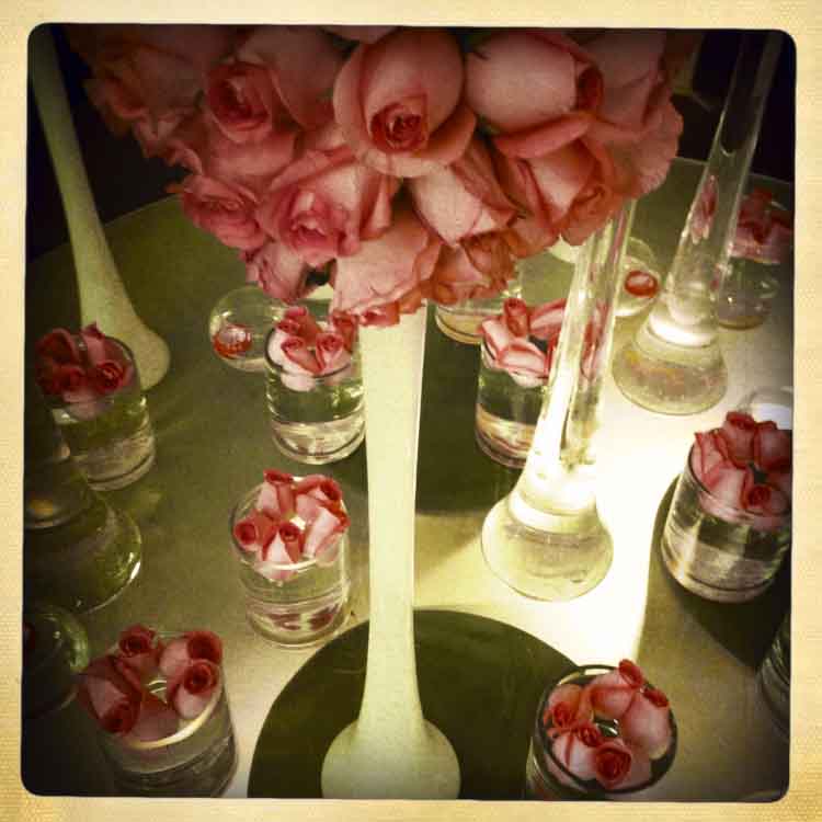
An extravagant flower display at a hotel reception looks charming when given a look of aged film, complete with old-world border given by Hipstamatic Libatique lens with Ina’s 1969 film options.
Get 50% off Tom’s ebook Ang’s World – A Life in Photography eBook, now only until July 26 at Snapndeals.
The post How to Bump Your Photography up a Level by Using Film Style Limitations by Tom Ang appeared first on Digital Photography School.
from Digital Photography School http://digital-photography-school.com/bump-photography-level-using-film-style-limitations/
No comments:
Post a Comment