Each time I process one of my images I do it in a totally different way. This might sound strange to you. I feel that often articles about image processing are riddled with ideas about formulas and essential steps. But for me, this totally goes against everything I believe about photography.
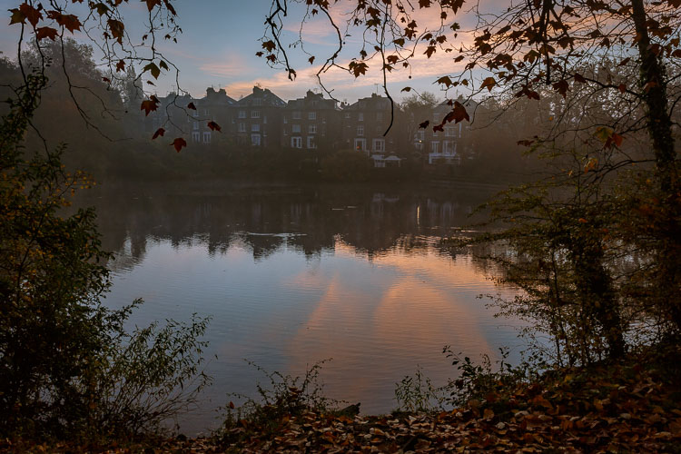
If you want to make creative images there is no one formula that you can apply to all photographs, or all genres. There are no essential steps that you must follow for every single image.
Why there is no magic formula
To say there is one formula is like saying there is one for making great art, and if we followed it then we’d all be great artists. But that is looking at it from the wrong angle. That’s asking for something outside of you to make you perform well. In fact, the only chance (literally the only) any of us have of taking great photographs, is to allow the most unique parts of ourselves to flow out.
Now, that’s not to say I don’t have some great advice for you. I do! It is, though, based on my philosophy that every image is unique. This is not a paint by numbers experience – so processing must be approached in a fresh, new way every single time.
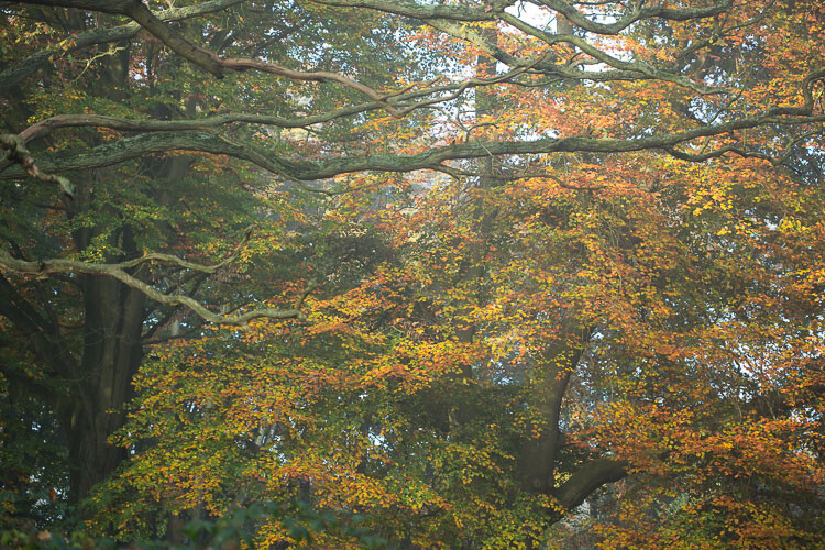
Before processing
Like a lot of photos there are a few different ways I could have gone about this. Processing, like the act of taking photos, is a totally subjective experience. That’s most of the fun!
Unlike the other photos I’ve featured in this article, which were all taken on the same beautiful morning in Hampstead Heath in London, in this photo I didn’t want to have that misty fog in the photo. It didn’t work for me with the vibrant colours of the leaves. So instead I enhanced that deep colour and gave the leaves a strong contrast with the dark branches.
To me this is more of a natural look, what you would see when you are out in the woods. I used the HSL module to saturate the colour channels individually with a little Clarity in the basic module. It didn’t really take a big push to make a big change.
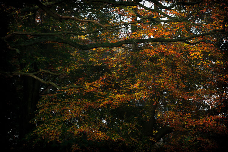
After processing.
“The reason that art (writing, engaging, and all of it) is valuable is precisely why I can’t tell you how to do it. If there were a map, there’d be no art, because art is the act of navigating without a map.” – Seth Godin
Take a unique approach for each image
You wouldn’t shoot all of your images at the same shutter speed would you? When you are out taking photos, even if you shoot on full auto, you respond to both the subject and the lighting conditions around you. You adjust and work with what is there. That’s the same approach you need to take when processing your images.
I like to think of processing an image like creating a painting. It’s an organic, subjective, unstructured process that finds me going back and forth between the tools, using a little of this, a little of that, until I am able see something that I want.
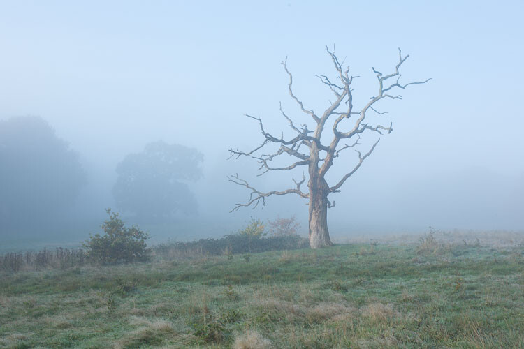
Before processing.
This image already has all of the elements for a good photo. There is atmospheric light that you can truly feel, and the composition of the bare wild tree on its own is strong. So what I focussed on in the processing was to bring out the colours and enhance the atmosphere ad feeling of cold, bleak and misty. Plus I thought a blue/orange split tone would look cool and topping it off with some grain would make it a have a feel of nostalgia…I’m very nostalgic about trees (childhood thing).
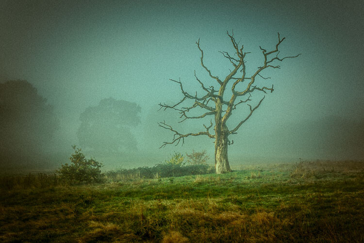
After processing in Lightroom.
“You must forget all your theories, all your ideas before the subject. What part of these is really your own will be expressed in your expression of the emotion awakened in you by the subject.” – Henri Matisse
How can you apply this to your photography?
My approach might sound a tad unhelpful – I mean if I can’t tell you the formula, the five steps to success, the three keys everyone needs, how can you learn? Well, my approach may take longer to learn, but you will end up with much stronger images. You’ll create images that are powerful, impactful, and unique to you.
Even though Lightroom is about learning a software program, I recommend you do not use it with a technical mindset. Use it with a creative, artistic mindset. Use it as you would a paintbrush, a pen or your camera. Remember we are creating – not solving an algebra problem here!
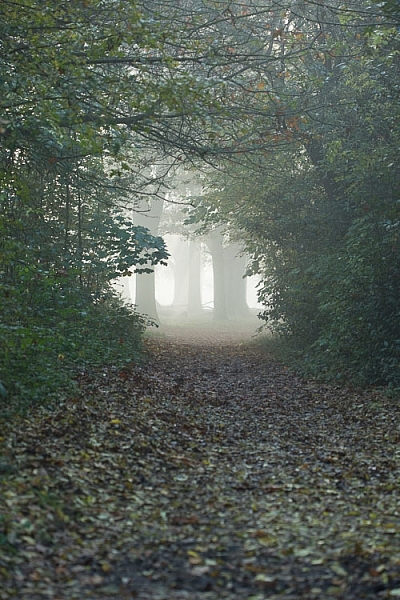
Before |
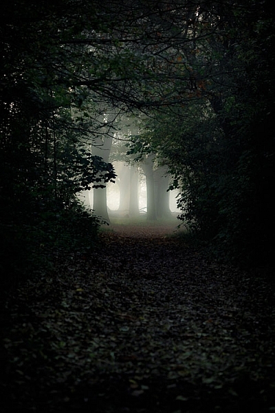
After |
What appealed to me here was the slightly mystical feel. It made me think that the path was leading to a circle of fairies. So my Lightroom work reflected that vision, and this is what I created (above right).I wanted a very surreal look. I used split toning in greens and blues, as well as a vignette, and brought out the blacks very intensely using the basic panel. What I ignored was the histogram, which was all squashed up to the right, but that doesn’t matter.
I wanted a very surreal look. I used split toning in greens and blues, as well as a dark edge vignette, and brought out the blacks very intensely using the basic panel. What I ignored was the histogram, which was all squashed up to the right, but that doesn’t matter. Art is always a bit chaotic, right?
Before and after step by step
This is a creative, organic, fun process. Once you’ve gone through all the Lightroom modules (if needed), don’t be afraid to go back and adjust and have a play.
So, I want to take you through the steps of how I processed an image in detail. I hope it sparks a lot of ideas for ways to help you process yours. I am going to take the photo from this, straight out of the camera:
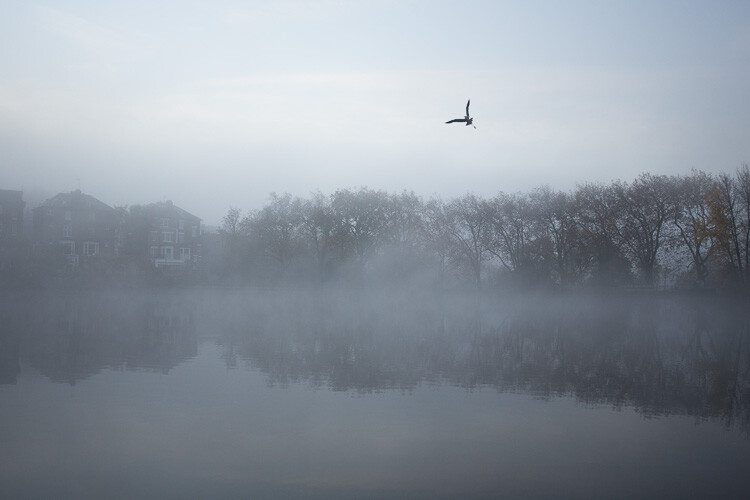
Before image, straight out of the camera.
To this:
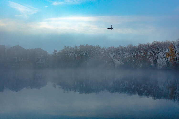
Finished image processed in Lightroom.
Connect to the image
Look at the image. What does it make you think of, feel or imagine? What qualities can you sense in the image that you can work with and draw out? The Lightroom tutorials you watch and read will tell you how to use sliders, etc., but they usually don’t tell you when to use them. This process of knowing when to use certain tools comes down to getting really involved in your image, and learning to use the inherent qualities of the photo to guide you.
This may sound obvious, but I think this is an essential step that most people miss. We are often so focused on getting it done, or getting the buttons ready to press, that we leave the artistic part of our mind and jump too quickly into the technical. So respond to the subject, the colors, and the mood of the photo. No blanket presets here, please!
Basic panel first
My next step with this image was with the Basic panel. Most images will start here because you may want to control the tones before starting on the color work. This image was really flat tonally so I wanted to boost the contrast by bringing down the shadows and raising the whites. You get much more specific control when you use the Highlights, Shadows, Whites and Blacks slider then you do with the Contrast slider above them. So here are the settings I applied:
- Highlights -94
- Shadows -50
- Whites +50
- Blacks -31
- Saturation +50
- Exposure -0.20
- Contrast +19
Those changes produced the following result:
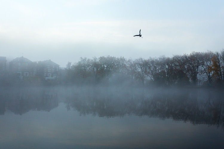
Now I have some good dark tones in the trees and some bright whites in the sky (all contained in the Histogram). Some Saturation gives me a good idea of what color the image would like to be (what direction it leans naturally). In this case, it’s blue.
Apply a Tone Curve
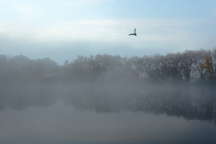
Next I decided to use the Curve panel for a bit more tonal change; bringing up the shadows and bringing down the highlights. Now the sky is richer and the dark areas are less muddy looking.
Dehaze
It was a really beautiful morning with the fog and trees, not to mention the fantastic bird (got lucky there!). That said, I was looking at this image and feeling that I wanted to bring out a lot more detail in the water and houses. The fog was great but I was pretty sure I could get more detail without a loss of atmosphere. My answer was Dehaze in the Effects module.
Dehaze is useful for images like this, but can be really super harsh if you are not careful. This image seemed to take a +44 without negative effects, like colour blocking and artefact creation so I left it there (see below).
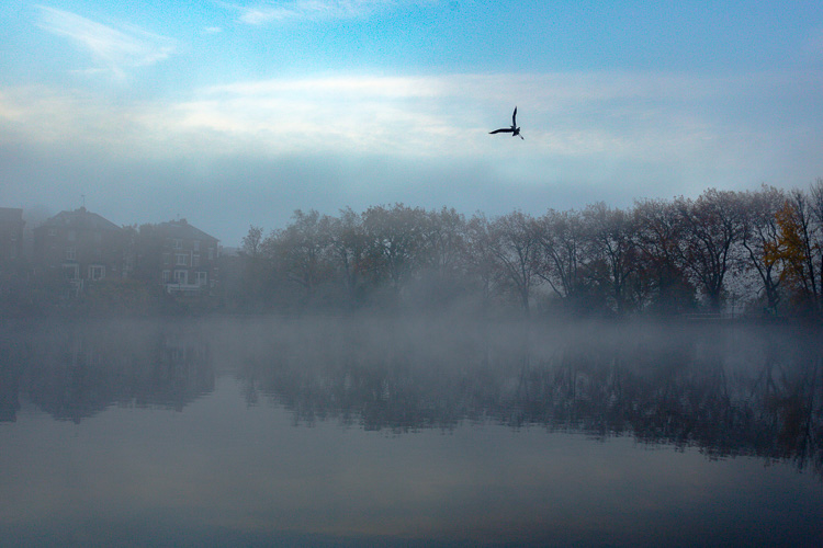
Dehaze does tend to mess around with Saturation, which you can see here. But, eh, I liked it! What I was going for was removing some of the fog on the water and houses and that worked well. It also had the added effect of making the reflection of the trees in the water stand out.
Local adjustments
At this point I usually start to toggle modules on and off to see what happens. I thought the shadows of the trees on the right hand side could use a bit of detail so I made a mask with the brush tool to lighten them a bit. This also brightened up the sky behind the trees and made it all look less muddy. Then, I did the same for the reflection.
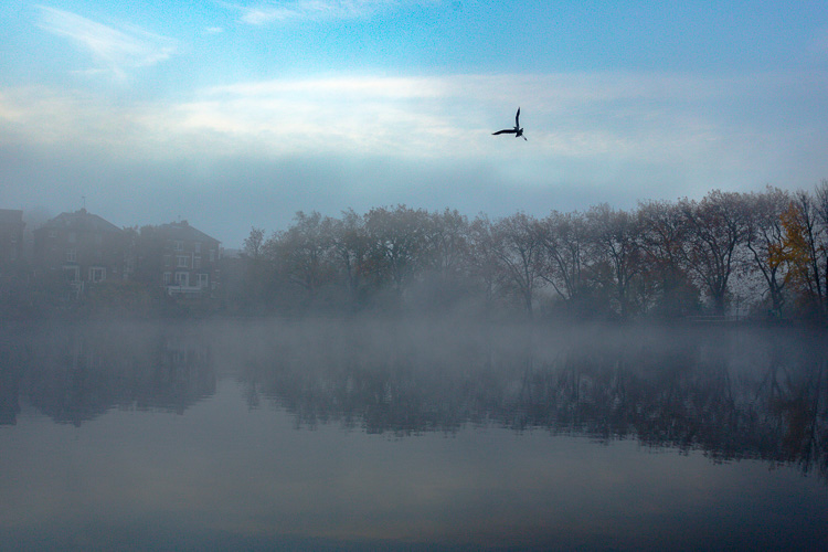
I really liked the fog on the water but I wanted the water to look crisp. So I used a graduated filter over it and put Clarity up to +74 and Exposure at +.60. I also changed the colour to match the blue sky. Now there is a lot more separation between the water and the reflection.
If I like my work up to a point I’ll make a snapshot so I can continue working on the image, but go back to that stage later if necessary. I’m pretty happy with it so far. Now is the time I would start toggling modules on and off again to see what needs adjusting.
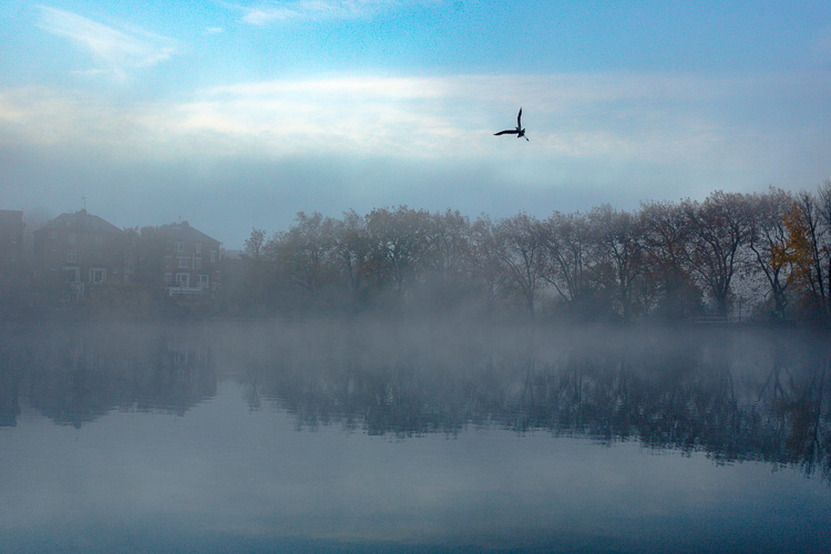
Next, see below, I chose to use HSL (Hue/Saturation/Luminance) panel last just to boost specific colours, in this case the blues. (Not sure why now that I look at it…probably would do it all over again without the blue boost).
I did try lightening the tones in the trees, which look yellow but LR wasn’t having it and said that it was actually blue. Understandable, since there is such a blue cast over everything. The only yellow that could be targeted was that last tree on the far right. I end up with this:

Conclusion
Now – on the last note, Lightroom is never going to destroy your image or make permanent changes. Therefore you have endless opportunities to play and learn what is possible with this amazing world of processing. Processing is the second half of photography, taking the photo is just the first half. Now I encourage you to:
“Go and make interesting mistakes, make amazing mistakes, make glorious and fantastic mistakes. Break rules. Leave the world more interesting for your being here. Make. Good. Art.” – Neil Gaiman
I’d love to know what you think. Maybe you would have gone about processing this image totally differently? Maybe you like what I did, and maybe you don’t? Let me know, I would love to hear your thoughts.
The post Tips for How to Think and Use Lightroom More Artistically by Anthony Epes appeared first on Digital Photography School.
from Digital Photography School http://digital-photography-school.com/tips-for-how-to-think-and-use-lightroom-more-artistically/
No comments:
Post a Comment