As a photographer, designer or artist, your professional ethics could be wrapped into one line: work hard, (dis)play hard. You dedicate a lot of time to the creation of beautiful and meaningful images. And as you should, you want them to be showcased in the most professional way possible. This is especially the case when designing your online portfolio, the equivalent of your persona on the web that will help you grow a community and attract more clients.
Full disclosure: This post was sponsored by Wix.
The most challenging part? More often than not, the mere act of uploading your creations to your website can be distressing. Once transferred, you often discover to your dismay that the images appearing on screen are not as high quality as the ones you created with such precision and passion.
Trying to solve this issue, you face a dilemma that challenges your very existence. On the one hand, your high-resolution pictures take time to load. This can ultimately lead site visitors to exit without even catching a glimpse of your art. On the other, trying to “lighten up” your files, you experience a loss of image quality, sacrificing precious pixels along the way. So, how can you preserve the quality of your images without harming the performance of your portfolio? The answer to this equation can be solved by adopting some best practices. Let’s delve deeper into the problems and solutions of image optimization for the web.
Image optimization: What’s the big deal?
In order to render images on your portfolio, whether this be on mobile or desktop, the Internet browser needs to download every single file. Therefore, the heftier the files, the more time it will take for your pages to load. Nothing new under the sun, you might say. Right, except that you probably don’t realize the full extent of the damage done to your online reputation. A recent study showed that 40% of people will abandon your page if it takes more than 3 seconds to load. More than that, speed can have terrible consequences for your SEO. Seeing as user experience is considered to be an important ranking factor for Google (and other search engines), slow websites tend to be associated with lower positions in search results. This is crucial if you want your audience to easily find you online.
An additional challenge stems from mobile devices, counting for over 50% of web traffic. The bandwidth of smartphones and tablets is usually lower than wired home networks, which makes it harder for your high-res images to be displayed on the screens of your visitors. The balancing act of portraying your beautiful artwork online in the best quality while maintaining your website’s performance is a tricky one. Let’s have a look at the existing solutions on the market.
The compression fix: How low can you go?
The first major image optimization technique is called compression. Although mathematically extremely complex, the basis of compression is quite simple. Your software will find redundant information on your images and omit these ‘less important’ pixels from the file. Since less pixels means less bytes, this process helps reduce the size of your images, making your website load much faster. One of the most popular and widespread compression algorithms known is JPEG, and lots of cameras offer the possibility to save your shots straight in this format – which is absolutely not recommended if you plan to do some editing work afterward.
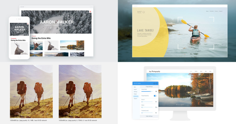
You’ll find that the higher the compression coefficient, the lesser the size. However, if a light compression is hardly visible to the bare eye, applying a strong coefficient leads to an apparent diminished quality of your pictures. Once rendered, images become significantly less sharp and less sophisticated on a visitor’s screen. This may go without severe consequences for regular websites such as blogs or business portals. But it is definitely not recommended for a professional photographer or designer, whose power to convince clients lies in the stunningness of their images. Since images speak louder than words, here’s a picture compressed in JPEG quality 10 (1MB), and the same picture in JPEG quality 10 (72KB):
The resizing factor: Does size really matter?
Today, the larger part of cameras and mobile devices are able to take high-resolution photos. Although a tremendous asset to capture your art, this poses somewhat of a problem when it comes to web design. As we’ve mentioned earlier, bigger photos take more time to load on your online portfolio. A solution to this complication can be solved by image resizing. The principle is easy: the smaller your picture (in terms of dimensions), the lighter the file will be. This common technique allows you to reduce the resolution of an image, almost without altering its quality.
Only one (but major) problem: a smaller picture is also harder to view or read. On a smartphone, the resizing is not necessarily perceptible. The problem crops up once your image is displayed on larger screens. In most cases, you can’t overturn this problem by uploading various versions of the same photo and tell the browser to display them based on the size of the device. What’s more, is that some images are meant to be displayed on a larger scale simply because of the subject (a beautiful portrait), the technique (macro-photography) or the artistic composition. By resizing your images, they run the risk of appearing pixelated and unprofessional. Thus, this technique may not be the answer, either.
The best practice: Optimization
The most popular options (compression and image resizing) fall short if you’re an artist looking to show your work in the best quality, without overloading your website. This is exactly why Wix developed an advanced solution that revolutionizes image optimization: the Wix Pro Gallery. The website builder offers a free and sophisticated online gallery, which automatically finds the perfect balance between speed and caliber. There’s absolutely no need to compress or resize the files. So, how does it work? When displaying an image on a mobile or desktop browser, the algorithms automatically apply the best resolution to your file. The resized image is then served using a CDN (Content Delivery Network) from the closest possible server. This assures that your photos are rapidly displayed to your portfolio’s visitors. The only thing you need to do is know how to create a photography website, and upload your pictures through the Wix Pro Gallery.
The Wix Pro Gallery gives you full control over the final quality and sharpness of your images. On the control panel, you can easily override the specific value for each piece. You can define the amount of sharpening applied to the image, the radius (amount of pixels from the edge that is affected by sharpening), and the threshold (which pixels to be considered as edge pixels – the lower it is, the more intense the sharpening effect).
The result is stunning, all the more so as, on top of being a powerful optimizer, the Wix Pro Gallery comes with a variety of beautifully designed layouts – that automatically adapt to all screens and devices. Sliced gallery, Instagram-like grid or slider: you name it. And for a full professional experience, note that you can also decide to forbid the right click in order to protect your images from being stolen, or allow your visitors to share your creations with a very convenient social button.
Ready to enjoy the best image gallery online? Design your online portfolio with Wix.com.
About the author: Ruth Eschenheimer is a Design Community Expert at Wix.
from PetaPixel https://petapixel.com/2017/11/14/optimize-images-online-portfolio/
No comments:
Post a Comment