#1 – Visualize Spots
Has this happened to you? You published online or printed a picture just to find out that you missed some dust or spots (be it from the camera sensor or on the photographed subject)?
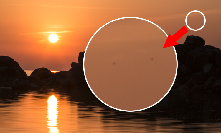
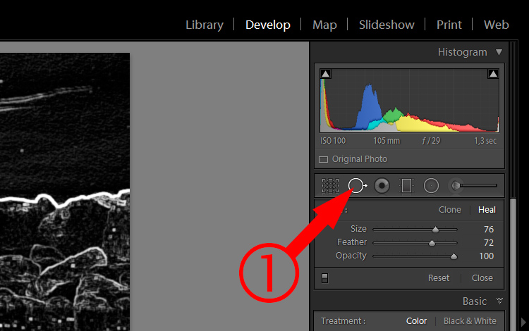
Lightroom has a great tool which will help you visualize and find those spots. Make sure you are in the DEVELOP module. Open the Spot Removal Tool (1 below).
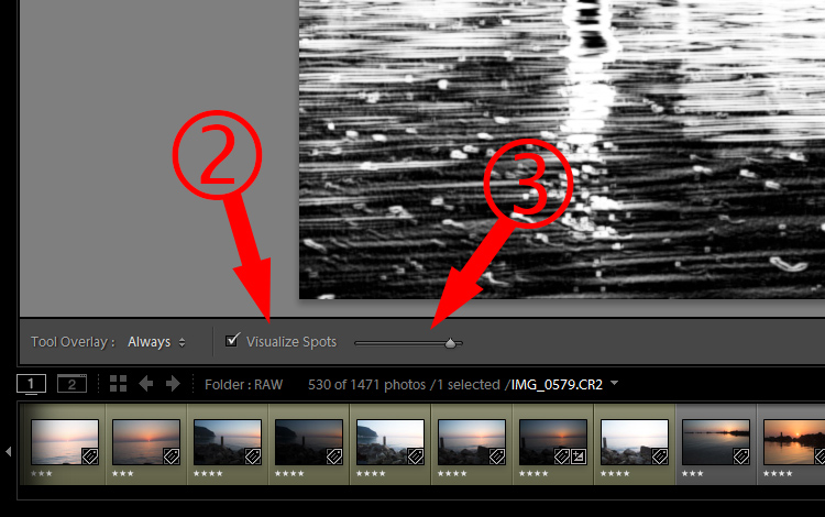
Underneath the picture check “Visualize Spots” (2). You can also adjust how detailed this visualization should be (3). Note: if you do not see that toolbar hit T on your keyboard to show it.
Now you can see clearly where those spots are.
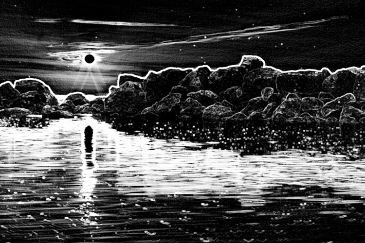
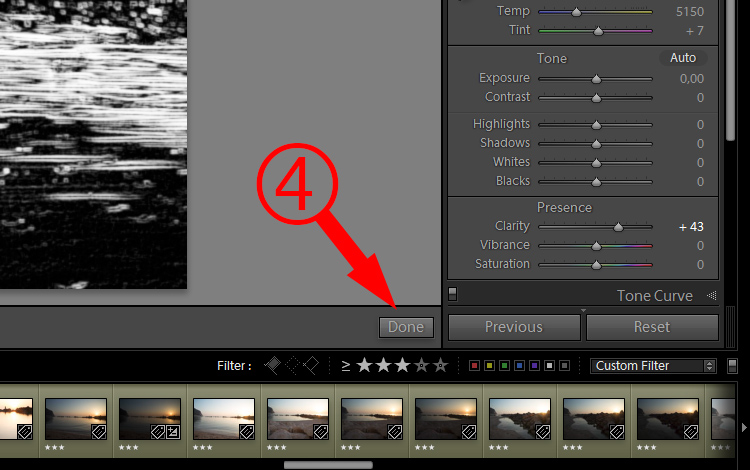
Switch Visualize Spots on and off while gradually removing the unwanted spots using the Cloning or Healing tool. You could remove spots with this option always on, but it’s better to make sure that spots are removed properly. When you finish, hit “Done” (4).
#2 – Saturation Quick Develop
After importing your pictures into Lightroom, you will want to select the best ones for editing. In some cases, you need to make some quick adjustments to more easily decide which pictures may look better after your edits. Although most of the basic adjustments are available and visible, there are some hidden ones, which you might need as well. For me, it would be saturation.
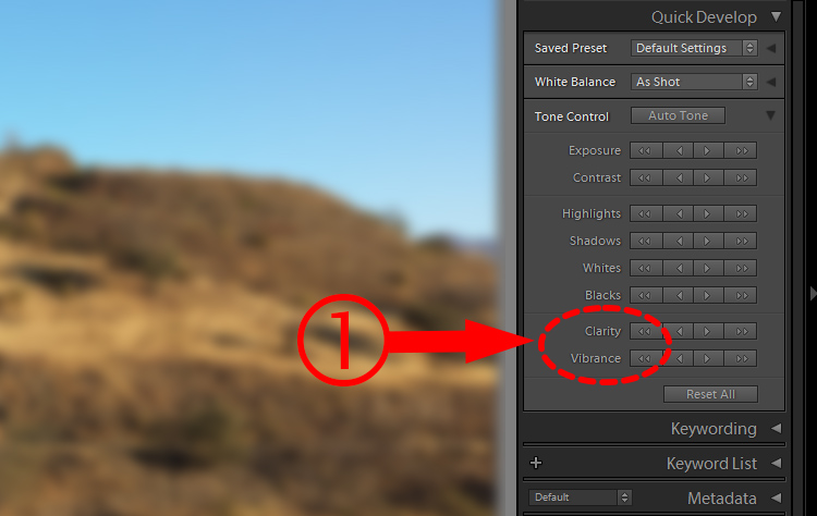
Make sure you are in Library module and look at the Quick Develop panel. The last two options are; Clarity and Vibrance (1).
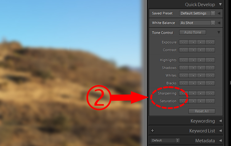
Press and hold the ALT key. Those options will change to Sharpening and Saturation (2).
#3 – Quick Develop More Precise Adjustments
Quick Develop panel (Library module) – again. This time it’s about more accurate adjustments. It may not be used often, but in some cases can be useful.
In Quick Develop panel you have buttons instead of sliders (like in the Basic Panel of the Develop Module).
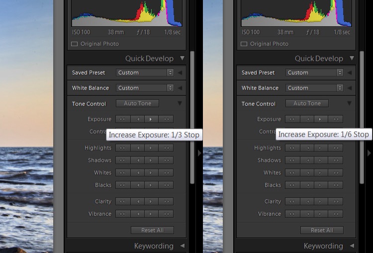
Let’s take Exposure as an example. There are single and double arrows for increasing and decreasing the exposure. Single arrows change the exposure in 1/3 of a stop increments. Double arrows change it by 1-stop. If the 1/3 of a stop increment is too much, hold down the SHIFT key; the single arrows will become smaller. When you click on them (while holding down the SHIFT key), your changes will be only 1/6th of a stop.
#4 – Graduated Filter Refinements
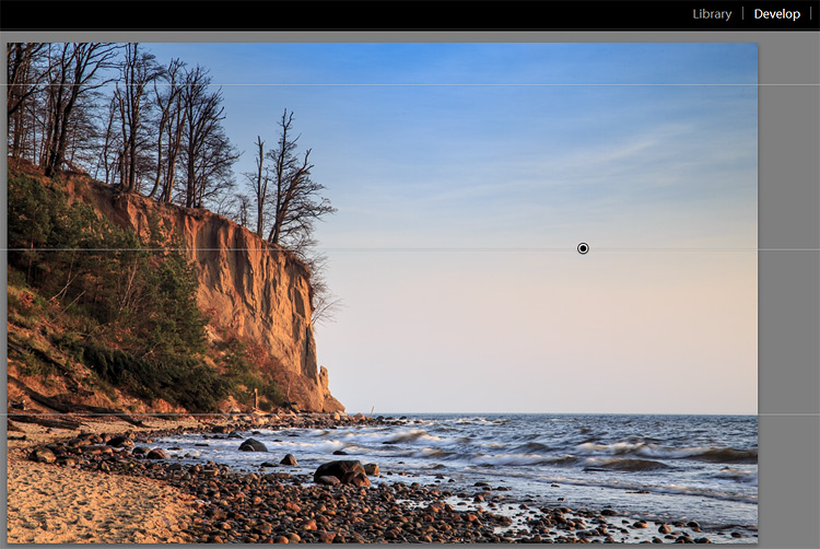
Sometimes, when you use a Graduated Filter for darkening the sky (for example) it would be nice if it would not affect parts that are above the horizon (trees, hills, etc.). In this case, a cliff on the left side.

When you are just starting out working with Lightroom, your first thought would probably be to pull down the exposure and that’s it. But then you will see that the cliff also becomes darker.
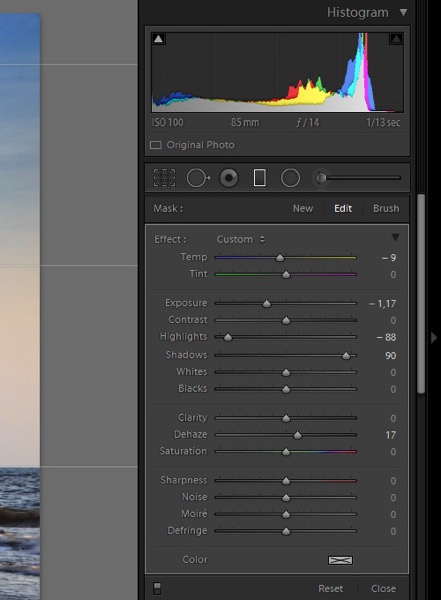
There is a great, quick and easy trick. After applying a Graduated Filter, pull up the shadows, and problem solved.
I also moved the temperature slider a bit more towards blue, the highlights down and added a bit of dehaze, which also darkens the sky, gives more contrast and saturation.
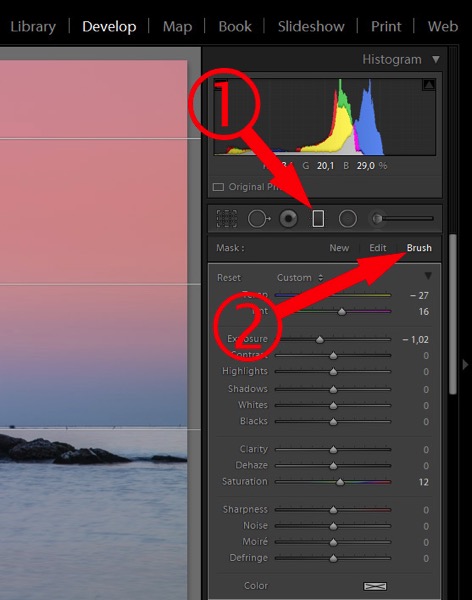
The second method needs a bit more work. It’s not as good when you have a lot of small elements, like the trees on the cliff (in the example above). On the other hand, it gives you more flexibility with adjustments.
Once you have your Graduated Filter applied and you’re still in the Graduated Filter panel (1), click the Brush (2).
Then turn on “Show Selected Mask Overlay” (3).
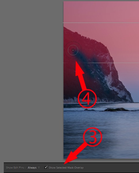
Hold down the ALT key, so the plus (+) in the center of the brush changes to a minus (-). Now you can paint on those areas which you do not want to be affected by the Graduated Filter.
#5 – Standard Preview Size
When you import your pictures, Lightroom creates previews. In the import window you can select one of these options:
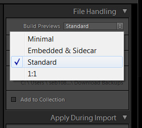
In case you are wondering how big the Standard Preview is (and how much of your hard drive space the previews will consume), you can check that in the Catalog Settings. You can also adjust the size if you want to.
Go to the menu (Edit for PC, File for Mac) > Catalog Settings and click the File Handling tab.
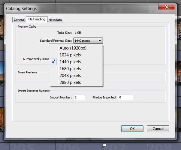
Here you can choose what size you want your Standard Previews to be. Auto – Lightroom will automatically set the preview size to match your monitor resolution. But here is the question, are you using one monitor or maybe 2 or 3? On top of that, what is your monitor resolution? If it is 1920×1080 then maybe it is fine, but what if you have a 6K monitor (5760×3240)? Then your previews will take a lot of space on your hard drive. In such cases, I would suggest that you pick a smaller size, like 1440 pixels for example.
#6 – Camera Profile
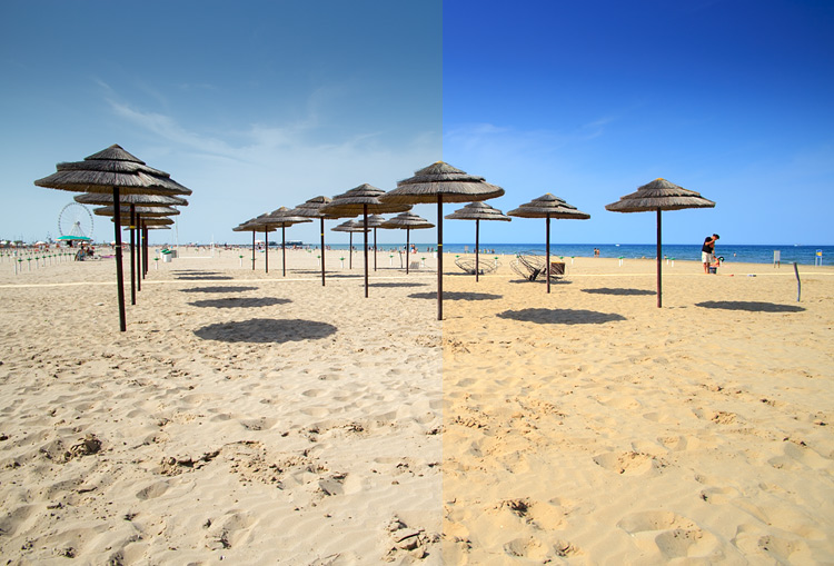
For a quick improvement of your picture use the camera profile: landscape, portrait, etc. instead of the default “Adobe Standard” which is neutral, or one could say, washed out.
Note: It will work only with RAW files. For JPEGs, the chosen profile is already “burned” into the image, it’s not separate information anymore.
Make sure you are in the Develop module. Open the Camera Calibration panel, the very last one on the right side.
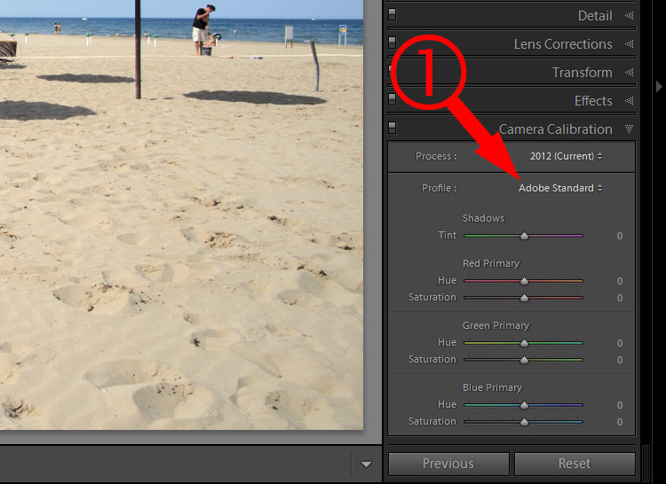
Change the profile to the one you like.
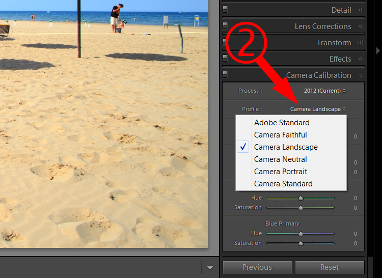
The left side of the picture (below) shows the effect of the Adobe Standard profile. The right side shows “Camera landscape”. It has better colors, more saturation, and is an easy fix.
#7 – ALT Key for Setting Whites and Blacks
Quickly check the burned out areas of your image while adjusting exposure, highlights, shadows, whites or blacks of your image.
Most of the time we want complete information in our pictures; details in both the highlights and shadows, without any flat, burned out areas. An exception might be, for example, a studio portrait or product pictures, where you want to have a completely white or pitch black background. Otherwise, you want to have details in all areas of your picture.
You can easily check that by holding down the ALT (PC) or Option key (Mac) while moving the adjustment sliders.
When you adjust Whites while holding down Alt/Option key, your image will turn black. If some parts are burned out, you will see them as white areas or with some red/green/blue colors. If there are only a few pixels here and there, then it’s alright. The problem starts when these areas are bigger (or it’s clipping in an important area).
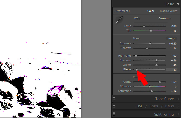
When you hold down Alt/Option key while adjusting Blacks, the picture will turn into white with some black areas (if there is anything burned out, it will be just white overlay).
Using this method is great for checking and adjusting the contrast of your picture. By Adjusting the blacks and highlights (whites) to the point where you see only some spots blown out, you are making sure that your picture gets maximum contrast while preserving all the details. Some people call it, “setting the white and black points of the picture”.
Concluding
Which of those tips did you like the best?
Also, if you have found any Lightroom tools that were not obvious to you, but have recently discovered them, please share with everybody in the comments below.
The post 7 Little Known Lightroom Tools and Tips to Improve Your Editing Workflow by Sebastian Jezierski appeared first on Digital Photography School.
from Digital Photography School http://digital-photography-school.com/7-lightroom-tools-tips-improve-workflow/
No comments:
Post a Comment