When we think about what goes into making a photograph most often our thoughts leap to camera settings like aperture and shutter speed. “What ISO should I use? Should I incorporate more or less of the foreground and is that tree branch really in the way?” We burden ourselves with the technical, while unfortunately overlooking other elements of the shot which potentially mean more to the outcome of the finished image. In this article, I will share a few of my own images and then break down a few key points that you can use to make your own images more consistently extraordinary. I won’t even mention the word exposure…well, maybe just that once.
Don’t worry, this will not be an overly introspective study of the all the “feelings” which we might pour into making a photo. Instead, this is an examination of the how and why we include what we do in our images and it covers some of the thought processes which drive our own creative visions. Once we begin to have a general understanding of how our artistic nature approaches composition the better we can work towards refining our own techniques.
Photo #1: The Brooding
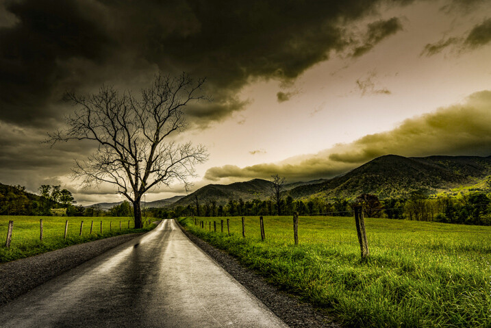
This is one of my personal favorite images. It came about very unexpectedly but it would turn out to be one of the most successful photographs of my career thus far. But why? There must be a reason this image was so well received. So let’s break it down and see what can be learned from the composition.
Use leading lines
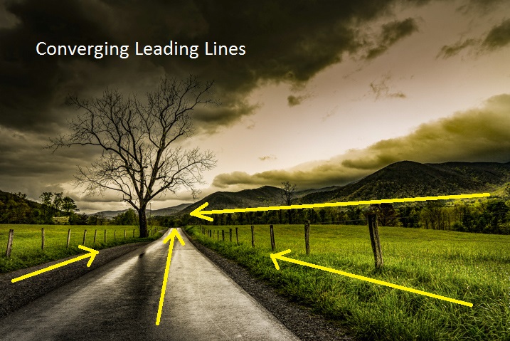
This is a photographic methodology that has been mentioned many times. Leading lines are simply guideposts within a frame which lead the attention of the viewer to certain elements and essentially direct their attention within the photo itself. Oddly enough, leading lines can be worked into your composition in many ways and there are no set “rules” for using them. But generally, they originate in the foreground and extend into the frame. That isn’t to say that leading lines can’t be horizontal, diagonal, or anywhere in between.
In the case of this image, the lines of the fence and road move from the foreground to the background thereby creating a sense of depth in the mountains. Meanwhile, the horizontal line of the mountains converges with the vertical lines of the road. This helps to highlight the central element of the photo which is the tree.
Don’t fear the weather
It goes without saying that this photo was made during some less than hospitable weather. An incredibly strong mountain thunderstorm had moved through the valley the night before and the rain had just stopped as I made my way out to shoot. Normally, bad weather deters many photographers from venturing out to make images. This is wrong.
When the weather gets rough it brings with it interesting cloud patterns and awesome light that you wouldn’t encounter on clearer days. Not only do the clouds add a sense of moodiness to the photo but the wet asphalt imparts the feeling of the dankness in the morning air after the storm passed. The yellowish post-storm light works well with the hazy mist in the valley which was hanging low after the rain.
Work with proportions
Whenever you begin mentioning words such as proportions, scale, or ratio as they relate to photography – you lose people’s attention. Usually, because it can seem complicated. Stay with me here! Composing your images based on certain aesthetic ratios and proportions isn’t as difficult as it sounds and I’m about to prove it to you. Ratios don’t have to be exact or perfect in every case but can really add that something extra to your photographs.
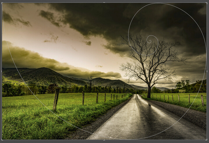
The image we have here incorporates what’s called the Golden Spiral or a Fibonacci Spiral to add interest and draw attention to the main elements of the composition. It’s a proportion based on the Fibonacci Sequence and it occurs in nature frequently. In this case, the spiral has been tweaked (flipped horizontally) to guide the viewer, yet again, towards the tree and into the distant mountains. Have a look at this overlay set on top of the flipped photo above and you can see how it lines up.
Pretty cool, huh? Try the Golden Spiral or the simpler Rule of Thirds for yourself to see an immediate boost in your compositions.
Photo #2: Summertime

When most people see this photo they either love it, hate it, or say “Adam, your feet are really, really dirty”. It’s true, this was a very impromptu and unorthodox exposure of yours truly as I swayed in my hammock during a hiking trip last summer. Unbelievably, it went on to win First Place Professional in a state magazine a couple months ago. No matter your initial impressions of this image there are still a few important lessons that can be gleaned to help you with your own work.
Find natural framing
This is a close cousin to using leading lines to enhance the viewability of an image. There are many cases when a strong composition makes use of what is referred to as natural framing. This is when a photographer composes certain elements (not always the main subject) in a way so that they are framed by other elements within the shot. Sometimes this framing is obvious, such as when a portrait photographer positions the client in a doorway or when a landscapist places the sunset between two mountain peaks. Other times natural framing is less obvious, as is the case with this image. Look closely.
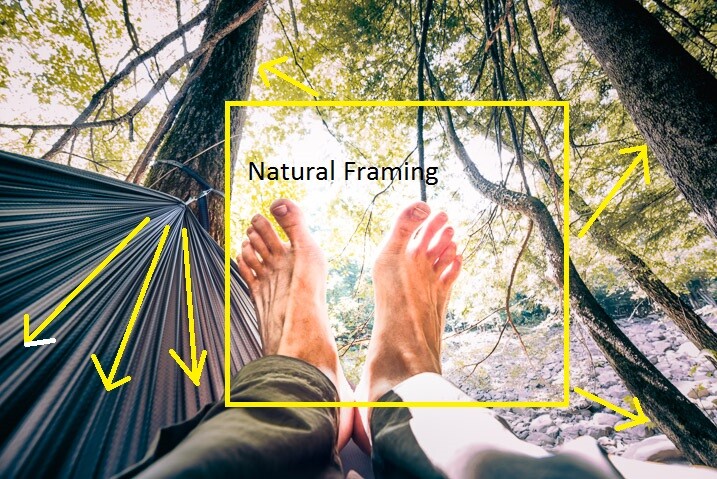
You’ll notice that my beautiful feet occupy the empty space between the hammock at the left and the trees to the right. The empty space created between the structures offers a place for the central subject to really stand out from the rest of the elements of the photo. The lines created by the hammock also help with the overall framing of the image and gives it a very anchored perspective. Speaking of perspective…
Use perspective
This photo was shot using a Rokinon 14mm F/2.8 super wide-angle lens, mounted on a full-frame mirrorless camera. The 14mm focal length bulges the exterior aspects of the frame. This causes the trees to bend in towards the center of the frame. The camera was held relatively close to my feet so that the entire scene seems relatively compressed around them. The overall effect is one of first-hand perspective and allows the viewer feel as if they themselves are swinging in the hammock on a warm summer afternoon…with dirty feet.

Shoot what you want
When I was about to enter this photo into the contest (in which it eventually took first prize from among 2,000 other entries) there were some politely well-worded reservations expressed by some of my friends. Why would anyone want an image of some dirtbag hiker’s feet? Well, when I shot the image I knew it carried the feeling of summer. The earthy remnants of a day’s trek and the welcomed relaxation of a swinging hammock that chases away all worries. I knew the photo fit the theme of the contest which was Summertime. It was an image which I felt was worth entering even though it was slightly unorthodox.
Shoot the images you want to shoot. Hopefully, this is a lesson you already know and have been putting into practice for some time now. If not, now is the perfect time to start.
Photo# 3: The Stars Fell
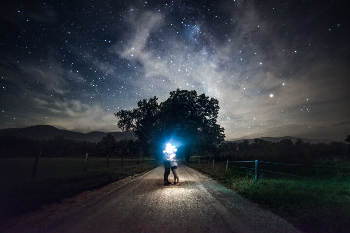
On the night this image was made my girlfriend and I had been out chasing the Milky Way through the mountains. There was nothing planned as far as a self-portrait was concerned. This was one of the last photos to be made that night and it came about completely by accident. It is the only exposure I made of us under the stars, which to me makes it even more special, but I digress.
Incorporate the environment
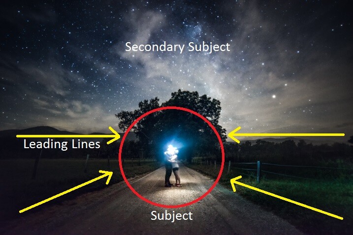
Consider your environment as another subject and use it to enhance the image. This may go without saying when working with landscapes or nature photography, but it can’t be overstated when it comes to portraiture and working with human subjects in general. In the case of this image, the stars wheeling overhead become almost a completely separate subject. Add in the human element and it produces a wonderful duality between man (or woman) and nature.
Here we see a few of the environmental elements which came together in the photo. Some of them may be familiar.
Open yourself up
Let’s face it, not everything goes to plan. There have likely been many times a shot didn’t pan out, your camera wasn’t set on the ISO you needed, or the light faded before you could click the shutter. Other times everything goes completely to plan. So much goes to plan in fact, that you consider it a job well done and stop thinking creatively.
While it’s great when everything goes right, we shouldn’t stop looking for the next exceptional image. Be open to those great moments that produce great work even if they go beyond what you had set out to do originally.
We were on the verge of packing up and heading back to camp when I had the idea for our spur of the moment self-portrait. I had already produced all the images I wanted to make so we had chalked it up as a success. But as it turns out, the image I never intended to make that night ended up being the best.
Trust your instincts
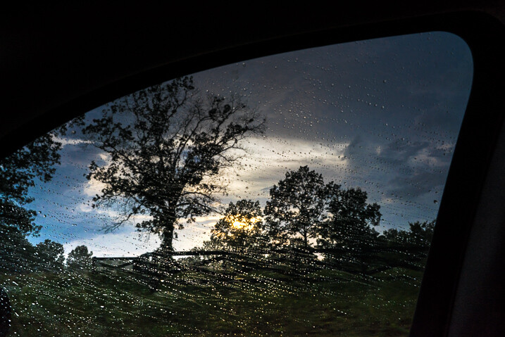
The reason this photo came about was due to a feeling I had that the image was there before I made the exposure. I was told later that my exact words were, “Want to try something weird?”
Even though it had already been a successful night of shooting the stars I knew there was one more frame to take and that frame should include us. It wasn’t something that was planned but it turned out being one my most cherished images to date.
When shooting any type of image it always pays to go with your gut. More often than not, your instincts will be right. If it feels like a photographic opportunity is presenting itself then it’s usually a good idea to follow your intuition and pursue the idea. Don’t think you have astute instincts? Don’t worry. They will develop and mature as you do as a photographer.
Conclusion
Remember, strong images are made by more than just perfect camera settings. Begin looking beyond your exposure and aperture to understand how your photos impact you and ultimately the viewer. The methods mentioned above will give you a great start to producing consistently better images time and time again.
The post How to Compose Better Images and Make your Images More Extraordinary by Adam Welch appeared first on Digital Photography School.
from Digital Photography School http://digital-photography-school.com/compose-better-make-images-extraordinary/
No comments:
Post a Comment