Balance is one of the characteristics of good composition. It is the way elements of an image are arranged to create a feeling of stability. If you imagine that your image is a set of scales, all elements of your composition should be balanced to make a photograph feel stable.

There are many ways to create balanced images. The easiest way to achieve it is by using symmetry, as it guarantees left to right, or top to bottom balance. The results look formal, organized, and orderly.
If you would like to create a balanced composition that feels more casual, free, and energetic, then use asymmetry.
To understand this concept, let’s go back to our analogy of a set of scales. If you have several small items on one side, they can be easily balanced by one large object on the other side. Visual balance works in a very similar way, but it can be affected not only by the size of objects, but also by their value, colour, texture, quantity, orientation and isolation.
Different colours, shapes and sizes create different degrees of visual interest. So, to achieve asymmetrical balance you need to arrange elements of all different visual weights, when composing your image, in such a way that each side is still balanced out.
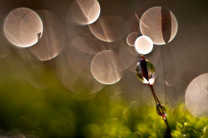
There are seven basic factors to consider when you compose your images with visual balance in mind. Let’s have a close look at how you can use these different factors affecting visual weight and gain some advantage.
1 – Colour

Colour has many properties that can affect an object’s visual weight relative to others in the photograph, such as saturation, brightness, darkness, and hue. Warm colours advance into the foreground and tend to weigh more than cool colours, which recede into the background. Red attracts attention better than any other colour, and thus has the highest visual weight as opposed to yellow, which has the least visual weight. Also bright colours attract more attention than subdued colours.
2 – Size

Large elements appear heavier than small ones. Size is an evident visual weight factor because, in the physical world, an object that’s bigger than another will naturally be heavier, and will take up more physical space. Large elements command more attention. We naturally see them first, or spend more time looking at them anyway.
3 – Value
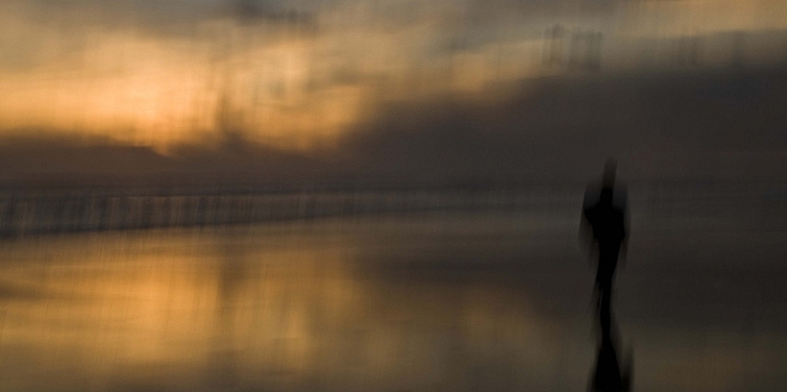
Value is a powerful tool for balancing images. Dark elements feel heavier than light items. The higher the value-contrast (between object and background), the heavier will be the weight of the object.
4 – Texture

Texture adds visual weight to items in photographs. Texture is just more interesting and our eyes are drawn to it. Smooth areas will feel lighter than those with a lot of heavy texture.
5 – Isolation
Objects isolated in a space appear heavier than those surrounded by other elements. Look at the image below with a brown circle on it. Your eyes go directly to the brown circle first because there’s nothing else to see.

6 – Quantity
A few small objects can balance out a single large object. Repetition of objects can be used here as well. In the example below, the three small berries are balancing out the large berry.

7 – Orientation
Vertical objects appear heavier than horizontal objects. A diagonal orientation carries more visual weight than a horizontal or vertical one. Lines can be very powerful in your composition. Pay close attention to them.

Remember, you don’t have to balance colour with colour, or light with dark – you can mix and match your visual weights. For example, a counterweight to a large, bright area might be a small red object. Experiment with different kinds of balance and play around with visual weight. See what works best for your images and the story you want to tell.
As you go out exploring with your camera on your next photo shoot, keep balance in mind and the seven factors of visual weight. Look closely and try to determine which elements are commanding the most visual weight when you compose your photographs, and see how they affect balance in your images.
If you have any comments or questions please post them below. And we’d love to see your visually balanced images.
The post 7 Quick Tips on How to Use Visual Balance to Make Better Photographs by Eva Polak appeared first on Digital Photography School.
from Digital Photography School http://digital-photography-school.com/7-quick-tips-use-visual-balance-make-better-photographs/
No comments:
Post a Comment