Sunday 31 July 2016

How to Use Two LED Lights to Achieve Moody Portraits

Any kind of light is a must for photography. You just cannot photograph without light. There are various types of light that no doubt you are familiar with:

  • Natural light from the sun
  • Ambient light (could be natural or manmade)
  • Artificial light such as strobes, incandescent or tungsten, fluorescent, flash and LED lights
  • Infrared light

achieving-moody-portrait-2-LEDs-tips

This article will give you tips for using two LED lights to achieve moody portraits.

Tip #1 – Modify your light

The best light is always modified. Even sunlight is better with a diffuser. Direct sunlight produces hard shadows and harsh light. Clouds soften and diffuse sunlight (by making it spread over a larger area). On a bright cloudless day, shooting in open shade minimizes the harshness, but still takes advantage of the beautiful natural light. Shooting in shadows, located next to reflective surfaces, also leverages any bounced natural light. These techniques are simply modifiers of natural and available light.

Modifiers are more obvious for artificial light. There is a plethora of choice when it comes to these: soft boxes, diffusers, reflectors, foam cores panels, umbrellas, flags to name a few.

The same is true for LEDs when it comes to the need for modifiers. There are many types of LED lights, including ones that you can adjust their brightness as well as colour temperature. But, just like the above, regardless of brightness intensity of the continuous light, it is essential to modify LEDs to get soft, pleasing, beautiful light -overall a better quality of light.

I’m going to show you a setup using modified LEDs to create moody portraits.

achieving-moody-portrait-2-LEDs-tips

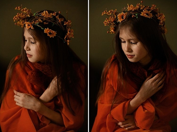
Using a window to camera left and an LED, bounced into a diffusion panel, to the right.


The main light I used here is the Magic Tube, the cheaper alternative to Westcott Ice Light. You can adjust the brightness of the light, and it comes with a tungsten gel if you need it. Apart from looking lightsaber Star Wars cool, the Magic Tube also comes with a charger that allows continuous charging while it is being used. So you can always have access to power by just plugging it in if the battery charge runs out.

You can also use window light and just one LED for this setup. Substitute the main light with your window light, but make sure you are diffusing the light coming from a window with a sheer voile, or fabric to soften it.

To diffuse the main light, I covered it with the Rogue Bender diffuser for the strip light. This is just a piece of rectangular translucent material which simply covers the light.

Tip #2 – Position your lights for contrast

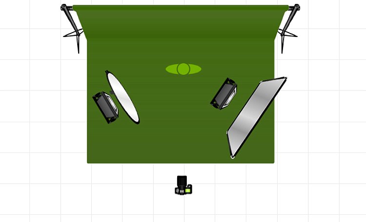
Position the main light at 45 degrees to the subject, up high to emulate light coming from a tall window. Use a diffusion panel or a piece of sheer fabric. The less opaque the fabric, the more diffuse your light will be. To further modify the Magic Tube after I have attached the Rogue Bender diffuser, I also used the diffusion (translucent part) panel of a 5-in-1 reflector and had an assistant hold the panel in front of the main light. Having these two diffusers together reduces the strength of the light, but also greatly softens its quality.

achieving-moody-portrait-2-LEDs-tips

The second light is also an LED, this time a small video light positioned to camera right, at 45 degrees, but at the same height as the subject. However, instead of using a diffuser to modify this light, you can turn it around so the light faces away from the subject, and put a reflector in place to bounce the light on. The subject (filling in the shadows) gets illuminated by the soft bounced light from the reflector.

achieving-moody-portrait-2-LEDs-tips

For a moody look it is essential to have both light and shadow in the portrait. You need to watch where the main light falls, and the shadow it’s creating. You want the shadowed area to still have some detail, instead of being completely black. The bounced light from the reflector takes care of this.

Tip #3 – Use a dark background

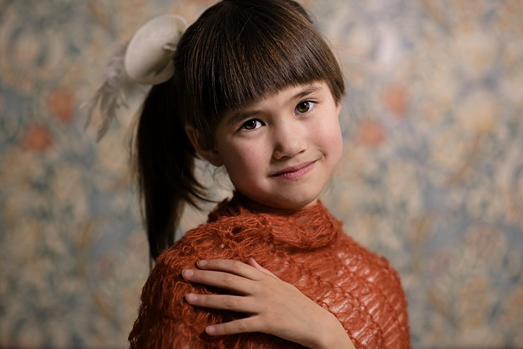
I tried the exact same setup, although the lights were positioned the opposite way, with the main light on camera right. This setup had a lighter background, in this case lightly patterned, and the results were far from moody. I did not want to shoot at a smaller aperture as I wanted to blur the pattern of the wallpaper in the background. I also wanted to emulate sunlight shining through a window illuminating a dark room, and this setup just did not work to achieve that look.

I’m sure if I had gridded the main LED to avoid spill into the light background, while increasing my shutter speed, the background would have gone darker, but I would have lost the soft and atmospheric look I was after. Compare this photo below to the one underneath it, and it’s pretty obvious the darker background is most definitely better at achieving the moody look.

tutorial-using-2-led-lights-for-portraits-photography

achieving-moody-portrait-2-LEDs-tips

I hope this article gave you new ideas to try. Do share other tips you have to achieve moody portraits!

The post How to Use Two LED Lights to Achieve Moody Portraits by Lily Sawyer appeared first on Digital Photography School.


from Digital Photography School http://digital-photography-school.com/how-to-use-two-led-lights-to-achieve-moody-portraits/

How to Boost Your Creativity by Including Props in Your Photography

Props: are they a blessing or a curse? In photography, props can often make or destroy a photo, and because of this some people try to avoid them, some are afraid to use them, and other people love to use them.

I moved from being afraid to loving props because I found they are amazing tools to unlock creativity.
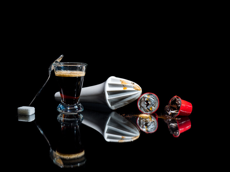
Photo00

Freshly squeezed coffee. A different way to prepare a fresh cup of coffee.

Why use props?

Usually, the role of the props in photography is to help add character and interest to a photo, or to add context to the scene.

Some kinds of photography, such as conceptual photography, cannot exist without props, as they are needed to translate the abstract concept or message into an image.
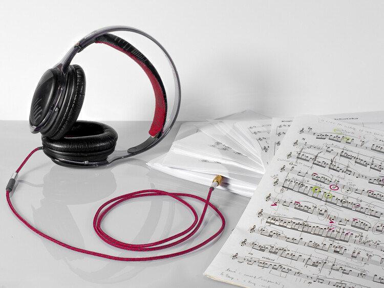
Photo01

Musical scores.

Props in commercial photography

In tabletop photography (product, food photography, and still life), props are used to build the scenography of the photo you are crafting.
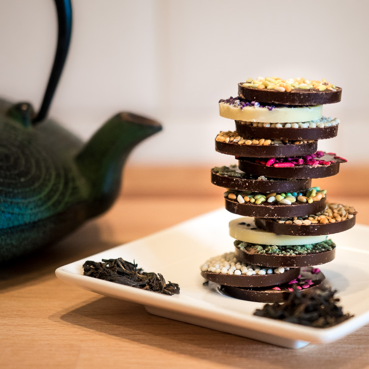
Photo02
The teapot, the plate, and tea leaves are all elements of the scenography used for the pile of chocolate biscuits in this a classic food photograph.

Props in landscape photography

Props are sometimes present even in landscape photography, usually with the task to add interest to the foreground. A classic example would be to photograph a camp site in the wilderness, with a lit tent under a starry sky.
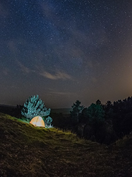
Photo03
This tent is, indeed, just a prop. I brought it along with me solely with the intent to add interest to this nocturnal landscape.

Props and portrait photography

Using props will also help you to create more interesting portraits. Are you into self-portraiture? Cool, but there is only so much you can do with your face, and after a while you will probably feel the need to start using props, The more creatively you can use them, the better and more interesting your portrait will be.
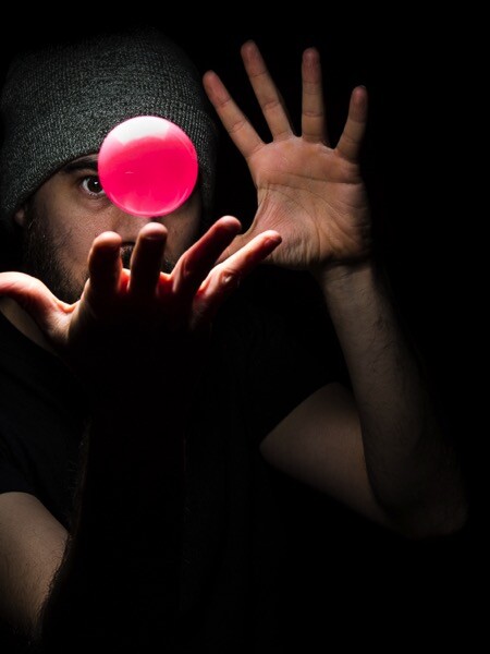
Photo04

A simple ball thrown in the air with a bit of timing can make for a dynamic, “It’s a kind of magic” portrait.

So, props are all those objects that photographers add into the scene they’re photographing that are not the main subject of the image. I don’t consider hats, jewelry, wristwatches, and all those accessories your model wears for a portrait, to be props.

Another plus with props, especially in portraiture, is that they can help your model to be more comfortable in front the camera by giving him/her something to do or to focus on, thus forgetting about you and your camera.
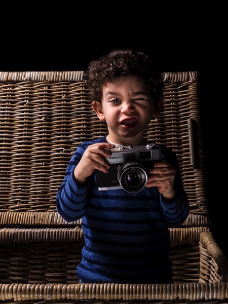
Photo05
A prop in the hands of a 3 year old toddler (my son in this case) can lead to interesting results without making a fuss.

Things to look out for using props

So where is the problem with the use of props? Why people can be negative about them? My guess is because they are so widely used in photography that the risk of fall into photographic clichés is quite high.

Below are five tips to help you be creative with props, instead to fear them.

Before you continue allow me a final word. While it is true that many things can be do inside editing software, to really exercise your creativity don’t be a lazy photographer, craft your images for real as much as possible.
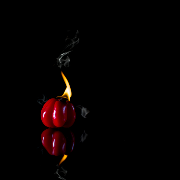
Photo06
I consider the flame and the smoke in this photo of a hot pepper to be props. The fun in crafting the image with real fire and smoke was unbelievable.

Tip #1: Use a classic prop in a fresh way

Old film cameras are classic props in portraiture, and the ways to use them are variations of my son’s portrait you saw above.

Among those cameras, the most photogenic ones are, in my opinion, the TLR (twin lens reflex) cameras, such as Rolleiflex, Rolleicord and Yashica. Because these cameras have a huge focusing screen you have to look into from above, the usual way to use these props is to have your model look down into the camera.

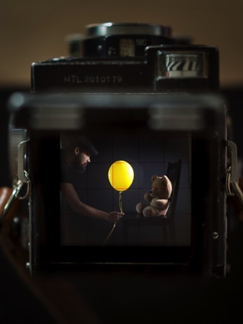
A less common way to use those TLR cameras as props is to take advantage of their massive focusing screen, which is many time larger than any SLR camera viewfinder, and to photograph the scene the TLR camera is seeing.

Once you get the setup right, don’t stop after the first shot, but experiment with poses and props.
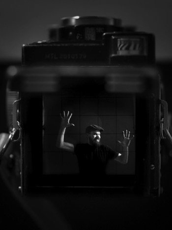
Photo07

Trapped!

Photo08

To reveal the child inside us.

Tip #2: Build your own props

Another way to get creative with props is to craft them yourself. This will not only ensure you have unique props to work with, but the whole process of making the props will make you think more creatively about how to use them.

A one meter long, origami paper boat, and a yellow balloon are good props to make one of my son’s fantasy and childish adventures come to life.
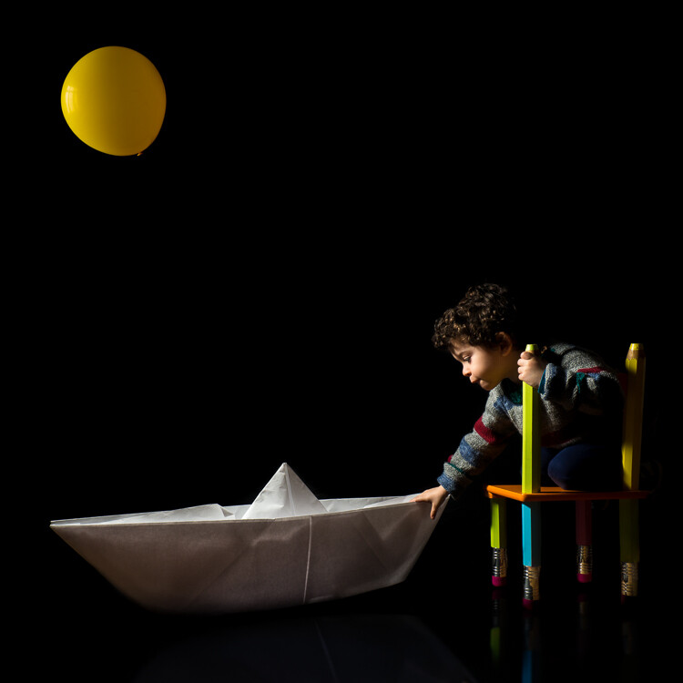
Photo09

A fantasy childhood adventure gets real in this photo.

If you are into origami, and tired of taking the usual portraits of your children, you could try to create adventures for them by folding big paper planes or animals, or whatever you know how to do with a piece of paper. Plus, you can find plenty of origami tutorials waiting for you online.

Once again, it is true you could easily compose the adventurous portrait of your child by adding elements to the photo later in Photoshop. But, again, what fun would that be for both of you?

Tip #3: Break the physical laws and go surreal

One of my favorite prop to work with are helium balloons, those you usually buy for parties. They are colorful, cheap, long lasting and very versatile.

Inspiration for their use is everywhere; have you watch the animation movie Up recently? Cool, wouldn’t it be fun to fly away holding tight to a bunch of balloons?
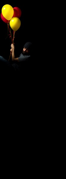
Photo10
Up, up we go. Here the low key really helped a lot to make the pose believable.

What about breaking the physical law by playing “tug of war” with those balloons, instead?
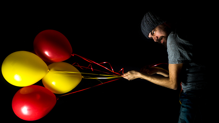
Photo11
Up and Down are quite arbitrary in this kind of photos. Here I was lying down on the floor but I tried to keep my shoulder off the ground, so that once I turned the photo 90 degrees counterclockwise, the pose was still believable. The low key helped by getting rid of the floor.

Tip #4: Prep your props

Sometimes, you can obtain something original just by prepping up a classic prop, such as the omnipresent book. Books are often used to fill a still life scene, or to get more interesting portraits.
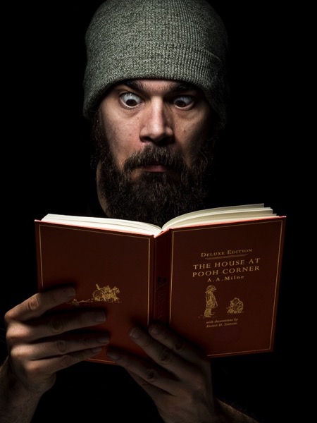
Photo12
A funny contrast between the surprised grown up, rude, and bearded man, and the book of one of Winnie the Pooh adventures.

To make things more interesting, dynamic and less cliché, you can prep a book by sprinkling body powder on its pages and then have your model to blow the dust off while you take the photo. Or have him slam the book shut just before you fire the shutter, so to record of white powder flying out the book creating clouds.
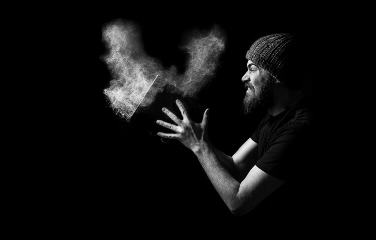
Photo13

By adding body powder to the mix, you can obtain much stronger and dynamic portrait.

Powder makes things much more interesting, and the only limit is your creativity (or the absence of a working vacuum cleaner to clean up after the mess). You can sprinkled some body powder on a ball (another common prop) and make your model hit it with the hands just before taking the photo. You will capture great puffs of powder, helping to convey a feeling of action and power.
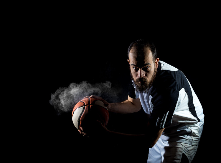
Photo14

Basketball and body powder mix in interesting ways.

Tip #5: Go crazy with conceptual photography

While it is challenging per se, I consider conceptual photography to be the best playground to learn to be creative with props.

When you do conceptual photography, your subject will be a concept, and the challenge is to translate it into an image by using props. At first, keep it easy, and don’t be afraid to get inspired by the work of other photographers.
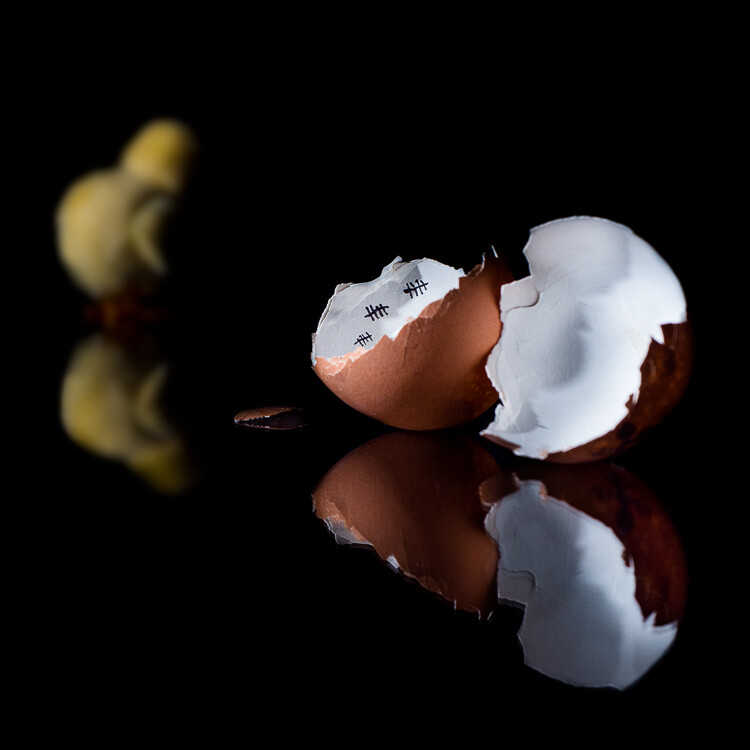
Photo15

The chicken’s great escape, a concept I saw online and I made it mine by using my personal style, and adding the escaping chicken.

Because you want to convey a message, even with the simplest setup, you have to pay attention on how you place your props into the scene.

In the previous photo, the dark, out-of-focus chicken in the background is there to give the idea of the chicken moving away from the egg. While the broken shell with marks on its inside make the viewer think of it as the chicken prison. Had I placed the chicken in the foreground, in-focus and well lit as the egg’s shell, the message would have lost some strength.

When you do conceptual photography, do not focus on the photography aspect at first, but let your ideas and concepts spawn naturally from your everyday life. Are you cooking your favorite food? In that moment the idea that photography is a bit like cooking could strike you.

In photography, as in cooking, you combine what reality puts in front your lens (the ingredients) to create your vision of such reality (the finished food).

This idea struck me once and this was my personal way to translate it into a photo: the ingredients are the colorful paper rolls in front the lens of an old TLR camera, and those ingredients combine in-camera to reveal an origami nocturnal seascape crafted using the paper from the rolls. Photography magic.
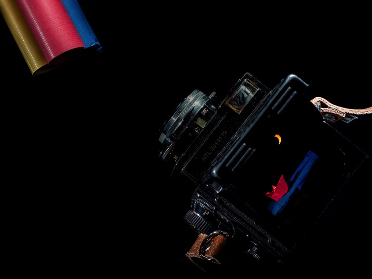
Photo16
The fun of doing the origami seascape for real and the challenge to frame, focus, and light it, so I could photograph the scene through my old TLR camera, was so much more than just use an editing software to copy/paste, move, rotate, resize and bled all the different elements together.

Once you start this game, you can find concepts everywhere; was your Mexican food too spicy even for a chili lover as you are? Something like that could pop in your mind.
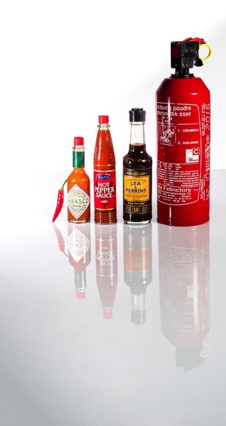
Photo17

The most useful kit for us chili lovers.

Bonus tip: The hunt for props

Now you know how you can get creative with props in many ways, even using common ones, but it is always good to hunt for more interesting ones.

A good way to hunt for unique and weird props is to visit flea markets and shops selling kitchen supplies, vintage clothes, and such. And then, as usual, once you’ve got your props, use them in a fresh and unconventional way.
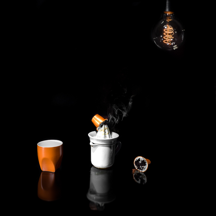
Photo18
A variation of the concept shown in the photo opening this article; the same concept can be photographed in many different and original ways. Creativity is your only limitation.

Once again, the way you use and prep the props is crucial to create a convincing image. The coffee stains on the table and the squeezer, the squashed and broken capsules, and the smoke from a hidden candle, make the viewer understand what the meaning of the photo is, and the reason behind those props.

Conclusions

Don’t be afraid to use props in your photography to add something more. Just remember to use them wisely and creatively to push your photography further, and to avoid falling into photography clichés.

The post How to Boost Your Creativity by Including Props in Your Photography by Andrea Minoia appeared first on Digital Photography School.


from Digital Photography School http://digital-photography-school.com/how-to-boost-your-creativity-by-including-props-in-your-photography/
Ep. 94: One Billion Reasons Not to Use Someone Else’s Photos + more!

Here’s episode 94 of the PetaPixel Photography Podcast. You can also download the MP3 directly and subscribe via iTunes or RSS!

Leave a comment in this post, or use our voicemail widget for feedback/questions for the show.

In This Episode

If you subscribe to the PetaPixel Photography Podcast in iTunes, please take a moment to rate and review us and help us move up in the rankings so others interested in photography may find us.

Sponsor:  FreshBooks. Get your FREE 30 day trial at FreshBooks.com/PetaPixel and enter PetaPixel in the “How Did You Hear About Us?” section.

Photographer and creator of Plotagraph Pro, Troy Plota, opens the show.  Thanks Troy!

A noted photographer sues Getty for $1 Billion. (#)

Plotagraph Pro is announced and seeks to breathe new life into your photos. (#)

More rumors about the Canon 5D Mark IV as its announcement nears. (#)

Rumors that Sony will be updating it’s a99, but is the A-mount system have any life in it. (#)

Yahoo! gets parted-out as Verizon acquires Flickr and other key assets as EyeEm offers a solution in Flickr’s uncertainty. (#)

A Kickstarter campaign for a mid-level monolight with some high-end features. (#)

Connect With Us

Thank you for listening to the PetaPixel Photography Podcast! Connect with me, Sharky James on TwitterInstagram and Facebook (all @LensShark) as we build this community.

We’d love to answer your question on the show. Leave us an audio question through our voicemail widget, comment below or via social media. But audio questions are awesome!

You can also cut a show opener for us to play on the show! As an example: “Hi, this is Matt Smith with Double Heart Photography in Chicago, Illinois, and you’re listening to the PetaPixel Photography Podcast with Sharky James!”


from PetaPixel http://petapixel.com/2016/07/31/ep-94-one-billion-reasons-not-use-someone-elses-photos/
Saturday 30 July 2016

How to Achieve Background Blur or Bokeh

If I show you two different portraits, one with a blurred background and one with a sharp background, you will automatically prefer the one with the creamy bokeh. Why? Because that’s just how it is. No, the bokeh effect is very flattering because it isolates the main subject by separating it from the background.

If you did not know, bokeh means blur in Japanese, and it is purely aesthetic.

Most portrait photographers blur their backgrounds, and I certainly do it because when I take a picture of someone, I want the viewer to focus on the person’s face and not what’s going on behind them.

IMAGE 1

Portrait with nice bokeh in the background.

I always want good background blur when I shoot portraits, that’s one of the main reasons why I shoot on Aperture Priority and let the camera do all the rest of the work. My minimum shutter speed has to be 1/100th, so I increase my ISO to 400 to compensate – this is for portraits with natural light.

Bokeh basically depends on how shallow your depth of field is (note that the further the background is from your subject, the smoother the bokeh). Depth of field depends on three main things

IMAGE 2

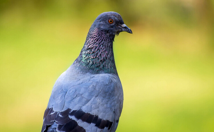
In this image, the bokeh looks really good because the background was really far from the subject (the bird).

The Aperture Matters!

The bigger your aperture (smaller the f-number), the shallower your depth of field (e.g., f/2.8 is a large aperture opening, and it creates shallow depth of field).

The first thing I did not understand when I first started photography is that I used the biggest aperture on my lens but the background was not completely blurred.

At that time I used the 18-55mm canon kit lens with its maximum aperture of f/3.5. The user’s manual on my camera told me to just use the smallest f/stop on my lens and I would automatically blur the background. However, they did not mention a lot of other factors to get this result, like how big should my aperture be. After hours of trying to get a background blur with my aperture of f/3.5, I was left very frustrated because I did not get the results that I saw on the internet.

I later understood that bokeh depended a lot on how big my aperture was – I wanted to get bokeh for portraits with a focal length of 50mm. I had to buy a lens with a bigger aperture to get a completely blurred background, and the Canon 50mm f/1.8 was the answer. It is a relatively cheap lens to get started with portraits. You can find other lenses with an aperture of f/1.4 or f/1.2 but the bigger the aperture, the more expensive the lens.

IMAGE 3

Portrait with an aperture of f/1.8

With a regular lens like 50mm, you will start getting nice bokeh starting from f/2.8. So lesson number one is to buy a lens with a really big aperture – this is the first way to achieve flattering background blur. You probably know this already, but this is important to mention before giving the two other points.

With a big aperture, you will be sure to get a nice background blur. But, there are other ways you can blur your background without having a wide aperture.

The camera to subject distance controls the depth of field

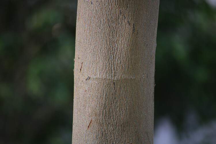
Let me show you my point: lift your right thumb (or left thumb -it doesn’t really matter) in front of your right eye and stare at it while closing your left eye. While focusing on your thumb, notice that you cannot clearly see the background. Now move your thumb farther away from your eye, keeping your thumb in focus. You will notice that the background won’t be blurred anymore. This works with your camera the same as it down with you eyes. The closer you get to your subject, the more blurred the background will be.

IMAGE 4

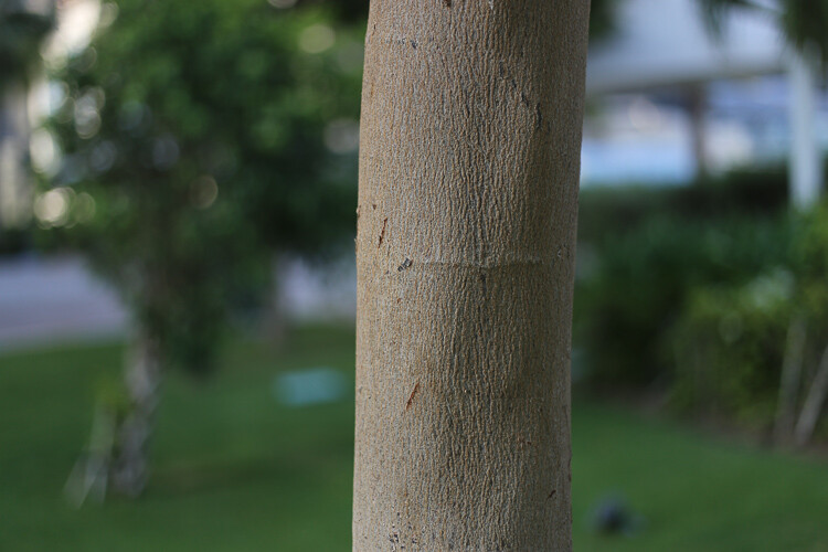
At 40mm, f/5.6 you can see that I’m not getting any bokeh in the background.

IMAGE 5

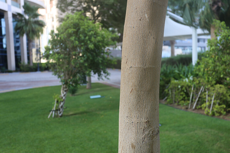
At 40mm, f/5.6 you can see that with the same focal length and aperture I can get a nice bokeh by getting closer to the tree.

IMAGE 6

At f/1.8 I get a nice bokeh with the 50mm lens.

IMAGE 7

Still at f/1.8 with the 50mm, if I get closer the effect gets more intense.

I understood this when I finally managed to get nice bokeh with my kit lens (I still did not have my beloved 50mm f/1.8). I used to practice my photography, and background blur on a tree. The f/3.5 aperture was not good enough for me so I tried different things. The first satisfying bokeh I got was when I focused my camera really close to the tree.

If you take a second and think, you will realize that all the macro photography images have a shallow depth of field, therefore a smooth bokeh. This is because macro photographers get really close to their subjects.

IMAGE 8

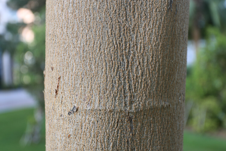
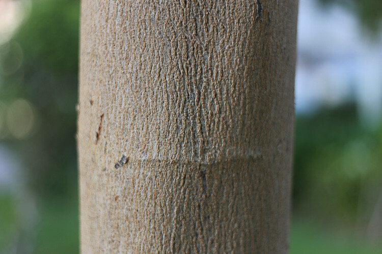
By getting close to your subject you will blur the background.

IMAGE 9

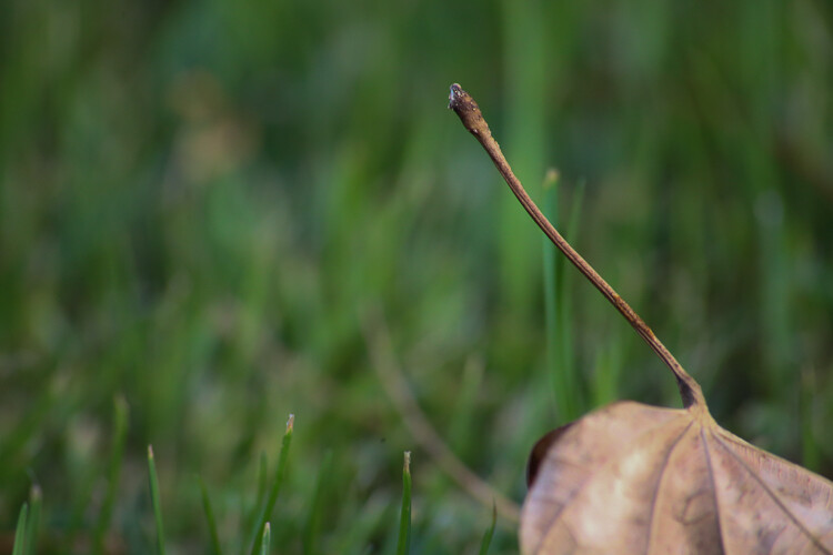
Here I used a zoom macro lens (at 300mm) and got as close as possible to the leaf.

IMAGE 10

Here I used an aperture of f/1.8 with the 50mm, and got as close as possible.

Even if you have an aperture of, let’s say f/5.6, if you get your camera really close to your subject, you will have a blurry background.

Note that macro photographers use special lenses that enables them to take images really close to their subjects. Standard lenses have a limit regarding their focussing distance. If you cannot afford a lens with a big aperture nor a macro lens, extension tubes are a good solution to extend your focusing distance.

The shorter the distance between your subject and the camera, the shallower the depth of field will be. The bokeh really depends on that distance, because I can shoot a landscape scene with an aperture of f/1.8, and there will be no background blur. That is because there is a huge distance between my camera and the subject I’m trying to photograph.

The lens focal length changes the perceived depth of field

If you cannot get close to your subject, but still want to isolate it with a background blur, then use a long focal length lens.

IMAGE 11
Image taken with a long telephoto lens.

The cool thing with longer focal length lenses, is that you can photograph portraits, wildlife, macro, and isolate anything you can’t get close to. The other advantage is that you don’t need a large aperture, an aperture of f/6.3, for example, will give you creamy backgrounds.

A longer focal length will appear to give you a shallower depth of field, because the subject is compressed, and the isolation between your subject and the background is more important.

IMAGE 12

A shorter focal length will appear to give you a larger depth of field. Let’s go back to the example of the tree. If I put my aperture at f/4 on a 16mm lens in front of the tree, the background will appear quite sharp. Whereas if I focus on the tree from the same distance, with the same aperture, but with a focal length of 50mm, I will notice that I get a background blur and a shallow depth of field.

IMAGE 13

Taken at f/5.6 and 70mm.

IMAGE 14

Taken at f/5.6 and 300mm without moving.

Conclusion

So you must be thinking: the best bokeh you can get is to have a long telephoto lens, focused really close to your subject, with a really wide aperture. That’s pretty much it!

The sad part is that these lenses are very expensive. But, I have two portrait lenses, and together they cost less than $400 – and, I am still able to take good looking portraits with nice bokeh. So it’s about combining these things, the best you can with the tools you have.

IMAGE 15

Using a telephoto lens and getting really close.

The post How to Achieve Background Blur or Bokeh by Yacine Bessekhouad appeared first on Digital Photography School.


from Digital Photography School http://digital-photography-school.com/3-ways-to-achieve-background-blur-or-bokeh/

Instagram Will Soon Let Users Filter and Moderate Comments: Report

instagramfilter_1

Instagram is preparing a big release. According to a report by The Washington Post, the photo sharing app will soon let users moderate the comments on their photos, or even turn off the ability to comment altogether.

The Post spoke to Instagram about upcoming comment moderation features following rumors that high-profile accounts (most prominently Taylor Swift) were already being given access to certain moderation tools. Without naming names, Instagram basically confirmed as much.

“We have slowly begun to offer accounts with high volume comment threads the option to moderate their comment experience,” a spokesperson told the Post. “As we learn, we look forward to improving the comment experience for our broader community.”

Moderation tools such as setting up certain word filters will apparently launch to high-profile accounts in “the coming weeks,” with the rest of us getting them in “the coming months.” The option to turn off comments on a post-by-post basis is also mentioned, although Instagram seems uncertain about releasing this feature to everybody.

When it comes to comment moderation and community policing, social networks often have to walk a fine line. Ban too much, and you’re an enemy of free speech; ban too little, and you’ll become a favorite platform for trolls that tolerates harassment. Putting moderation in users’ hands looks to be Instagram’s way of having their cake and eating it too.


from PetaPixel http://petapixel.com/2016/07/30/instagram-will-soon-let-users-filter-moderate-comments-report/