
I’m a strong believer that there are no rules when it comes to composition in photography, only guidelines. The rule of thirds is misnamed (but guideline of thirds is not nearly so catchy), and while it is helpful for newcomers to photography realize that you can often improve composition by placing the subject off-centre, it is not a rule.
The rule of thirds, and other similar guidelines that you may read about (golden section, golden triangle, Fibonacci sequence, etc.) are really about placement. The question you are looking to get answered is, where in the frame should the main subject be placed? Secondary questions are how large should the subject be in the frame, and how does it relate to other elements that may be included?
In simplistic terms: sometimes the best place for the subject is in the centre of the frame, and sometimes it is not. In this article we’re going to look at some examples where the subject is centred, and talk about how that central placement actually makes the image stronger, not weaker.

In the photo above I placed the girl in the centre of the frame (horizontally) because that was the best way to include the metal statue she was sitting on. If I moved the camera to the left (to place her on a third) then the statue’s head would be cut off. If I moved the camera right then there would be an empty space to the right of the statue’s head.
Here, the question of whether or not to place the subject (the girl) on a third, is the wrong question to ask. A better question is – What’s the best way to include everything that needs to be in the frame, and nothing more? Different question, and a different thought process.
The image also shows a strong use of tonal and color contrast. The girl’s white clothing contrasts against the surrounding dark tones, pulling the viewer’s eye to her. The eye also moves between the girl and the pink umbrella lying on the ground. The pink tones (umbrella, shoes, wristband, hair ribbon) stand out because the rest of the scene is fairly monochromatic.
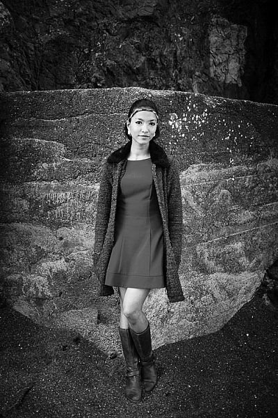
The photo above is interesting because it utilizes symmetry. I asked the model to stand at the corner of concrete structure, built into the base of the cliff. The sides of the walls, the textured pattern on them, even the way the pebbles lie against the base of the walls all mirror each other. She is placed in the centre of the frame (horizontally) so she doesn’t break the symmetry of the background. The model, however, is not symmetrical. I asked her to put her weight on one foot, creating an S-curve with her body, to break the symmetry created by the background.
Consider also the size of the subject within the frame. If I had placed her on a third by moving the camera to the right or the left, I would have both broken the symmetry and been left with a large area of empty space. This can work when there is something interesting in that space, but it doesn’t always, and should be considered when deciding where to place the subject.

In this portrait you can see that the model’s sharp eye, is right in the centre of the frame. There’s a good reason for that – I took the photo with an EOS 5D Mark II, which has just one cross-type autofocus (AF) point in the centre of the frame. When you are using wide apertures, as I was in this case (f/2.5), it’s essential to use a cross-type autofocus point, as it’s the most accurate. One of the weaknesses of this camera is that it forced me to base my composition of portraits around its central AF point.
That’s the practical reason for using a central composition, but the portrait works. I moved in close so there wasn’t much empty space in the photo, The central composition takes the viewer’s eye to her face, eyes and hair, which are the important parts of the image. If I had moved back a little and placed her face on a third, then there would be a lot more empty space around her, and less emphasis on her features.
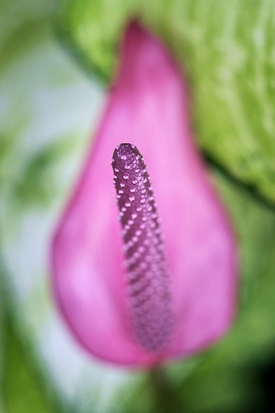
This close-up photo of a flower (above) is another example of using a central composition for impact. I focused on the flower’s stamen and let the petals go out of focus. Visually, you can divide the photo into three. At the centre there’s the stamen, which is the sharp part of the image. Around that is the petal of the flower, and around that the green leaves. If I moved the camera further away and placed the flower on a third, rather than the centre, then it would lose impact and be a completely different photo.

The final example uses the square format. You’ll see central compositions in the square format, far more than you will with a rectangular aspect ratio, because the square format lends itself to strong, graphic compositions that utilize shape.
In this example the domes of the Venetian church (centered horizontally) are the strongest shapes, and the focal point of the image. It helps that the lines formed by moving boats from the bottom right of the frame pull the eye towards the church in the distance.
What do you think? Are there times when you use central composition or do you prefer to place the subject off-centre? Let us know in the comments below.
Mastering Composition
If you’d like to learn more about composition then please check out my ebook Mastering Composition: A Photographer’s Guide to Seeing.
The post How to Create a Strong Composition by Centring the Subject by Andrew S. Gibson appeared first on Digital Photography School.
from Digital Photography School http://digital-photography-school.com/how-to-create-strong-compostions-by-centring-the-subject/
No comments:
Post a Comment