A great photo is a combination of factors that work together to produce a great final image. The subject, lighting, composition, focus, and timing are all key to capturing a great image. However, one aspect that is often overlooked is how the image is cropped, as this can have a huge impact on the final photo.
Here are five reasons why the way that you crop your images could be letting down the final result.
Not following The Rule of Thirds
The Rule of Thirds is nothing new, and should be viewed as a good starting point for a pleasing composition. The idea is that when you take a photo, you divide your viewfinder by two vertical lines, and two horizontal lines, then try to place a point of interest on, or near, the intersection of the lines. For example, in a landscape photograph this might be a boat on a lake.
However, if this isn’t how you shot the photo, you can crop your image to follow the Rule of Thirds. Inside Lightroom, if you click on the Crop Overlay button (or R) it will allow you to crop the image (you can also see an overlay of the thirds, hit the O key to cycle through the various overlays to find the right one if it’s not showing).
But remember, rules are there to be broken, and sometimes the composition might work better without following the Rule of Thirds, so try experimenting with your cropping to see what works best.

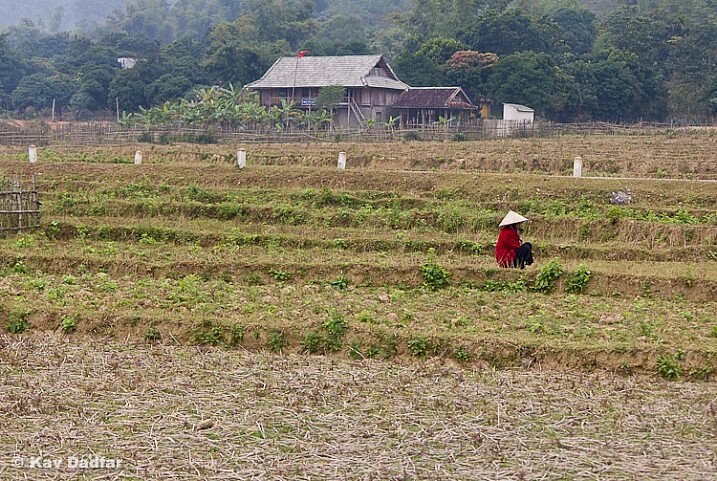
In this version the woman isn’t near one of the intersections of the third lines, and as a result looks lost in the photograph.

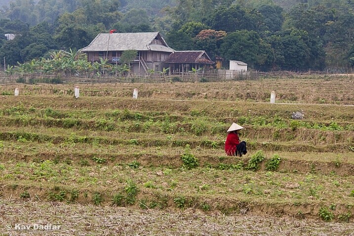
With a bit of cropping the woman is now near one of the intersections, and as a result there is more balance in the image.
No clear point of interest
Everyone can be guilty of trying to cram too much into their photos, but sometimes it’s better to crop an image to remove distractions, that will ultimately pull the viewers eyes away from the main point of interest. When looking at a photo, ask yourself, “What is the single message that I want the viewer to take away from the photo?” Then crop your photograph so that the focus is purely on that message, and nothing else.

Man selling buttons in a market by the side of the road in Bangkok. There is too much going around on the edges that distract from the main point of interest here.

By cropping in, I remove the distractions and keep the focus on the man.
Not showing enough
While sometimes cropping in to a photo is great for isolating the point of interest, sometimes it is better to show more, so that the image can have more context, and tell a better story. This is especially true of landscape photos, or environmental portraits, where seeing the surroundings of a person or object can be imperative to the composition. Remember though, that when you are showing more of the scene, still think about the Rule of Thirds, and consider that your photo should still have a clear message.

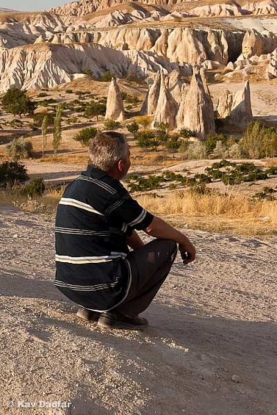
Not showing enough of the surroundings. |

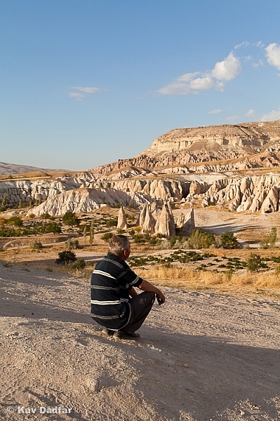
By having a wider crop, the photo has more context. |
It’s too safe
One of the great things about the digital age of photography is that you can experiment on your photos in post-production as much as possible. So, don’t be afraid to play around with the way you crop your images. You may find that a crop you are not usually accustomed to, like panoramic or square, works wonders for a photograph.

This is the original crop from the camera.

The majority of the foreground and sky is not interesting, so by cropping to a panoramic it makes the image much tighter, and more focused on the point of interest.
Not thinking about usage
If you are planning on selling your images, it is imperative to think about where they might be used. If you put your point of interest in the middle of the image, the photograph won’t be used as a double page spread in a magazine, as the point of interest will be in what is called the gutter. If you don’t allow enough space around a vertical photograph, it may not work as a cover image. You also need to think about how they might look on the stock agency website as a thumbnail, and if it will make an impression. That’s why it is imperative to crop your images while thinking about the end usage.

By placing the Blue Mosque on the left hand side of the composition it makes this shot easier to use in magazines where copy might be needed.
Cropping your images is one of the simple ways of improving a photograph, and the great thing is that if it doesn’t work, you can simply revert the image to how it was before and try something else. So give it a go and experiment with the cropping of your images, you may be surprised with the results.
Do you have any other tips and advice for cropping your images? Share them below.
The post 5 Reasons Why Your Cropping is Letting Down Your Photos by Kav Dadfar appeared first on Digital Photography School.
from Digital Photography School http://digital-photography-school.com/5-reasons-cropping-letting-photos/
No comments:
Post a Comment