Sunday 31 January 2016

How to Photograph Reflective Surfaces

Photographing reflective surfaces and objects is usually quite challenging, and can easily turn the work of the photographer into a frustrating task.

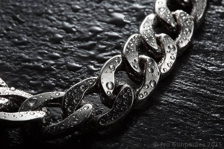
Reflections are a hard to tame beast, but it gets easier to control if you know the rules. So, in this article I will show you how to create a high impact image with controlled reflections, like the one below, with a really simple, but highly effective, technique and using equipment you most certainly already own.

01

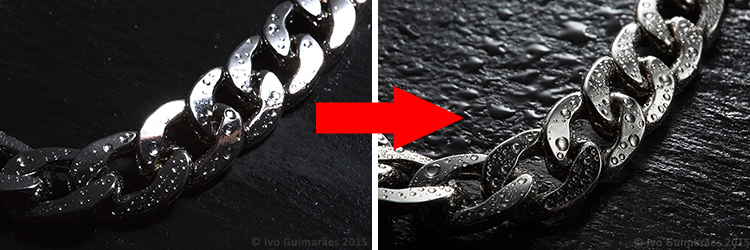
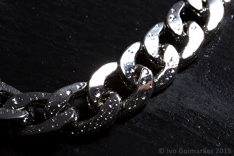
A reflective surface acts like a mirror reflecting light, so if the light source of your image comes from the same direction as the camera, it causes specular highlights resulting in blown out spots without texture, and an overall poor looking image like the following one photographed with the flash mounted on camera.

02

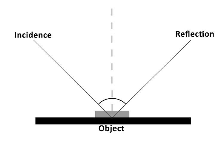
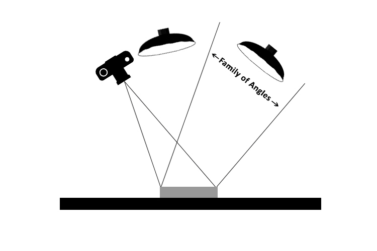
It all comes down to the basic principles of light and the way it behaves, which is in fact very predictable. The law of reflection explains this phenomenon. If you project a ray of light on a flat reflective surface like a mirror, then the angle of incidence equals de angle of reflection, like the following diagram illustrates:

03

So, physics apart, what this really means is that if you are trying to photograph a reflective surface you should never light it from the same angle as the camera, otherwise you will only get light bouncing straight back at you (depending on the angle of the object).

The trick here is to use a big light source, and position it in the same opposite angle of your camera, in relation to the photographed object (behind it).

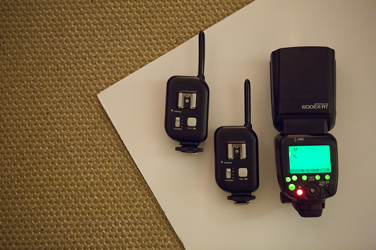
You can do this with a studio flash head and a big softbox, but there is a much simpler and cheaper way of doing it. You just need some white cardboard, a flash, and trigger system to fire it off-camera.

04

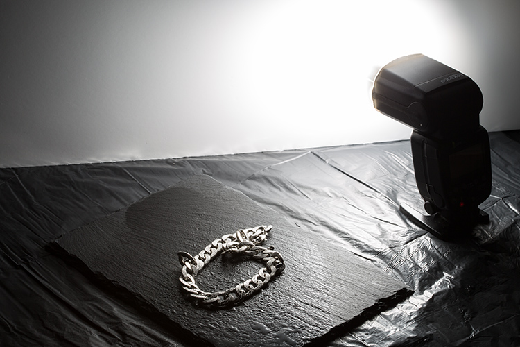
Here is how you can use this lighting setup:

05

The light from the flash bounced off the cardboard is a much bigger light source, allowing you to control the reflections on your image, creating gradients that shape the object, and avoiding specular highlights. Notice it also creates texture on the rock background.

06

This simple technique allows you to create a lot of different lighting effects in your image, depending how you position your flash, and angle the cardboard in relation to the photographed object, which also creates texture on the background stone and water drops.

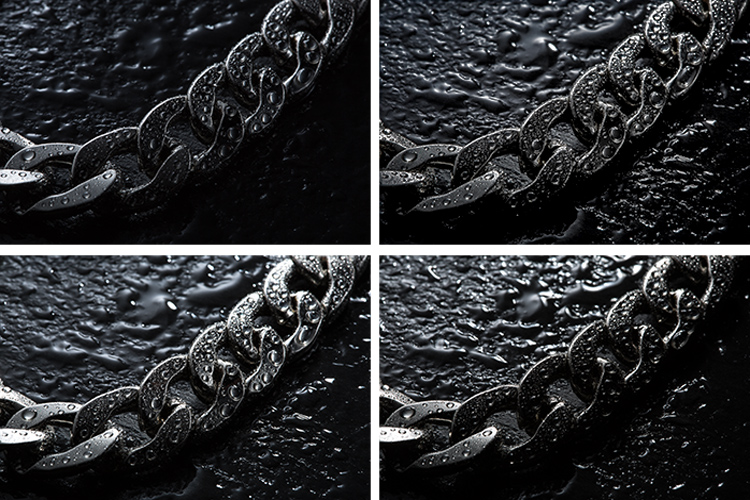
Here are some examples of light variations on this imag,e with just some small adjustments to the cardboard positioning.

07

Knowing that light rays will always bounce from a reflective surface, at the same angle at that at which they strike it, makes it possible to determine the best positioning for the camera and the light source, taking into consideration the family of angles as you can see in the next diagram.

08

The light positioned within the family of angles will produce a direct reflection and the light outside of the family of angles will not light a mirror-like subject at all, from the camera’s point of view.

Even though the reflections on these images are not direct, but rather diffused reflections (which makes difficult to calculate the light angle as it is being bounced and dispersed in different directions) the family of angles can give you a good estimate of how to position your light in relation to the camera angle, in order to control the reflections in your image.

All this technical information about light physics may seem overwhelming at first, but it will all make sense when you start playing around with it. So, give it at try, I’m sure you will get great images. Please share any questions and your images of reflective objects in the comments section below.

The post How to Photograph Reflective Surfaces by Ivo Guimaraes appeared first on Digital Photography School.


from Digital Photography School http://digital-photography-school.com/how-to-photograph-reflective-surfaces/

Ep. 43: Nikon Can’t Spot an Obvious Composite

Here’s episode 43 of the PetaPixel Photography Podcast. You can also download the MP3 directly and subscribe via iTunes or RSS!

Call 1-206-333-9308, leave a comment in this post, or use our voicemail widget for feedback/questions for the show.

In This Episode

If you subscribe to the PetaPixel Photography Podcast in iTunes, please take a moment to rate and review us and help us move up in the rankings so others interested in photography may find us.

Rangefinder editor-in-chief and author Jacqueline Tobin opens the show. Thanks Jacqueline!

Thanks to Audible for supporting our podcast. Get a FREE 30 day trial at audible.com/petapixel

Nikon Singapore misses an extremely obvious photo composite and awards prize to photographer. (#)

Adobe introduces Boundary Warp to Lightroom and Camera Raw for better panoramas. (#)

Yongnuo announces the YN360 LED Light Wand, a possible alternative to the Ice Light. (#)

Ever wondered why DxOMark stopped testing Fujifilm’s? cameras? (#)

A Muslim woman sues Associated Press and a photographer over a photo of her. (#)

Sony sensor sales slide in Q4 2015 with a slowdown projected in sensor demand. (#)

Getty Images’ co-founder ticks off many with a Tweet about recent Corbis sale to VCG. (#)

Connect With Us

Thank you for listening to the PetaPixel Photography Podcast! Connect with me, Sharky James on TwitterInstagram and Facebook (all @LensShark) as we build this community.

Leave us an audio question through our voicemail widget or call us at 1-206-333-9308. Alternatively, you can comment below or via social media. But we’d love to play and answer your question on the show!

You can also cut a show opener for us to play on the show! As an example: “Hi, this is Matt Smith with Double Heart Photography in Chicago, Illinois, and you’re listening to the PetaPixel Photography Podcast with Sharky James!”


from PetaPixel http://petapixel.com/2016/01/31/ep-43-nikon-cant-spot-an-obvious-composite/

5 Starter Steps to Batch Processing using Adobe Bridge

Post-processing can be a minefield. Beginners especially can feel overwhelmed when confronted by amazing software, that can do almost anything, like Photoshop for example. However, everyone starts from somewhere, and not everything is terribly confusing. I am personally a fan of simplicity, when it comes to technology. Let me share with you a few simple steps on how to get started batch processing using Adobe Bridge.
what-is-adobe-bridge_WEB

Editing in Bridge is super simple, and as easy as one – two – three. Open your file, edit your photo, save your file. I will walk you through it, and try to demystify the first step in post-processing, without touching Photoshop.

What is Adobe Bridge?

Bridge is part of Adobe’s Creative Suite, and is a media browsing application. It is an app that enables you to view your entire computer contents, manage and organize your digital files, and edit your photos without the need to import and file them in various catalogs elsewhere. For photographers specifically, Bridge simplifies the first step in the editing process, because within Bridge you can do the following easily, to name a few:

  1. Browse photos
  2. Rate photos
  3. Delete photos
  4. Rename, move, or copy multiple files at the press of a button
  5. Organize your files using various filters so you can perform your desired function in batches
  6. Watermark, copyright and manage metadata information
batch-editing-adobe-bridge-photography-tutorial

Adobe Camera Raw

To edit photographs in Bridge, you need to have Adobe Camera Raw, a powerful plug-in that allows you to edit and enhance any photo, including JPGS. RAW files however, can only be opened, and read, in Adobe Camera Raw.

I would suggest that you shoot in RAW. Here is a good article about RAW vs JPGS which explains the benefit of shooting in RAW format. I shoot in RAW, and always edit from that format in Bridge, as my starting point. If you photograph in RAW, make sure you have downloaded Adobe Camera Raw, preferably the latest version, onto your computer before you can edit the files in Bridge.

A first word

This tutorial is a very basic suggested process of editing in Bridge, meant to aid your understanding if you have never used Bridge before. I do not claim it is the better way of editing nor the perfect way; it is one option, among many others available. Bridge is my personal preference over Lightroom, and I choose to use as much or as few of the functions in Bridge as I see fit for every image, or batch of images, that I edit. I like Bridge because, together with Adobe Camera Raw, it is straight-forward, hassle-free, and offers a non-destructive way of editing.

Loading your images

Before starting the batch processing, you need to load your images to a new folder on your computer.

My suggestion would be to download your images from your memory card, directly onto your computer. In my opinion, this is the safest, and most direct way, to copy over images from your memory card to your computer, without having to go through various software that potentially could complicate the copying process. Keep it as simple as possible to try and eliminate any malfunctions or errors right at the start. Use an external USB card reader to load your images into your computer, if it doesn’t come with a built-in one.

Put your images in a new folder clearly labeled so you know exactly where to find them. As an added step, when I copy a new set of images from a memory card on to my computer, I also immediately copy the same set to various external hard drives and cloud storage for back-up and safe-keeping. Always copy from the same memory card so you keep the transfer direct, and minimize potential errors. For example, if you copy your memory card images to a folder called Set A, do not then copy the images from Set A into another external hard drive folder; do not create this unnecessary step. Paste the same set of images from the memory card, directly where you want them stored on an external hard drive or on the cloud.

Once your images are safely copied, open Bridge. You will need to be subscribed to Adobe CC to have access to this. Subscriptions are now very affordable, compared to previous years when you had to buy a license of the very expensive full Adobe Suite just to use one software.
 batch-editing-adobe-bridge-photography-tutorial

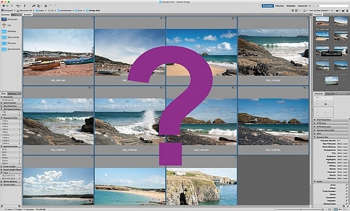
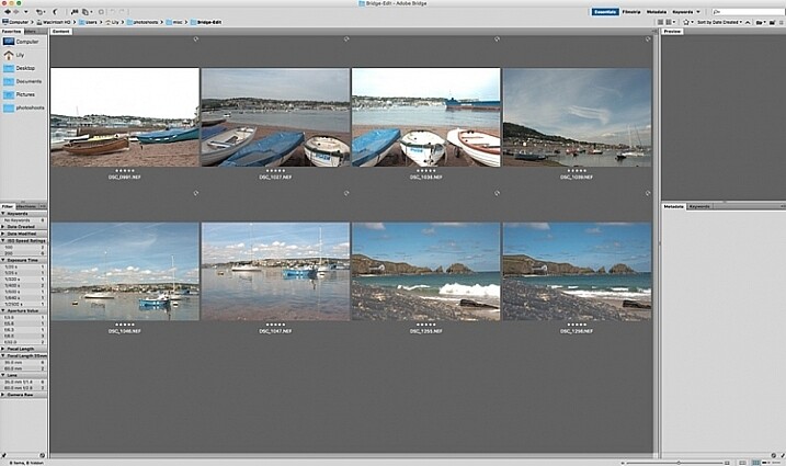
You will see the contents of your computer on the left side navigation menu. Find your folder, click on it and your images will be displayed on the main window. RAW files will be displayed as CR2 or CRW files for Canon cameras, NEF files for Nikon cameras and DNG for some other cameras (each manufacturer has a proprietary raw file format).

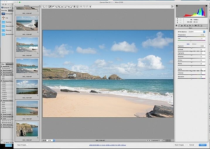
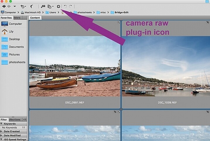
Select your RAW files, and open them by clicking the Camera Raw plug-in icon with the images selected.
 batch-editing-adobe-bridge-photography-tutorial

As a RAW file is an unprocessed image containing all the information the camera sensor sees. It can appear very flat, and darker than what you may have seen on your camera’s LCD screen, which displays a JPG preview of your image, and as such has already been processed by the camera for preview purposes.

An important note to consider when batch processing, is that it is most effective when used on images that are photographed using similar light and settings. The main thing to remember is that you are able to apply global edits in a few steps to multiple images, but the reality is that you may still have to tweak each image as appropriate before you save it.
sync-settings_WEB

Batch processing

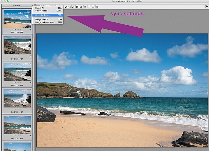
There are two ways of applying edits in batches. Below I make reference to selecting all images using cmd/ctrl+a, and making your adjustments by applying them to the images simultaneously – that is one way. The second way is to synchronize edits. To do this, use one image with all the adjustments made, then select all other images and click the synchronize button to apply the same adjustments to the rest of them.
 batch-editing-adobe-bridge-photography-tutorial

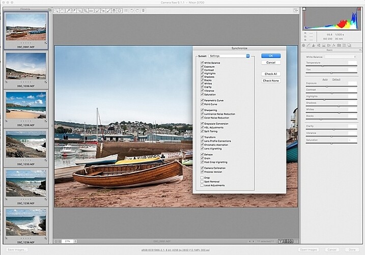
The idea behind batch editing is that you can apply a set of edits to multiple images, by only doing the adjustments once. To do this you can either select all the images you want to edit and make your adjustments while all the images are selected –  or you can edit one image first, followed by selecting all the images (making sure the edited image is the one highlighted with the blue box around it) then synchronizing the edits across all the images. A new window opens up with a series of boxes so you can check the settings you want to synchronize across the batch. I tend to uncheck the crop and local adjustments as those settings usually need to be specifically applied to each individual image.

Here is a key point to bear in mind when synchronizing your settings across the batches: It is important to note that you only want to do this with global adjustments that you want applied to the entire batch, and do it at an early stage of editing. If you use the synchronize function at the end of your edits, when you may have made various local adjustments to each individual image, any synchronizing action done then will overwrite previous adjustments (depending on what you select in the Sync settings popup box).

Step 1: Correct Lens Distortion and Chromatic Aberration
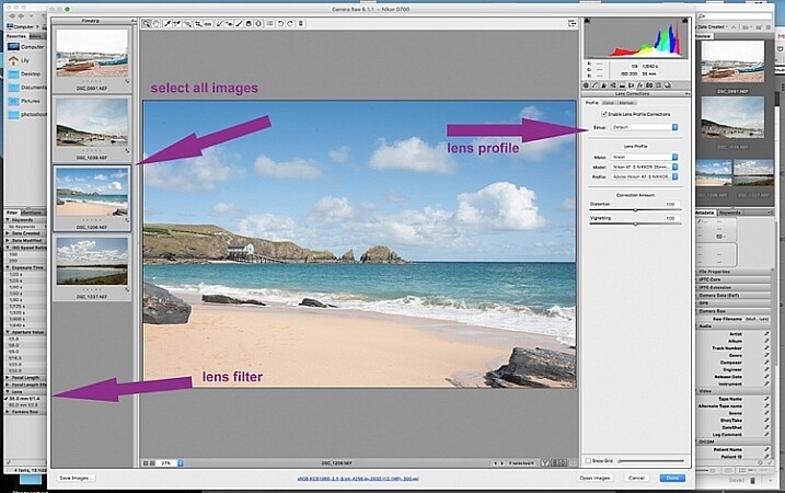
 batch-editing-adobe-bridge-photography-tutorial

On the left hand navigation filter, choose Lens. A dropdown menu of the lenses used appears. I correct distortion on all images photographed around the 50mm focal length and under. By clicking on the specific lens, you are filtering the set so that only images photographed with that lens are shown in the thumbnail window. Select all the images by clicking cmd/ctrl+a . With the images selected, click the camera lens icon to open the Camera Raw plug-in and window. Select the images again by clicking cmd/ctrl+a, and go to the Lens Correction tab on the right hand navigation panel. On the Profile tab click the box that enables lens correction and choose your camera and lens details from the drop down menus. If your lens isn’t in the list, alternatively you can do this manually using the sliders on the Manual tab. Click done and your changes will automatically be saved.

Often with extreme lens distortions coupled, with straightening adjustments, you will need to crop your images. Type c (keyboard shortcut) and the crop box at the top will be highlighted. Hold down the crop icon to bring up the crop ratios. By doing this, your image will be constrained to the ratio you have chosenwhen you crop. Don’t forget to click done to save your changes.

Do this for all the lenses for which you want the distortions corrected. If you are only editing a batch photographed using one lens profile, you do not need to click done just yet. You can keep making further edits before clicking done.

Next correct any Chromatic Aberration. I only do this step if I know I have taken images in bright light using a very wide aperture such as f/2 or wider. The filtering and batch editing method is the same as above. However, I do this for each image individually at 100% view as each image would have various amounts of chromatic aberration and varyious color fringing.

Step 2: Correct your White Balance
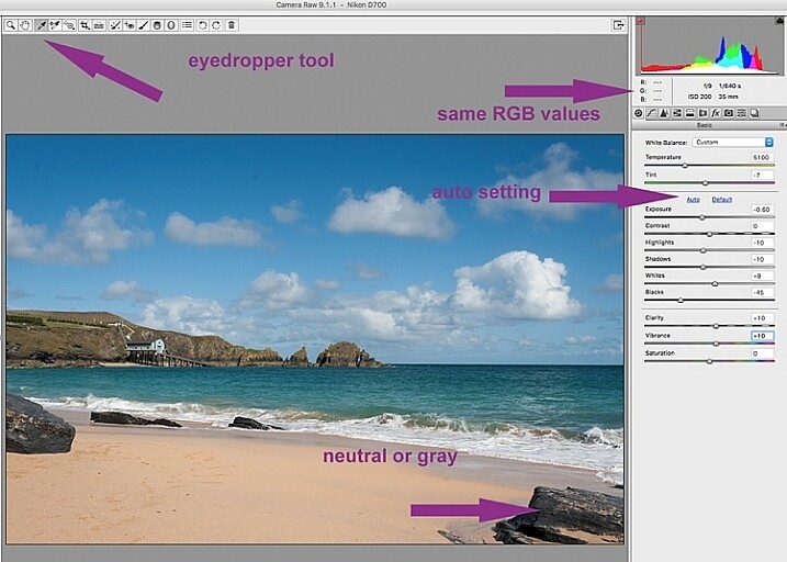
 batch-editing-adobe-bridge-photography-tutorial

Once all the distortions on various lenses and focal lengths have been corrected, open your images again in the same way. Now you are ready to make batch edits.

Once in Camera Raw, select a set of images that have been photographed in the same, or similar light. With the images selected correct the White Balance using the eyedropper tool. You need to find a neutral area (gray, or white) to click the eyedropper tool on and aim to get the RGB numbers to read the same, as much as possible. That way you know you are getting the most neutral color in the image. You can also correct White Balance by eye if you are confident enough to differentiate color temperature, although this will be less accurate than going with the RGB values.

You will notice that the White Balance changes on all the images you selected just by setting it on one image. Images that have been photographed in different light, or at varying times, will register a different White Balance. So, batch editing an entire set of images photographed in various places in this way, will produce irregular color results.

A solution to this is to use a gray card and have this set when photographing, or set your color temperature in-camera. By doing this the White Balance will be consistent throughout your images, for that time and setting. Here is a useful article on how to set your white balance in camera using a gray card. For more information on white balance and color temperature click here.

Step 3: Correct your exposure and make local adjustments
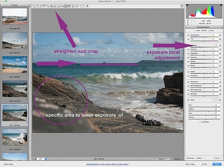
 batch-editing-adobe-bridge-photography-tutorial

You may want to click Auto first, to see what Camera Raw’s suggested edits are, then start making your adjustments from there. To batch process, it is important to select sets of images shot in the same setting and light to make the most of this editing function. Batch editing images that have settings in opposite extremes will very likely add to your editing time, as you will need to go back and correct all the other images, thereby doubling your editing process. This is just one of the benefits of shooting in Manual mode where you have full control of your camera settings, rather than the camera making the decisions for you. If you are considering switching to Manual mode, in case you are still shooting in any of the other modes, see: How to Learn Your Camera’s Light Meter and Master Manual Mode.
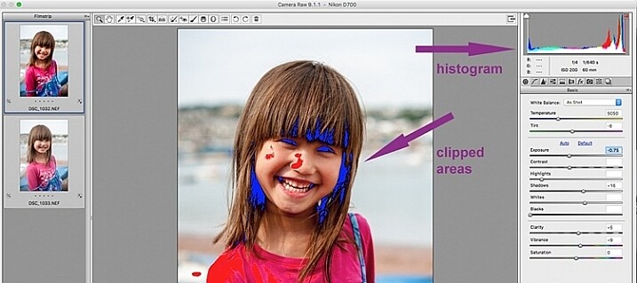
 batch-editing-adobe-bridge-photography-tutorial

When making adjustments, it is important to keep an eye on the histogram, which is the coloured graph displayed on the upper right hand corner of Camera Raw. The histogram tells you if there is clipping occurring in the dark and light areas of your image. Clipping simply means that there is no detail left in that area, as the tonal values have fallen outside the minimum and maximum brightness boundaries, where detail can be represented in the digital image.

Type U and O together and the window will display any clipped bright areas in red. Type U and O together again to display clipped dark areas, and one more time to turn off the clipping warnings. You can then make adjustments by moving the sliders to eliminate the clipped areas. Remember to keep checking the histogram. You don’t want to clip either the blacks or the whites, you will see this on the histogram when the colours start climbing up on the left and right walls. Ideally you want the colours to be evenly distributed around the middle area until they are just touching the walls. Here is a link explaining: How to Read and Use Histograms.

Local adjustments

There are useful tools that you can use in Camera Raw, but which will not be beneficial in batch editing such as: spot removal and healing, adding gradients, straightening and cropping. However, you can edit smaller sets within the opened big batch, with ease using the same process. Regardless of the number of images, you can select consecutive images you want to edit in smaller groups, and apply specific batch edits to those images only, such as cropping and other local adjustments.
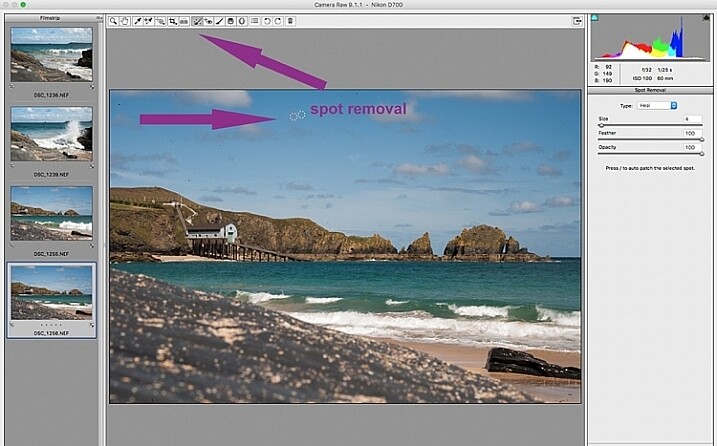
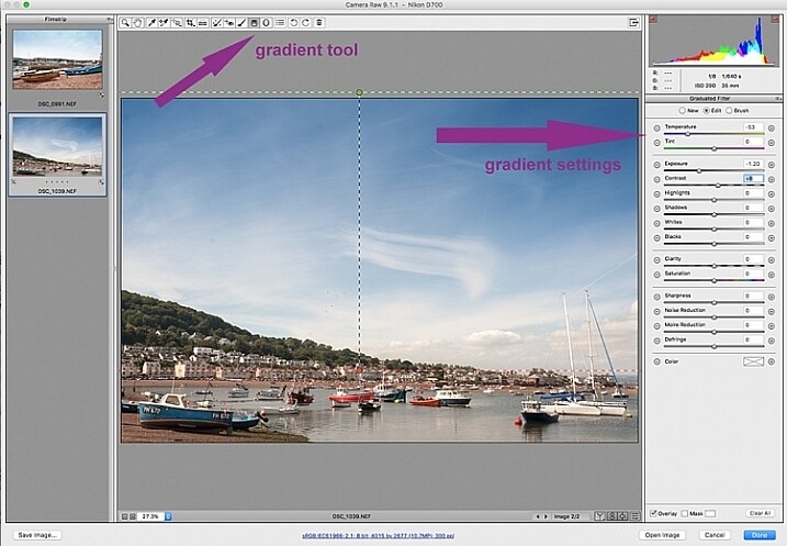
 batch-editing-adobe-bridge-photography-tutorial

 batch-editing-adobe-bridge-photography-tutorial

While I find local adjustments very useful, for instance brightening or darkening selected areas, warming up and cooling down specific parts of an image, and all the tools available on the adjustment brush panel, these tools need to be applied to each image individually, as necessary. Bridge and Adobe Raw can only go so far. If more fine tuning, and intricate edits need doing, you will need to take the image into Photoshop or a similar software to do so.
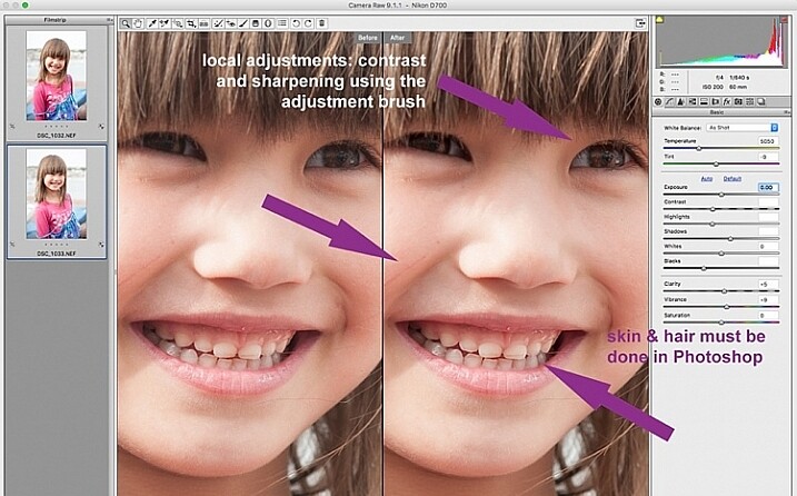
 batch-editing-adobe-bridge-photography-tutorial

Step 4: Remove Noise and Sharpen

Adjusting the sliders to remove noise in an image is essential for all images, more so if you are shooting at a high ISO. Noise in a digital image is composed of the grainy look that you see, and the red, green, and blue spots that show through on the image, especially in the dark areas. The luminance slider fixes the grainy issue, and the color slider removes the dots, so move both sliders until you remove the noise.

An image shot at a very high ISO such as ISO 8000 will need a different noise reduction value than an image shot at ISO 400. If this is the case with your set of images, you can go back and filter your images again as in Step 1, but using the ISO speed ratings this time, then proceed with batch editing. This process can be tricky, but is worth the extra step, especially when dealing with higher ISOs. It is essential to view the images at 100% when removing noise, so the effects of the sliders are visible. A word of caution: do not go overboard with the noise reduction and sharpening settings when doing global batch edits. The danger is that you may end up removal detail and color. The best way to ascertain the noise removal settings appropriate for an image, is to do it on every single image, due to the ISO and exposure variables which greatly determine the amount of noise in an image. But there is no reason why you can’t apply a gentle global noise reduction setting to your batch of images, and adjust from there individually as needed.

It is always good practice to sharpen all your images, ready for output. Sharpening values vary according to the detail, and information in the image. You can apply your chosen sharpening values globally if you are confident that the values are gentle, and general enough for all the images in the batch. A little sharpening is better than nothing. Some images however, may need specific, more aggressive, sharpening values, and this is where you need to apply the appropriate value to each individual image. Similar to removing noise, the best practice is to custom sharpen each image one by one.
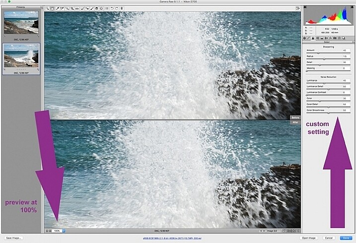
sharpen_WEB

Step 5: Save your images

Once you have made global batch edits to your images, I suggest you go through them one at a time, in the same Camera Raw window, and make final local adjustments for each one. Type cmd+alt+p to toggle between before and after previews. There are a variety of preview formats, so play around with the options given, to choose your preferred format.

Now it’s time to save your images. This is one of the features of using Bridge with Camera Raw that, for me, trumps all others. Select all your images again, and click the Save image button. A window opens up where you can specify where you want the images saved, or create a new folder for them. You specify the format you want them saved in, as well as quality. You name the files once only, and voila they are saved. Don’t forget to click the done button to store all your adjustments. If you close the window without doing so, all your adjustments will not be saved. Always make sure your images are in sRGB and are saved in sRGB color profile.

Summary

These are only very basic steps to get you started, Bridge and Adobe Camera Raw have so much more to offer. Play around, experiment for yourself, and find out how your workflow can be even more simplified. Editing in Bridge and Camera Raw does have its limitations, especially when it comes to fine edits on skin, and blemish and hair removals, but with their batch editing functionality, you can get you to a place where you’re ready for finer edits in Photoshop, much faster than opening each image in Photoshop as a starting point, and applying the same edits one at a time.
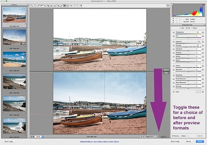
 batch-editing-adobe-bridge-photography-tutorial

There you have it – a few simple tips for batch processing. By saving your images in a different format, you will have your new set of edited images, while your RAW files are safe in the original folder. When you open these RAW files again they will show the adjustments you have made, but you can reset at any time if you want to re-edit from scratch. Your edited images are now ready to be further edited in Photoshop, should you want to do more creative and artistic edits, or if there are more edits necessary like head swapping, skin blemishes and hair removal as mentioned above. Bridge and Camera Raw are only the beginning, they gives you a good clean edited image to build on.

A last word

Batch editing is not for every photographer, nor for every photograph. Neither is batch processing necessary for every photography job that comes your way. But it is an option that can be easily learned, and might just save your sanity one day when you need to edit thousands of images within a short time-frame.

Here are the two images before and after editing in Bridge and Camera Raw.

landscape-after-before_WEB

landscape-after_1_WEB

landscape-after_WEB

Do you have other smart tips to share when batch processing in Adobe Bridge?

The post 5 Starter Steps to Batch Processing using Adobe Bridge by Lily Sawyer appeared first on Digital Photography School.


from Digital Photography School http://digital-photography-school.com/5-starter-steps-to-batch-processing-using-adobe-bridge/
Saturday 30 January 2016

10 Myths About the Rule of Thirds

10myths

My name is Tavis Leaf Glover, and I’m an artist just like you, trying to create art that I can be proud of and share with the world. Though, something really hindered me in the beginning… the Rule of Thirds.

I want to shed some light on the Rule of Thirds Myths we’ve all been forcefully spoon fed during our creative infancy, which continues to linger as our compositions mature.

Perhaps we can change the future of art together if we help other artists abandon the rule of thirds and introduce them to the invaluable design techniques demonstrated throughout this article. I need your help because I can’t do it alone!

Like many other artists, I was brainwashed into thinking that the rule of thirds was an acceptable method of composing an image. I guess that depends on the standard of art you’d like to produce. Art at the Master Level, like Da Vinci, Bouguereau, Degas, Rubens, or art like a Sunday painter whose goal is to hang their painting in the local antique store… not the prestigious gallery or museum.

Paintings by Da Vinci, Bouguereau, Degas, Rubens

Paintings by Da Vinci, Bouguereau, Degas, Rubens

Without composition, art cannot flourish. And when using the rule of thirds to guide your composition, you’ll end up in a dark alley waiting to be maliciously fondled by mediocre art. This might sound harsh, but… well, it kinda is.

It’s my experience that people don’t like rules, and they certainly don’t like to follow them. They are always saying the same cliché phrase “well, rule’s were meant to be broken” or “I think it’s good to learn the rules, but then know when to break them.”

The word “rule” has a meaning that can be looked upon as negative. What I’m striving to demonstrate isn’t a rule that needs to be broken. It’s a canon of knowledge that you can choose to incorporate into your art if you wish. Your choice, simple as that.

MYTH #1: “It makes it visually pleasing”

To debunk this, we have to know what makes an image visually pleasing, and I assure you, it’s not plotting your subject on a rule of thirds crosshair. To be visually pleasing is to apply your composition techniques in a way which is clearly read by the viewer… without getting caught up on distracting elements or creating confusion by lack of hierarchy. How do we do that?

Well, we need to understand how the mind perceives visual stimuli. For this we use Gestalt psychology techniques like Figure-Ground Relationship (FGR) to clearly separate the subject from the background.

Photograph by Henri Cartier-Bresson showing excellent FGR.

Photograph by Henri Cartier-Bresson showing excellent FGR.

Or we can use the Law of Continuity, which will allow us to create a sweeping arabesque by using multiple objects.

Painting by Edgar Degas showing an Arabesque.

Painting by Edgar Degas showing an Arabesque.

We can even use the Greatest Area of Contrast to help direct our viewer’s eyes towards the main subject.

Photograph by David Bellemere.

Photograph by David Bellemere.

MYTH #2: “Pros use it”

The next myth we have is “pros use it.” Annie Leibovitz is definitely a pro, and one of the most inspirational photographers of today. So let’s grab one of her photos and simply line it up to the rule of thirds grid, then we’ll see if she used it or not.

Photograph by Annie Leibovitz.

Photograph by Annie Leibovitz.

Showing the Rule of Thirds Grid lines up to the Mantel.

Showing the Rule of Thirds Grid lines up to the Mantel.

We can see how the mantel lines up perfectly to the rule of thirds grid. Hmmm, I guess she did use it… but wait, how did she pose the models? How did she create such a great composition when there are only horizontals and verticals to guide us? What do I do next? I have some of the models on the rule of thirds, but where do I go now? How do I position their arms, legs, dress, and gaze? This is where we introduce dynamic symmetry.

This is a Root 4 Rectangle with its Basic Armature (two diagonals, four reciprocals, horizontals and verticals).

This is a Root 4 Rectangle with its Basic Armature (two diagonals, four reciprocals, horizontals and verticals).

A Root 4 rectangle can be divided into four smaller Root 4 rectangles.

A Root 4 rectangle can be divided into four smaller Root 4 rectangles.

In order for Annie to properly pose the models, she uses dynamic symmetry. That’s basically a fancy term for grid system.

This is a 1.5 rectangle with it’s Basic Armature (same size as many camera sensors) and 3 can fit inside a Root 4 rectangle.

This is a 1.5 rectangle with it’s Basic Armature (same size as many camera sensors) and 3 can fit inside a Root 4 rectangle.

This is the complete grid system.

This is the complete grid system.

To put it simply, a grid system is something we can use in our photography to help us organize our composition. We can use the diagonals, verticals, and horizontals to help us create rhythm and unity throughout the image… whether it’s a painting, photo, or sculpture… dynamic symmetry can be used for all of them.

“Laocoon & His Sons” is a Greek sculpture that was constructed by using Dynamic Symmetry.

“Laocoon & His Sons” is a Greek sculpture that was constructed by using Dynamic Symmetry.

We could get really involved into explaining this system more, but let’s not lose focus of the main purpose, which is to expose the rule of thirds for what it is… a watered down rule that has brain washed us all into thinking it’s worth sharing with the world.

MYTH #3: “It moves the eye around the image.”

This couldn’t be further from the truth. Plotting your subject on a point without consideration for the whole will not help create movement within your composition.

Photograph by Tavis Leaf Glover

Photograph by Tavis Leaf Glover

When we learn of another Gestalt psychology technique called the Law of Continuity, we’ll discover several tools we can use to create movement and unity, which will move the eye around the image. The most visually pleasing one is an Arabesque.

Photograph by Tavis Leaf Glover

Photograph by Tavis Leaf Glover

This is a curvilinear element you can incorporate into your art to create a beautiful sweeping movement throughout the image. Master painters used these extensively throughout their work.

Painting by Vincent van Gogh showing an Arabesque.

Painting by Vincent van Gogh showing an Arabesque.

Another technique used to create movement is called a Coincidence. This is defined as edge-to-edge relationships, which unify multiple elements and can create movement side to side and up and down.

It’s not a solid line as you might think when you hear the term “leading lines.” It’s broken, hidden, and a magic trick which we can use to allow the mind to easily close the gaps.

Painting by Caravaggio shows how he hides his lines by understanding the Law of Continuity.

Painting by Caravaggio shows how he hides his lines by understanding the Law of Continuity.

In this photo we can see the edge-to-edge relationships Annie Leibovitz creates by using the limbs of the models.

Photograph by Annie Leibovitz showing Coincidences.

Photograph by Annie Leibovitz showing Coincidences.

We can also see it in this painting of the Mona Lisa by Da Vinci, and in this complex composition by Bouguereau.

Paintings by Da Vinci and Bouguereau showing Coincidences.

Paintings by Da Vinci and Bouguereau showing Coincidences.

MYTH #4: “It gets the subject out of the center.”

First off, who decreed that the center of a frame is so bad? Why are we lead to believe this?

Photograph by Tavis Leaf Glover

Photograph by Tavis Leaf Glover

Photograph by Tavis Leaf Glover

Photograph by Tavis Leaf Glover

There’s a Gestalt psychology technique called the Law of Symmetry, which basically means the human mind is always trying to find balance in visual stimuli. So if we use the rule of thirds and place the subject off center, then we will need a counterpart to help us balance the image. If there’s no counterpart, then we’ve just created horrible balance within our composition.

Photograph by Tavis Leaf Glover

Photograph by Tavis Leaf Glover

There is vertical balance (which I call breathing room), and there is horizontal balance (which I call gazing direction), and we must understand how to control each of these in order to create a properly balanced composition.

Painting by Bouguereau showing proper balance from top to bottom.

Painting by Bouguereau showing proper balance from top to bottom.

Painting by Degas showing proper balance from left to right.

Painting by Degas showing proper balance from left to right.

Here’s a photo I created which has the main subject centered, but is properly balanced because vertical and horizontal balance was considered.

Photograph by Tavis Leaf Glover showing how Balance can be properly achieved from top to bottom and left to right.

Photograph by Tavis Leaf Glover showing how Balance can be properly achieved from top to bottom and left to right.

It took me years to erase the damage the rule of thirds caused on my compositions. I was always placing the subject on one side or the other without consideration for the image as a whole.

Photograph by Tavis Leaf Glover before learning design and Gestalt psychology techniques.

Photograph by Tavis Leaf Glover before learning design and Gestalt psychology techniques.

MYTH #5: “Basis for a well balanced and interesting shot”

We already covered the Law of Symmetry, which covers the proper balance of an image, but what we didn’t mention how the rule of thirds gives birth to unwanted negative space. If we are generically placing our subject into one of the crosshairs without consideration of the whole, then we won’t have a counterpart on the other side of the composition and we’ll have negative space that takes attention away from our subject.

Photograph showing how the rule of thirds creates unwanted negative space.

Photograph showing how the rule of thirds creates unwanted negative space.

.

Negative space can be properly used to create a feeling of isolation or loneliness, but to use it without sophistication is a rookie move.

Photograph by Gregory Crewdson using Negative Space to enhance his story.

Photograph by Gregory Crewdson using Negative Space to enhance his story.

MYTH #6: “It’s a great starting point for beginners”

In my own experience, the rule of thirds only lead me down a dead end road. I thought of it as revolutionary at first and I was boasting its powers to photographers who were just starting out.

image34

Later I found myself at a plateau and not able to understand how to properly compose an image because the rule of thirds was guiding me.

image35

Dynamic Symmetry Grids are just as easy to use as R.O.T.

Dynamic Symmetry Grids are just as easy to use as R.O.T.

If new artists start with the grid of dynamic symmetry instead of the rule of thirds, they’ll be able to later take advantage of the diagonals, which they can create rhythm with… by posing the model, or applying paint strokes. The available diagonals within the rectangle will limit the number of directions you use, called a gamut, which will create a more powerful composition…rather than the spokes of a bicycle tire.

Painting by Bouguereau showing how he creates rhythm in the model’s pose based off of his grid system.

Painting by Bouguereau showing how he creates rhythm in the model’s pose based off of his grid system.

MYTH #7: “Artists from the Renaissance, or Greek artists, created the rule of thirds”

The rule of thirds was first documented in a book by Smith (around 1797), and if you take a look at his painting, you’ll see that he wasn’t a master at all.

image38

Da Vinci would be rolling in his grave if he heard anyone say he was using the this. The amount of schooling, studying, and practice he put into his compositions, and someone is going to water it down to something as simple as the rule of thirds? No way!

Da Vinci, along with other master artists, Greek included, used dynamic symmetry, the golden section, and other design techniques like arabesques, gamut, coincidences, radiating lines, figure-ground relationship, ellipses and enclosures.

Painting by Bouguereau showing different design techniques.

Painting by Bouguereau showing different design techniques.

MYTH #8: “The human eye naturally gravitates to the intersection points”

Photograph of a generically placed tree and horizon line.

Photograph of a generically placed tree and horizon line.

I truly wish composition were this easy. Place your subject in a crosshair, and BAM, you’re automatically controlling the viewer’s eyes. Not so fast! What about the fact that we are drawn to areas of high contrast?

When we make our subject the Greatest Area of Contrast (GAC), won’t we look there first…no matter what position they are in?

Photograph by Tavis Leaf Glover showing the Greatest Area of Contrast and a Counterpart.

Photograph by Tavis Leaf Glover showing the Greatest Area of Contrast and a Counterpart.

Another thing that pulls our eyes is something I call Edge Flicker. It refers to high contrasting elements near the edge, which greatly distract the viewer from your subject.

Creating a hierarchy of contrast and keeping the edges free of distractions will help you control the way your viewer’s eyes move around the composition.

Painting by Whistler showing no Edge Flicker when Adjusted.

Painting by Whistler showing no Edge Flicker when Adjusted.

MYTH #9: “Cropping to the rule of thirds after shooting a photo is a great way to save an image”

Cropping a poorly composed, badly lit image will not save anything. That’s starting at the end and working backwards.

Try not to crop. Get it right in-camera to save precious pixels.

Try not to crop. Get it right in-camera to save precious pixels.

Learn composition and Gestalt psychology techniques so you know what to look for, how to solve visual problems, and get it right in camera. Don’t sacrifice precious pixels for the rule of thirds. Your creativity deserves better.

MYTH #10: “The power points, or golden points, create tension”

Placing your subject on a third is not going to create tension as we’ve learned so far.

Photograph by Tavis Leaf Glover showing how cropping doesn’t create tension.

Photograph by Tavis Leaf Glover showing how cropping doesn’t create tension.

If we take a look at a Gestalt psychology technique called the Law of Proximity, we’ll see how visual tension can be created. Like this painting on the ceiling of the Sistine Chapel…they are clearly unified by their proximity, but another thing to notice as we view this is visual tension created by the fact that they are almost touching, but not quite. It’s the moment before impact.

Painting by Michelangelo

Painting by Michelangelo

Or this photo where the man is almost within reach of his dying wife. It’s that close proximity that creates the tension.

Photography by Tavis Leaf Glover

Photography by Tavis Leaf Glover

When considering the Law of Proximity, distance can create negative space, which in this photo creates a tension in the room.

Photograph by Gregory Crewdson using negative space to create tension.

Photograph by Gregory Crewdson using negative space to create tension.

Conclusion

So many tricks and techniques can be applied to create a remarkable composition, which communicates clearly to your viewer. Abandon the rule of thirds. Leave it behind and adopt the dynamic symmetry grid which is just as simple to use, but can leave many more options open for you as your art progresses.

Painting by Toulouse Lautrec.

Painting by Toulouse Lautrec.

If you found this information useful, please share it with your friends. Help me tackle this rule of thirds beast, kill it, and introduce better techniques to others who are in need of powerful composition. Learning powerful composition is the only path to becoming a master of your craft.


About the author: Tavis Leaf Glover is a fine art photographer and author based in Honolulu, Hawaii. You can find more of his work on his website and on Flickr. Glover is also an educator about applying Gestalt psychology principles to photography and art.


from PetaPixel http://petapixel.com/2016/01/30/10-myths-about-the-rule-of-thirds/